Goal: Learn how to visualize ATAC data.
The following image provides an overview of the key components of the Loupe Browser interface. Each of these components are described in more detail below.
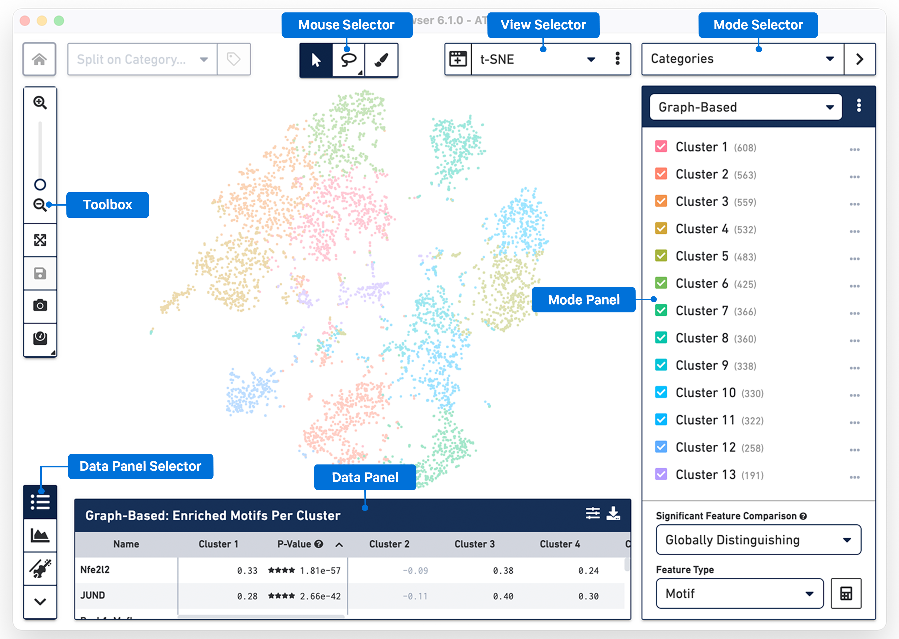
The Mouse Selector has three options from left to right:
| Tool | Description |
|---|---|
 | Pan - Move the image up and down, or left and right. |
| Lasso Selection - Select and label an image area with an irregular shape. | |
| Draw Selection - Select and label individual spots using a brush tool. |
The Toolbox is on the left side of the window and contains tools that perform the functions listed in the table below.
| Tool | Description |
|---|---|
| Zoom In and Zoom Out - Click on + to Zoom In, click on − to Zoom Out, or use the slide bar to zoom in and out. In Spatial mode, the current magnification level is shown. | |
| Autoscale - Reverts to default zoom and position that fits the screen after zooming in or out or moving the image/plot around. | |
Save - Save changes to the .cloupe file. | |
| Export Plot - Export the spatial image or the scatter plot (UMAP, t-SNE, Feature Plot) in SVG or PNG format. | |
| Marker Settings - This option can be used with t-SNE, UMAP and Feature Plot views to scale marker size. Uncheck the Auto-scale box and use the slider to move to desired size. |
To return to the home screen and the Recent Files list, click the 10x Genomics button in the top left corner.
The Data Selector Panel is on the left side of the window at the bottom. Move your mouse over the icons to see an explanation of what each tool does. The tools in the Data Selector Panel perform the functions listed in the table below.
| Tool | Description |
|---|---|
| Feature Table | |
 | Peak Viewer |
| Violin Plots | |
| Hide Bottom Panel |
The View Selector controls what is displayed in the View Panel. There are two different types of views that can be selected:
- t-SNE View
- Feature Plot View
The following components in the interface are common across all views and are defined in separate sections:
- Mouse Selector
- Toolbox
- Mode Selector and Mode Panel
- Data Selector amd Data Panel
The workspace is centered around the barcode plot, in which single points representing cell barcodes are shown in a variety of projections. Each point represents a single barcode, the vast majority of which represent a single cell. The default projection is the t-SNE plot created by the Cell Ranger ATAC pipeline. Cell Ranger ATAC generates this plot by identifying the most significant peak vectors using dimensionality reduction techniques, and then processing the lower-dimension matrix through t-SNE to produce a two-dimensional scatter plot. You can also view a projection that plots cut site counts in a peak, near a gene promoter, or within a certain motif on two-dimensional axes.
You can click-and-drag the mouse over the cells to reposition the plot, and use the mouse wheel or trackpad to smoothly zoom in and out. You will see cluster labels as you move your mouse over the plot, which is useful for data that has a high number of precomputed clusters. Cells are colored by the active legend in the sidebar.
There are three modes in Loupe Browser for ATAC data including:
- Categories mode - where you can see the different cluster assignments for all the cells.
- Accessibility mode - where you can overlay quantitative cut site count information atop the barcode.
- Filter mode - where you can create complex Boolean filters to find specific cell types.
Switching between modes applies mode-specific coloring to the graph, and changes the sidebar to reveal mode-specific functionality.
Cell Ranger ATAC pipelines compute and produce clusterings from two algorithms: a graph-based clustering algorithm and by either K-Means or K-Medoids clustering. A selector at the top of the Categories sidebar allows you to switch between these clusterings, or other clusterings that you can create yourself within Loupe Browser.
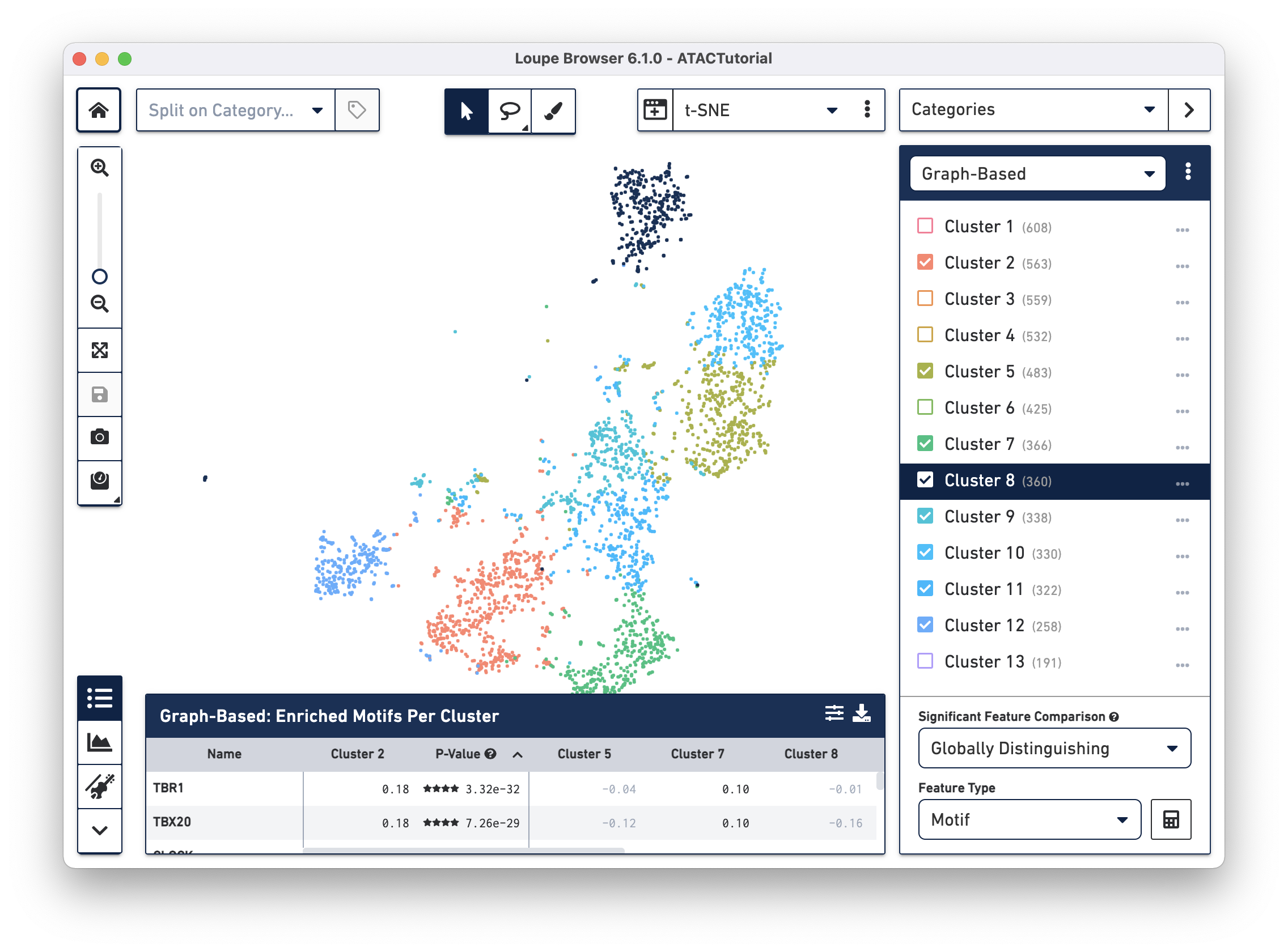
You can hide, show, and highlight individual clusters within a category by using the sidebar. To highlight a cluster, click on the cluster name within the legend. To toggle the appearance of a cluster, click on the checkbox next to the cluster name. Finally, you can hide or show all clusters within a category by clicking on the menu with three dots to the right of the category selector.
You can also rename and recolor clusters by right-clicking on a cluster name or color, and selecting the desired option from the pop-up menu.
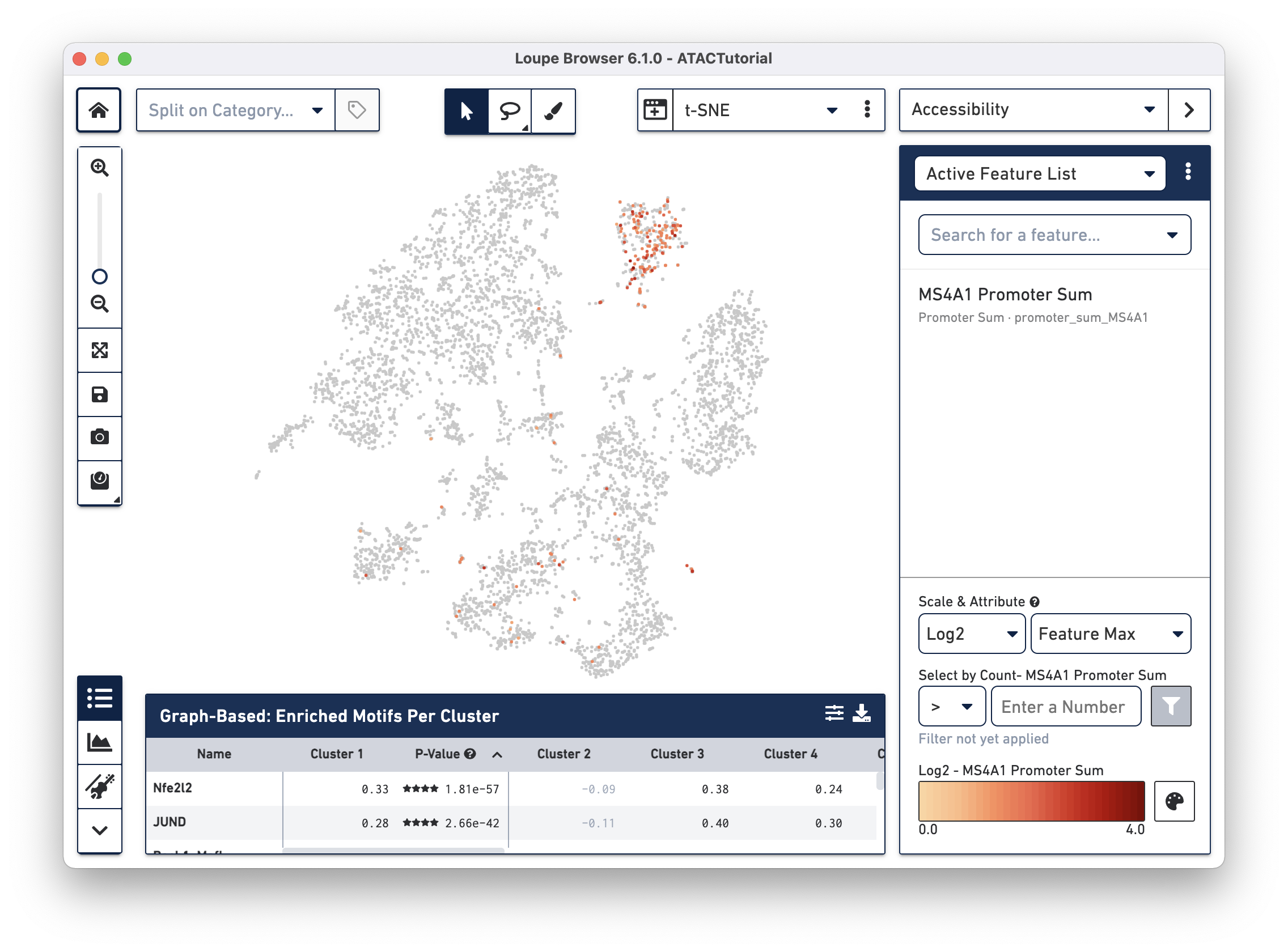
In Accessibility mode, you see a graphical representation of chromatin accessibility across your dataset. You can view the number of cut sites detected per cell within individual peaks, near the promoter regions of particular genes, or in total across the entire genome, through the Peak Sum feature. Each of these views shows the following:
- Peak: An interval on the genome that has a local enrichment of transposase cut-sites.
- Motif: The sums of cut sites per cell which fall within all the peaks associated with the motif.
- Peak Sum: The sum of cut sites within peaks in each cell.
- Promoter Sum: For a given gene, the promoter sum is the number of cut sites per cell that fall within all the peaks labeled as promoters for that gene.
- Nearby Gene Sum: The number of cut sites per cell that fall within all the promoter and distal peaks for that gene.
You can also view Z-scores of transcription factor motif counts per barcode, look at one or more features at a time, load and save lists of features for analyzing across multiple datasets, and look at the density of cut site counts across your data. We will explore Accessibility mode more in-depth when looking for cell types.
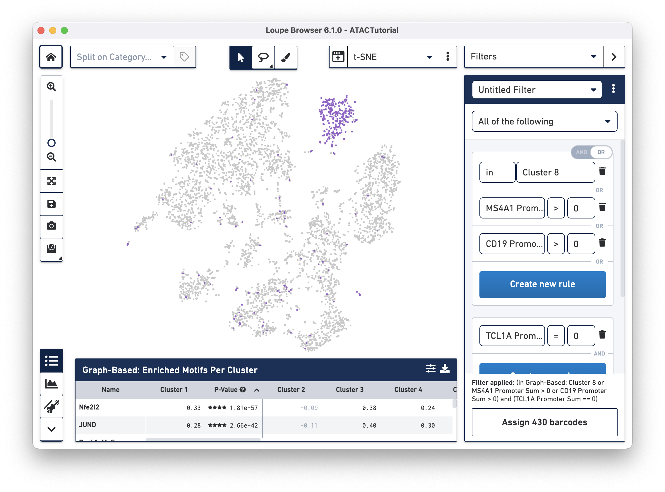
In Filter mode, you can compose complex Boolean filters to find barcodes that fulfill your criteria. You can create rules based on feature counts or cluster membership and combine these rules using Boolean operators. You can then save and load filters and use them across multiple datasets. We will introduce filtering in detail and identify complex cell types.
The panel on the bottom of the workspace does double duty for ATAC data in Loupe Browser. The Feature Table ![]()
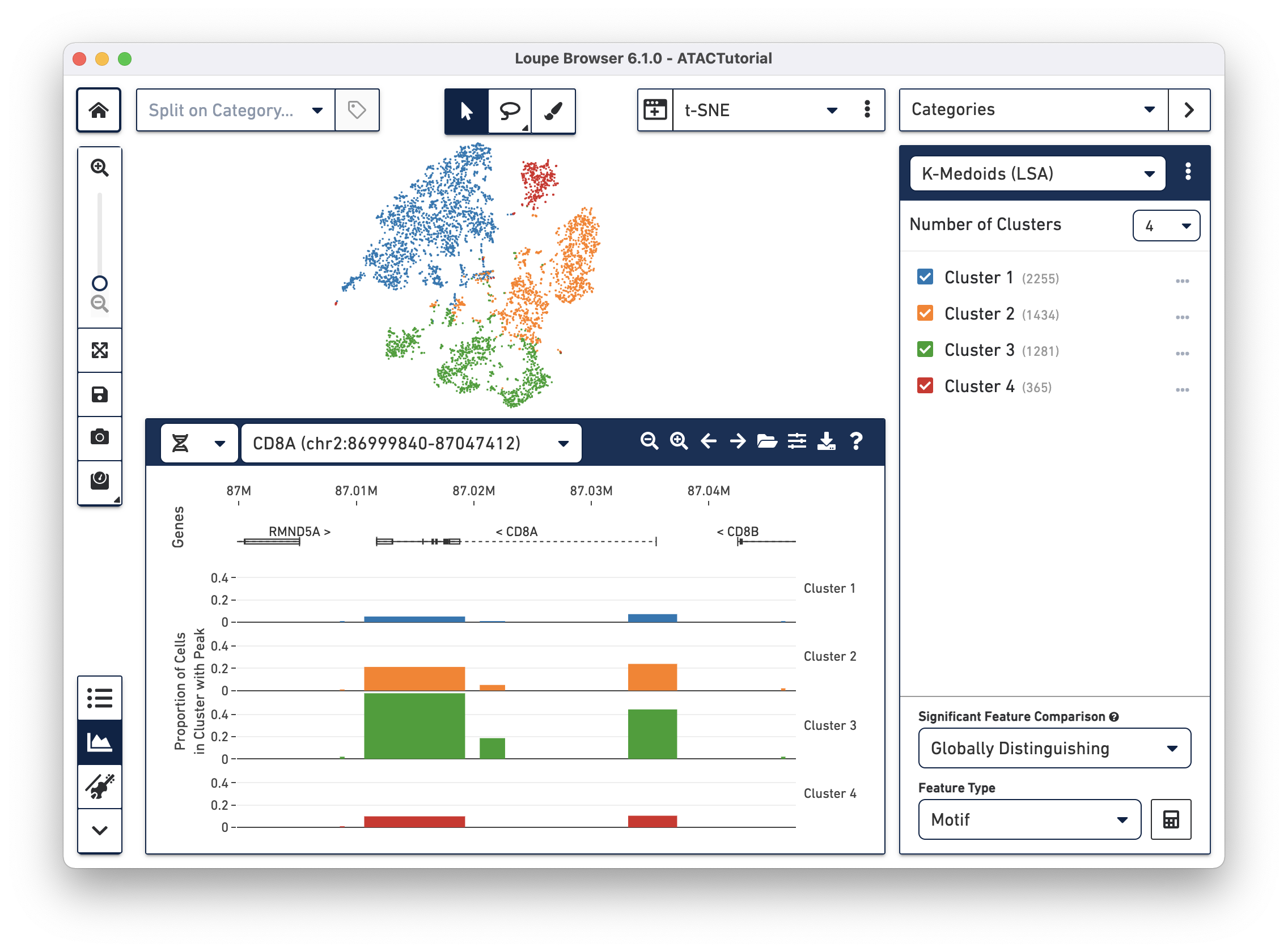
The Peak Viewer 
Now that you are familiar with the user interface, explore the data.