The cellranger-arc count outputs a summary HTML file named web_summary.html that contains summary metrics and automated secondary analysis results. Click the "?" in the top of each dashboard for more information on each metric.
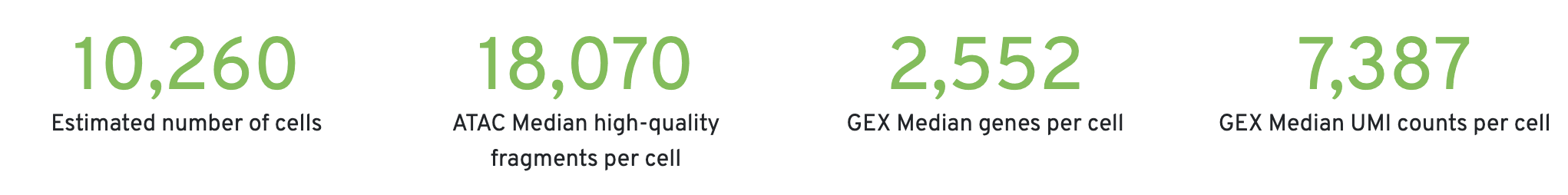
Key metrics are prominently displayed at the top of the page (number of cells detected, ATAC median high-quality fragments per cell, GEX median genes per cell, and GEX median UMI counts per cell). Alerts will be displayed at the top in cases where an issue is detected during the pipeline run. For more information, refer to the troubleshooting documentation.
For more information on quality control and filtering of 10x Genomics Epi Multiome data, please see this Analysis Guide tutorial for a hands-on workflow.
This is the default view visible upon first rendering the summary and can be accessed by clicking "Joint". This view is divided into the following sections:
- Sample and Joint Metrics
- Joint Cell Calling
- Cell Clustering
The Sample dashboard included in this view gives an overview of the sample and key parameters used for this analysis. In Cell Ranger ARC v2.2 and later, the "Chemistry" parameter will be updated to "v1 or v2" because the kits share the same barcodes. The "Cell Annotation" parameter will be "On" if an annotation model was run or "Off" if annotation was disabled.
The Joint Metrics dashboard describes metrics that are generated using paired chromatin accessibility and gene expression data.
The Cross-sensitivity Plot under the Joint Cell Calling dashboard shows a scatterplot representing each barcode as a point.
| Data quality | Example |
|---|---|
| Good quality | 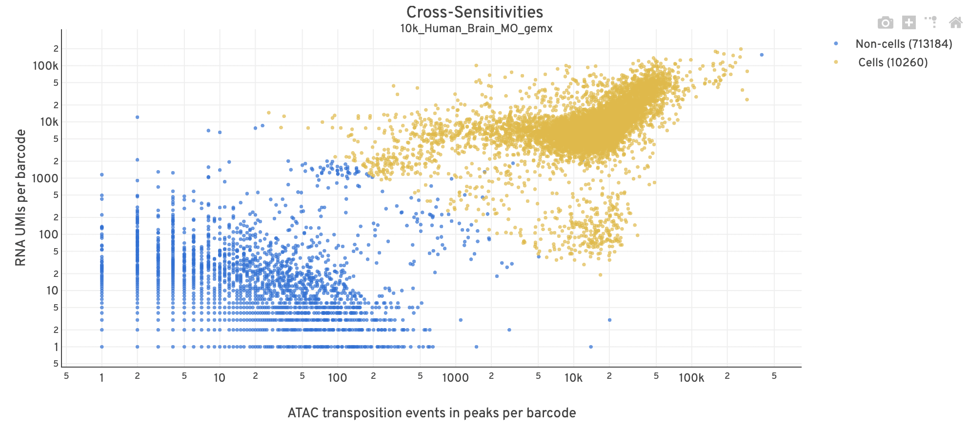 |
| Poor quality | 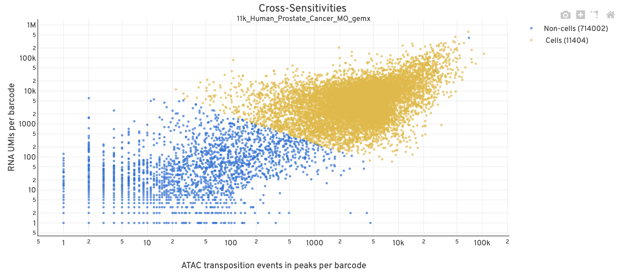 |
- The position on the x-axis reflects the number of ATAC transposition events in peaks associated with that barcode, while the position on the y-axis corresponds to the number of GEX UMI counts.
- See Cell Calling Algorithms for more details on how each barcode is classified into non-cell and cell groups, represented as different colors. Distinct populations between the non-cell and cell groups in this 2-D plot is indicative of good signal separation between the cell-associated barcodes and barcodes associated with empty partitions.
- In addition, barcodes are excluded from being classified as cells if the ATAC data suggests they are gel bead doublets or if the fraction of transposition events in peaks is low. This would explain why some barcodes in the vicinity of the cell-cloud are classified as non-cell barcodes (e.g., top-right corner of plot). Examine the Peak Targeting plot on the ATAC tab to investigate these non-cell barcodes further (e.g., these may be non-cell barcodes with high signal but few fragments with overlapping peaks, shown as non-cell points in the lower-right corner of the Peak Targeting plot). Also, see
excluded_reasonin the per barcode QC metrics file for more information on why each barcode is classified as non-cell.
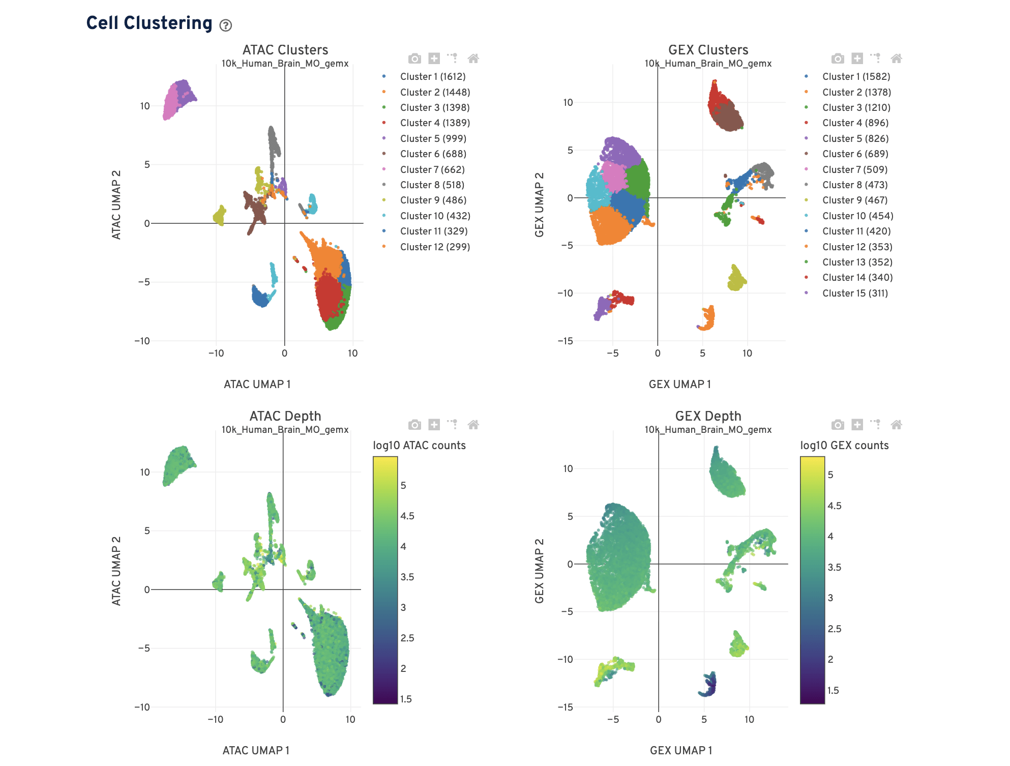
The Cell Clustering dashboard presents dimensional reduction analysis which projects the cell barcodes into 2-D space (UMAP) as determined by ATAC counts and GEX UMI counts, independently. The points are colored to show:
- Automated clustering analysis that groups cells with similar chromatin accessibility and similar gene expression profiles.
- Cells colored by total ATAC and UMI counts, respectively. Greenish-yellow points are cells with more counts.
Metrics that are specific to the given Chromatin Accessibility library will appear in the ATAC tab. This view is divided into the following sections:
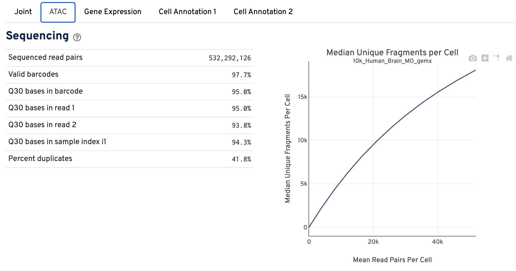
- Sequencing
- Cells
- Targeting
- Mapping
The Sequencing dashboard shows the sequencing QC metrics and a plot showing the effect of decreased sequencing depth on observed library complexity, as measured by median unique high-quality ATAC fragments per cell barcode.
The Cells dashboard shows QC and sensitivity metrics associated with cell barcodes.
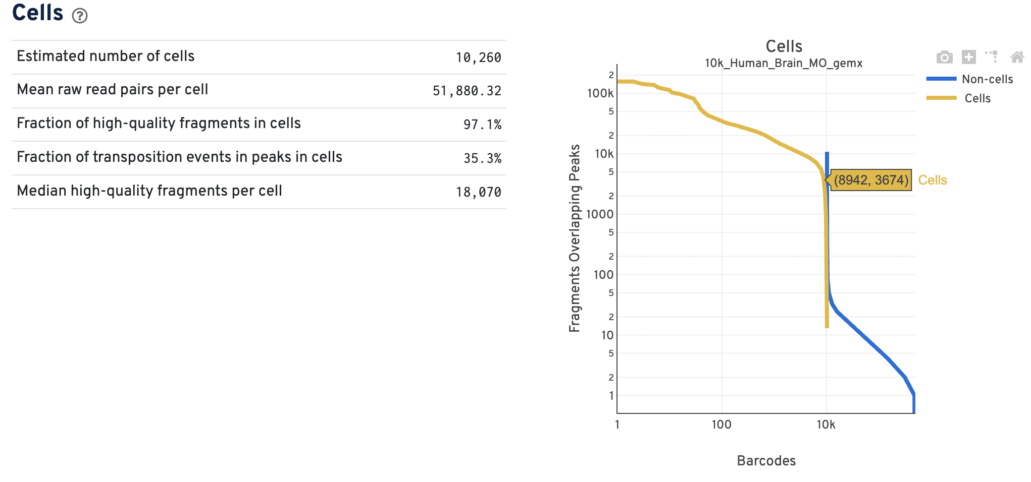
The barcode rank plot shows the number of fragments overlapping peaks for all the barcodes in the library. The x-axis represents barcodes ranked by their fragment counts in descending order. There should be a tight vertical overlay where the cell barcodes transition to non-cell barcodes with some overlap in the transition zone. A more sloped curve could indicate poor sample quality and a loss of single cell behavior. The Cross-Sensitivities plot on the Joint tab will also reflect whether there is clear separation or not between the data modalities.
The primary use case for the ATAC data barcode rank plot is to verify the overall single cell nature of the data. For example, do you see both populations of cells and non-cells clearly separated by barcode rank? The Cell Ranger ARC pipeline performs joint cell calling using both the ATAC and GEX data in an experiment, so additional filters of either the GEX or the ATAC data could result in non-cell barcode calls. As a result, cell and non-cell barcodes may overlap in the transition zone, such that the data are less uniformly separated compared to single modality data. Do not worry about the cell calling assignments based on this barcode rank plot alone, as there is more information that determines the final cell calling.
The Targeting dashboard shows metrics associated with peak calling and chromatin accessibility behavior of the library at Transcription Start Sites (TSS).
The Peaks Targeting plot presents the variation in the number of fragments that overlap peaks within each barcode group, namely cells and non-cells. It is useful for diagnosing how cleanly the cells and non-cells are separated after cell calling.
| Data quality | Example |
|---|---|
| Good quality | 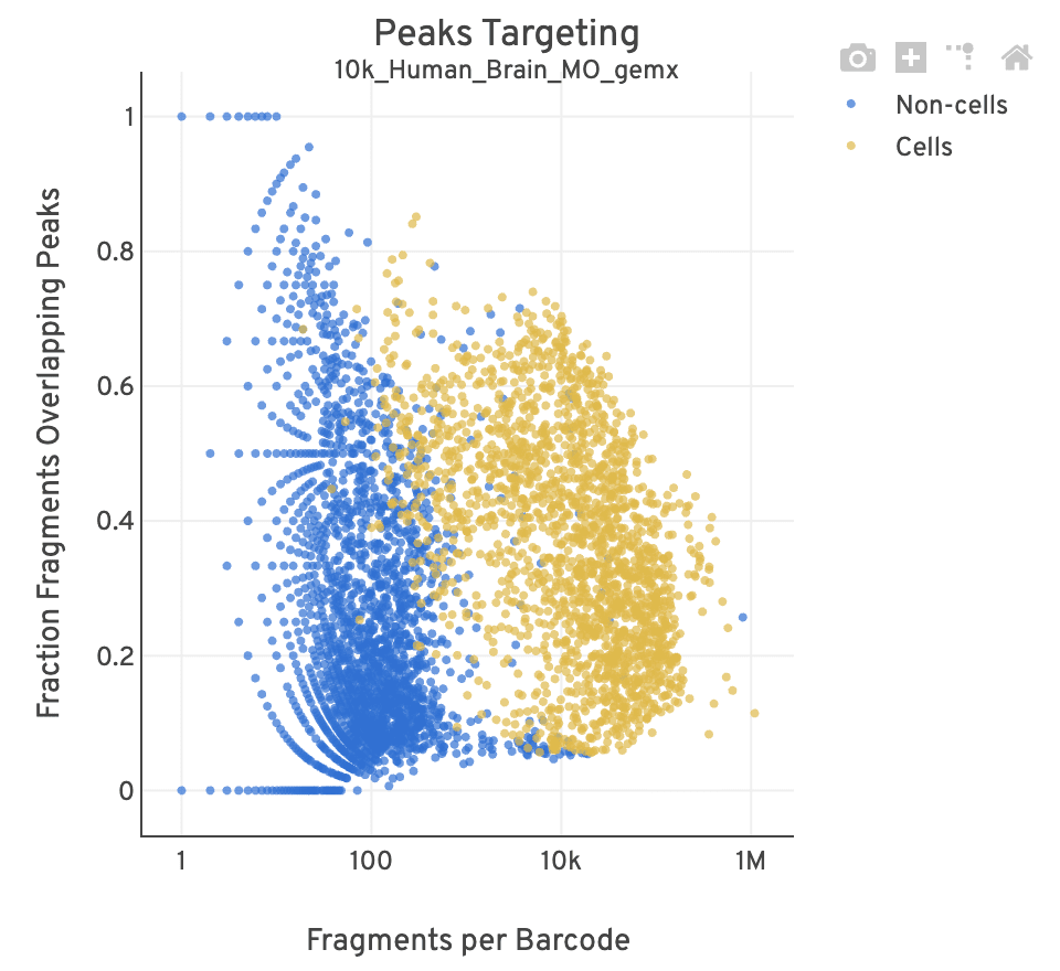 |
| Poor quality | 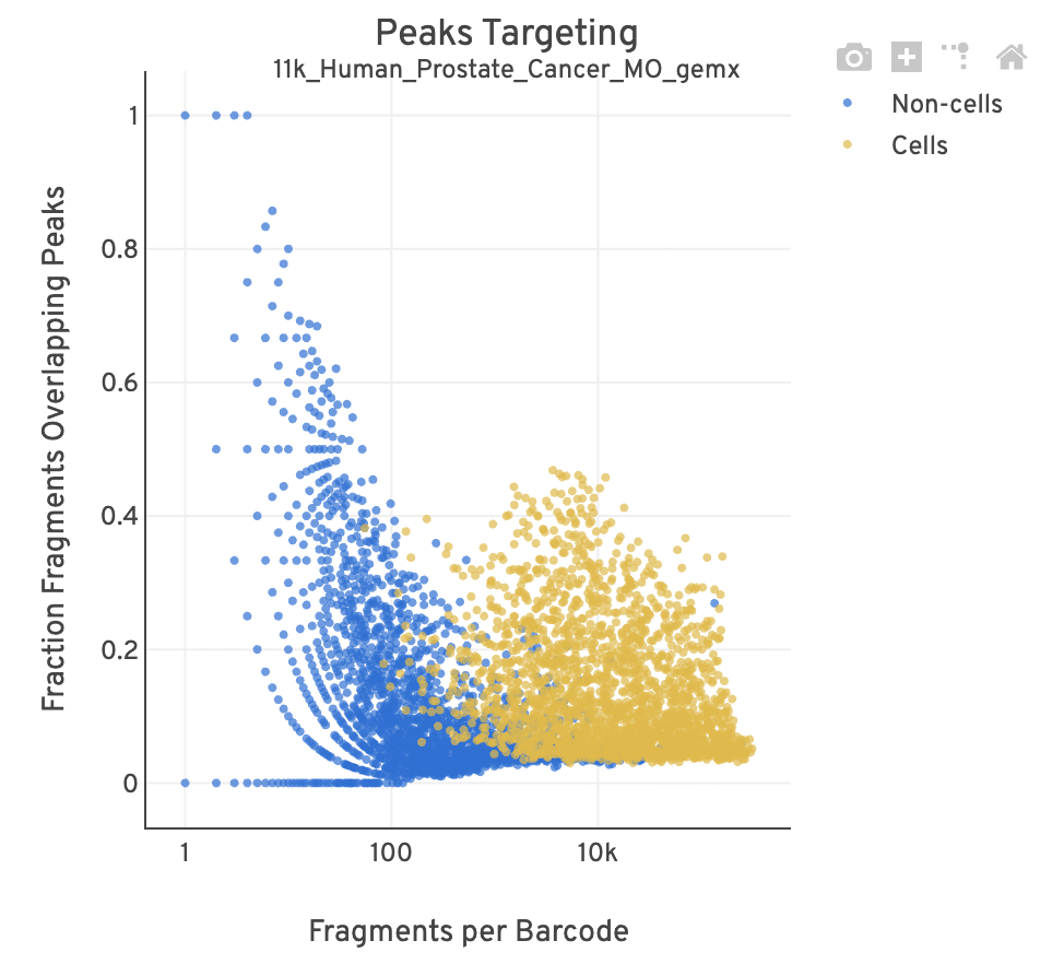 |
- For cell-associated barcodes, it is expected that a high percentage of the barcode fragments overlap peaks. Points in the top-right of the plot are indicative of good quality data (high signal, high peak overlap), while those in the lower-left are poor quality (low signal, low peak overlap).
- This plot is useful for investigating barcodes you may wish to filter out for downstream analysis (e.g., in Loupe Browser or manually). This Analysis Guide tutorial has more information on filtering and QC analysis of ATAC data. A large smear of non-cells clustered at the bottom-left of the plot is indicative of a workflow issue; it is unlikely that the data can be rescued by computationally filtering out barcodes.
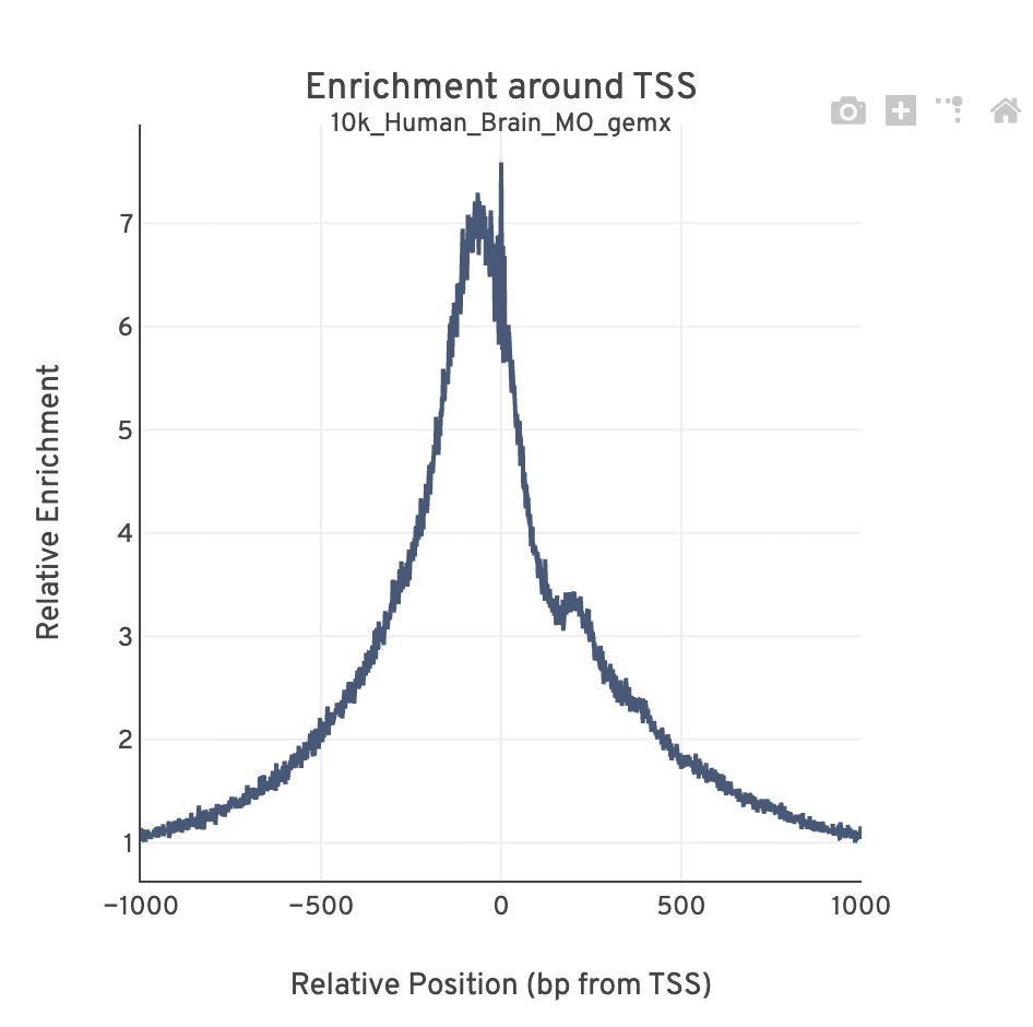
The TSS profile plot is computed as the summed accessibility signal across all barcodes, in a window of 2,000 bases around the full set of annotated TSSs, and is normalized by the minimum signal in the window. This profile is helpful for assessing the library signal-to-noise ratio, as it is well known that TSSs and the adjacent promoter regions on average have a higher degree of chromatin accessibility compared to the intergenic and intronic regions of the genome. Note that both this plot and the TSS enrichment score metric depends on the source of TSS sites as packaged with the reference.
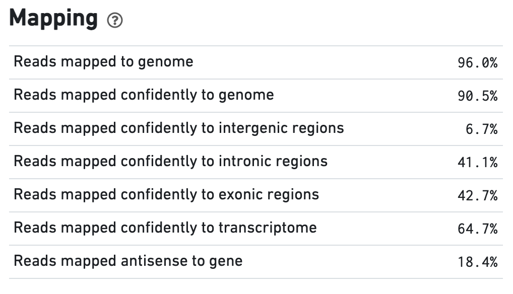
The Mapping dashboard shows metrics associated with the alignment of the sequenced read pairs to the input reference. Read pairs from single cell chromatin accessibility libraries produce detailed information about nucleosome packing and positioning.
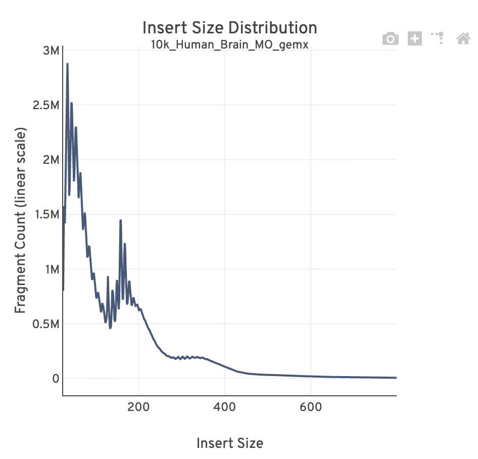
The insert size distribution (aka fragment size distribution) plot captures the average nucleosome positioning periodicity. A typical plot shows a sharp peak at the <100 bp (open chromatin), and a peak at ~200 bp (mono-nucleosome), and other larger peaks (multi-nucleosomes). A clear nucleosome phasing pattern is indicative of a good quality chromatin accessibility library.
Metrics that are specific to the given gene expression library will appear in the Gene Expression tab. This view is divided into the following sections:
- Sequencing
- Cells
- Mapping
- Differential Expression
The Sequencing dashboard shows the sequencing QC metrics and plots showing the effect of sequencing depth (Mean Reads per Cell) on Median UMI Counts per Cell and on Median Genes per Cell.
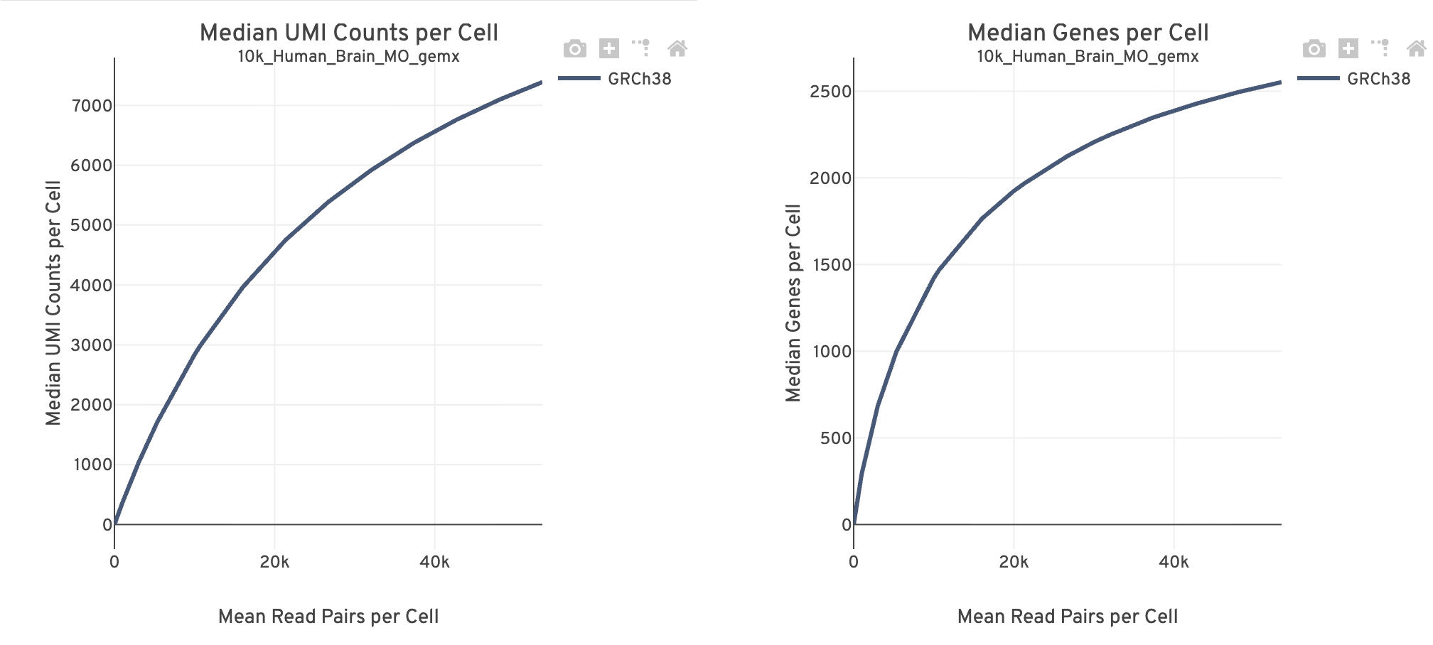
Together, these plots are useful for estimating whether there is sufficient sequencing information (saturation) to reach the desired library complexity and data recovery (i.e., number of UMIs, number of genes recovered) targets for subsequent experiments.
- The mean reads per cell is calculated as the number of sequenced read pairs divided by the estimated number of cells. The point at the end of the curve is the actual sequencing depth of the experiment. The curve is generated by downsampling from the final sequencing depth to the remaining points in the distribution.
- The curve flattens as sequencing depth saturates and the addition of more sequencing data will yield diminishing returns. The presence of PCR duplicates also increases with deeper sequencing.
- These plots are expected to look similar. Use these plots to evaluate whether more reads are adding to the number of observed UMIs or genes, respectively. Sample quality affects the number of UMIs and genes identified per cell. A discrepancy between these plots could indicate increasing sequencing depth does not improve gene or UMI detection.
The Cells dashboard shows QC and sensitivity metrics associated with cell barcodes.
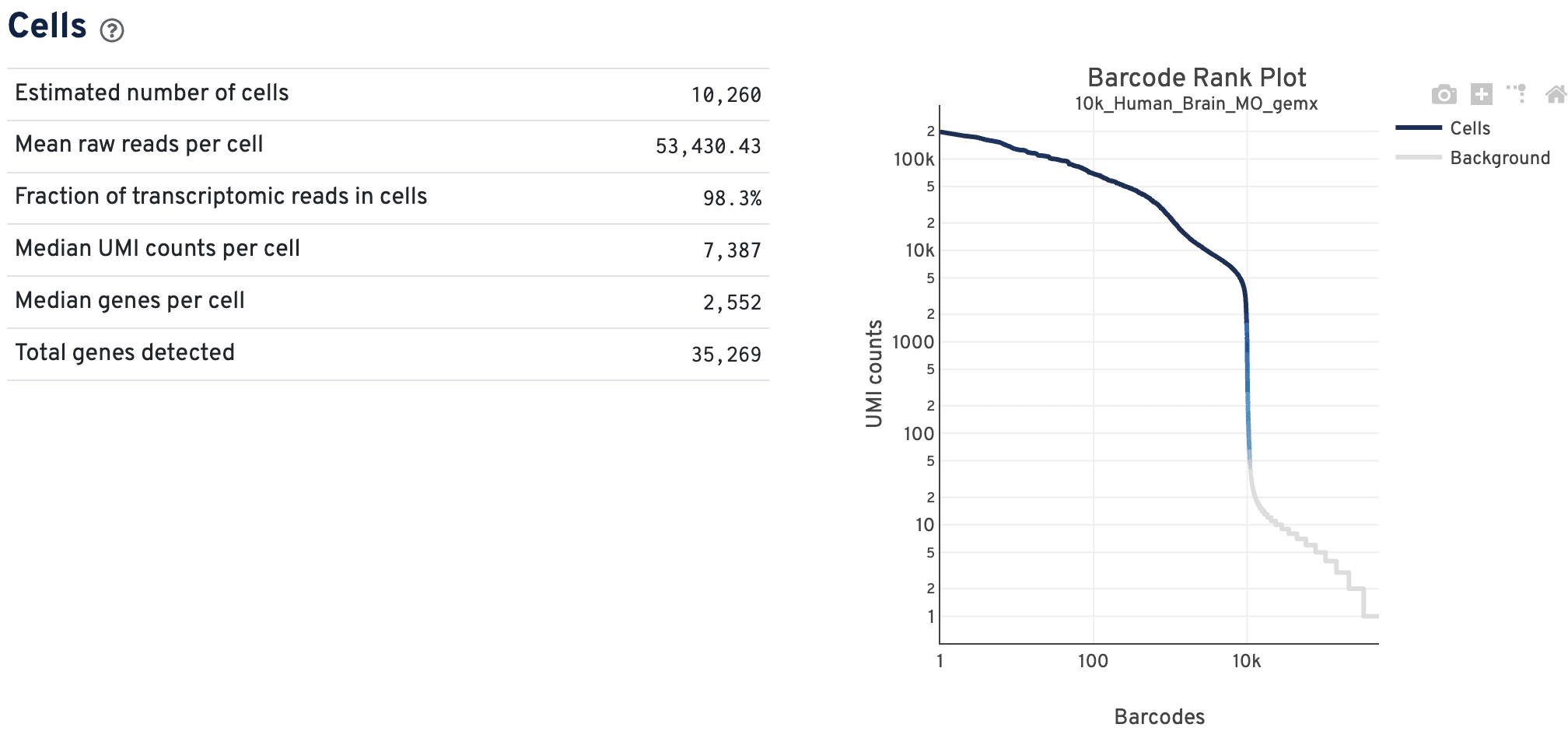
The GEX barcode rank plot shows the count of filtered UMIs mapped to each barcode. Barcodes are not determined to be cell-associated strictly based on their UMI count, so joint GEX and ATAC datasets may have a broader transition zone from cell to non-cell barcodes. Instead, they could be determined based on their expression profile or ATAC data quality filters. Therefore, some regions of the graph contain both cell-associated and background-associated barcodes.
- The color of the graph in these regions is based on the local density of barcodes that are cell-associated.
- Hovering over the plot displays the total number and percentage of barcodes in that region called as cells along with the number of UMI counts for those barcodes and barcode rank, ordered in descending order of UMI counts.
- General guidance on interpreting GEX barcode rank plots is described here.
The Mapping dashboard shows metrics associated with the alignment of the sequenced read pairs to the input reference.
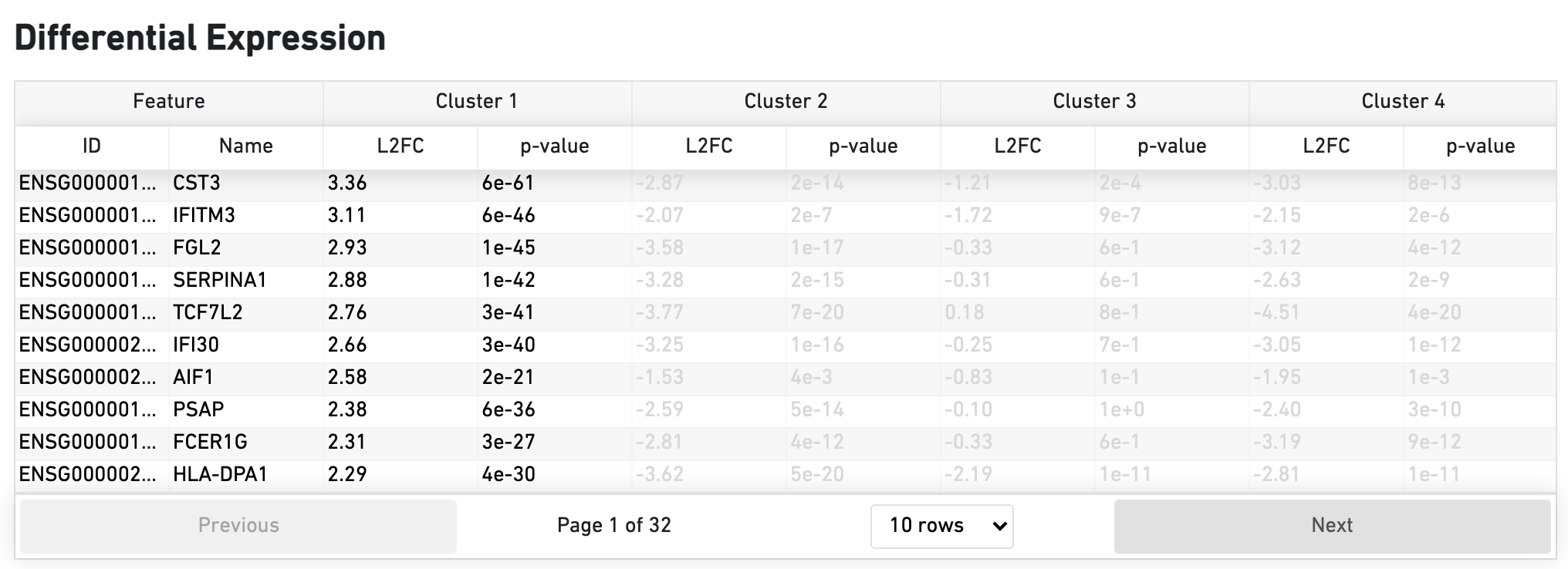
The Differential Expression dashboard shows a table with genes that are differentially expressed in each cluster relative to all other clusters. To find genes associated with a particular cluster, you can click the cluster number to sort the genes specifically by that cluster. The clusters are the result of an automated graph clustering analysis that groups cells with similar gene expression profiles, and are plotted in the Cell Clustering section in the GEX 2-D space.
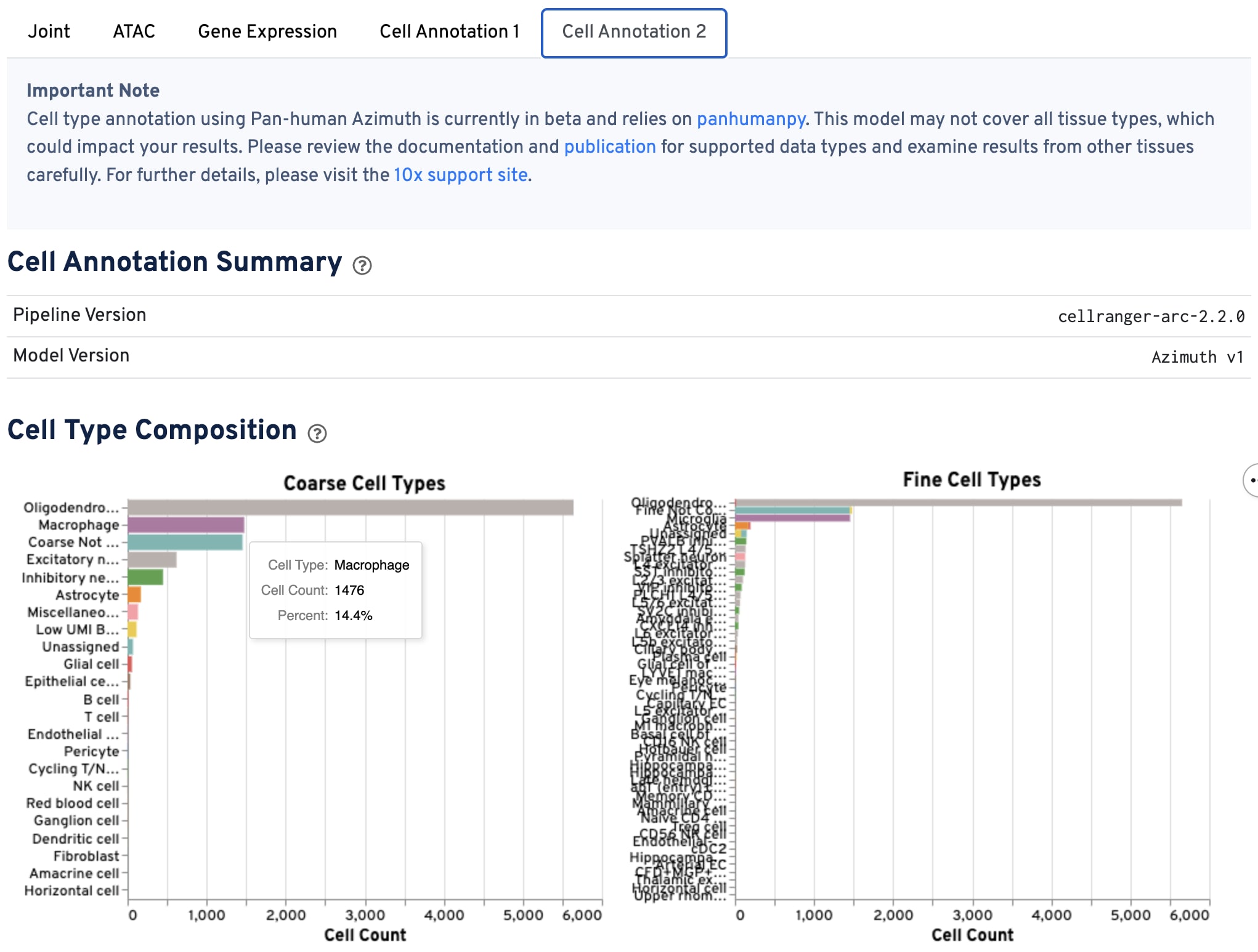
The cell annotation tab shows the distribution of cell types across the sample, including the interaction between ATAC and GEX data types, using the annotation model specified in "Model Version".
Use this tab to QC the ATAC and GEX data based on the annotated cell types - do you see the expected cell types for your experiment? Annotation quality depends on both 1) good GEX data quality and 2) whether your sample type or condition matches those used to train the annotation model.
These plots are interactive. Changing one plot results in changes to all the plots in the tab. Hover your mouse over the plot bars or points to view additional information. QC specific cells either by clicking on individual bars in the bar charts to select specific cell types, or by click-and-dragging to select a region of the plots to subset by specific barcodes (points). Clear selections by double-clicking on any plot.
-
The bar charts show the hierarchical composition of cell types at both the coarse and fine levels.
-
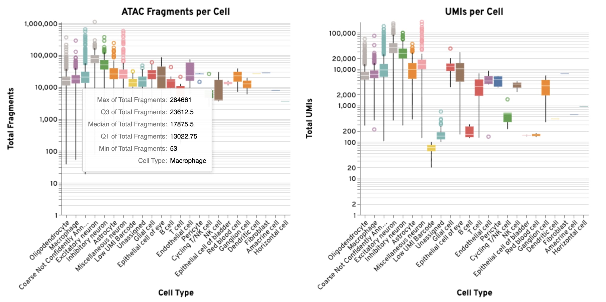
The box plots show the distribution of GEX UMIs and ATAC fragments per cell for each annotated coarse cell type.
-
The UMAP projections show the relationship between the annotated coarse cell types and the overall structure of the data in both the GEX and ATAC modalities. They are the same UMAP projections shown on the Joint tab, but colored by annotated cell type. If there are multiple annotated cell types, we expect defined clustering by type in ATAC and GEX UMAP plots. If one of the data modalities has poor definition between cell types compared to the other, there may be issues with data quality.
-
The cross-assay plot compares GEX UMI counts to ATAC fragment counts for each cell, colored by annotated coarse cell type, which can help reveal differences in assay sensitivity across cell types.
-
The ATAC peak targeting plot shows the relationship between ATAC fragment counts and the fraction of fragments overlapping peaks, which can help assess data quality across annotated coarse cell types.
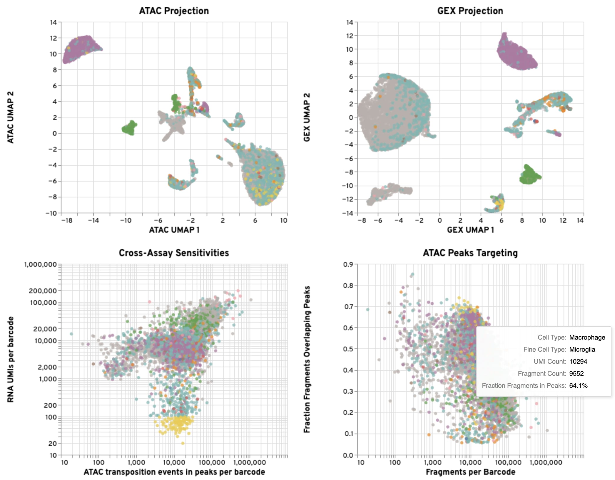
Below are suggestions for ways to interact with the plots to evaluate your GEX, ATAC, and gene expression-based cell annotation results together. Based on these assessments, you may wish to filter some of the data for downstream analysis.
- Click on a coarse or fine cell type in the bar plots: This allows you to investigate unexpected results, such as presence of an unexpected cell type for your sample type. It is helpful for identifying potential misannotations or the presence of doublets, which can then be cross-referenced in the plots on this tab.
- Select a region of a UMAP plot: By highlighting specific areas of interest on the UMAP projection, you can isolate and examine the underlying data for those specific cell populations.
- Select a region of the Cross-Assay Sensitivity plot: This interaction helps you evaluate the relationship between the GEX and ATAC signals, allowing you to see how sensitivity varies across different cell types.
- Select a region of the Peaks Targeting plot: This is useful for QCing the ATAC data, such as identifying populations with low ATAC signal to assess data quality across annotated cell types.