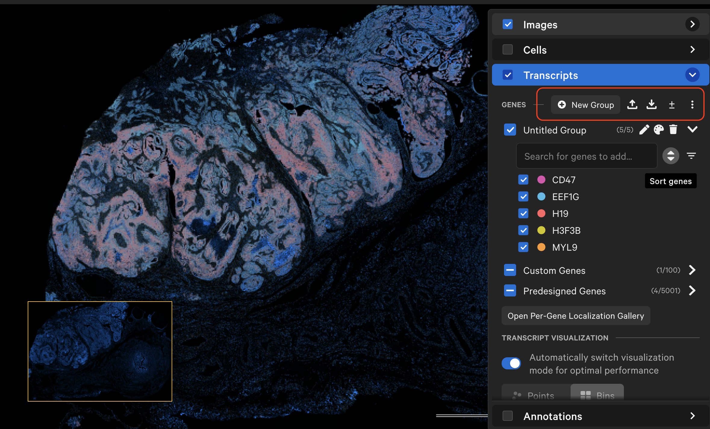
The Transcripts layer allows you to overlay transcript data with image and cell segmentation data. By default, genes are categorized by their panel design source (Atera datasets: by panel; Xenium datasets: by "Predesigned Genes", "Custom Genes").
You can view transcripts as points or density bins, create custom gene groups in the app (New Group) or by uploading a CSV file, and export newly created or modified custom gene groups in CSV format. The ± toggle allows you to collapse (default) or expand the list of genes in each group. The "Untitled Group" is an example custom gene group to help you start exploring the transcript layer options.
Click the link below to learn how to explore, select, and export transcript statistics.
Transcript counts can be shown as points or bins. The default toggle setting auto-switches the visualization mode from points (zoomed in) to bins (zoomed out) to optimize application performance. You can turn the toggle off to view transcript bins when zoomed in.
When displayed as points, selected gene icons will be visible in the viewing area and unselected genes will be invisible. If tooltips are turned on (Settings > Show Tooltips), you will see gene name, gene group, Q-Score, and location coordinates (in µm) for individual transcripts as you move the cursor over each point.
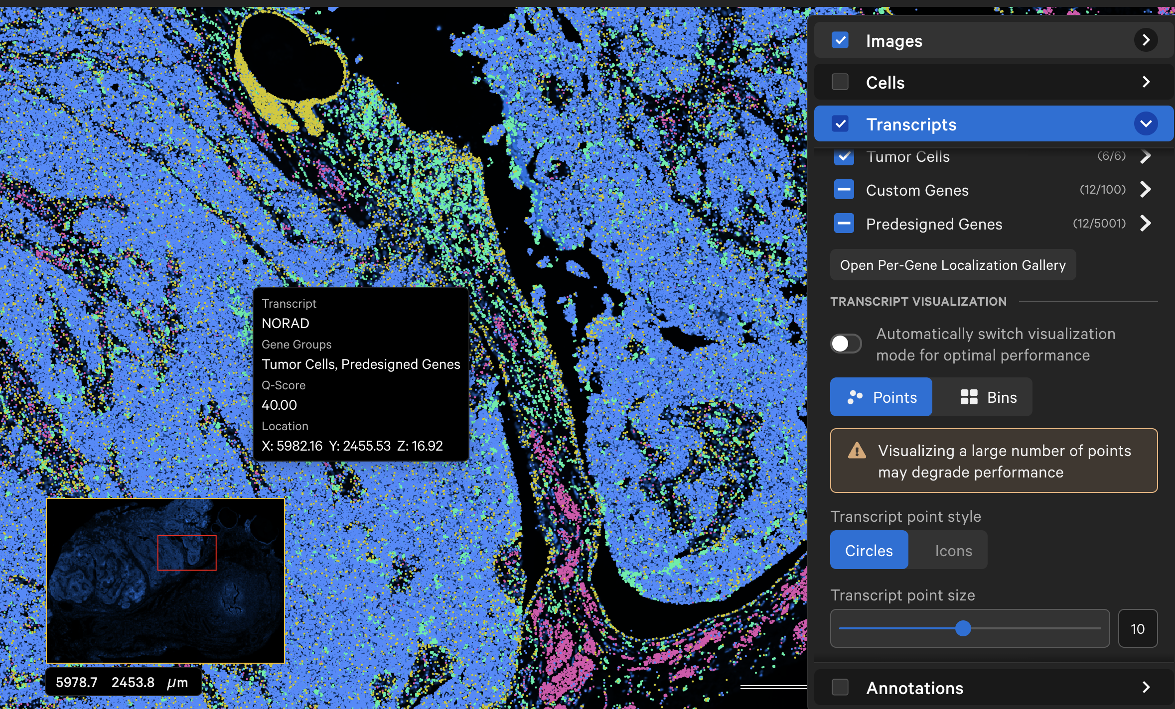
Low quality transcripts (Q-Score < 20) are filtered out by default. Switch the toggle to display them as gray circles.
Transcript point size increases when your mouse hovers over a gene name. This feature makes it easier to find rare transcripts across the sample. It can be turned off in the Settings menu. Transcripts are plotted by default as small points. You can customize point size, style, and opacity to enable better visualization of transcripts across the sample.
The individual transcript or gene group icon and color can be changed (depending on whether point style is "Icons" or "Circles"). You can reset to the original (prior to creating grouped genes) point color and icon by selecting Reset to default.
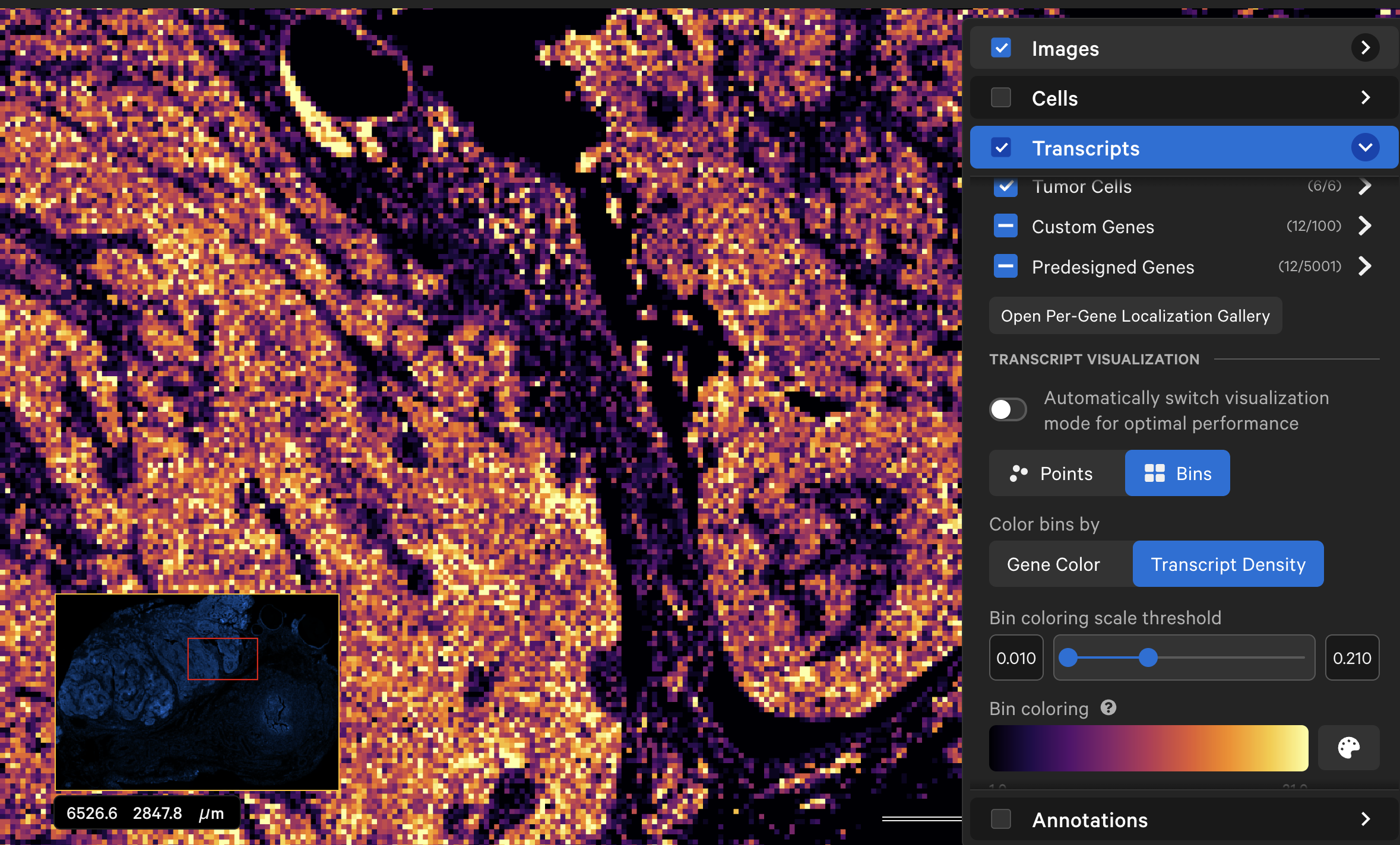
When displayed as a transcript density map, the cumulative density of all checked genes will be visible in the viewing area. Low quality transcripts (Q-Score < 20) are filtered out by default. The density map opacity, bin color, and scale threshold can be adjusted with the sliders (click arrow above maximum threshold value to reset). The Bin coloring scale threshold slider allows you to choose a different mapping range (units = transcript count per µm2), which can help to visualize bins that are at or beyond the limits of the density range. The bin size is 5 µm x 5 µm.
The Color bins by option allows you to select either Gene Color or Transcript Density:
-
Transcript Density: The lowest transcript density bin maps to the lower end of the palette (i.e., Inferno=black, Viridis=purple), while the highest transcript density bin maps to the upper end of the palette (i.e., Inferno and Viridis=yellow), with a linear distribution in between. There are several bin color palette options.
-
Gene Color: This option blends the colors of the selected genes (either by gene group or gene color) to more easily see the expression level contributions from specific genes. This feature is most useful when viewing a few gene groups or a few genes at a time, rather than the full panel of genes.
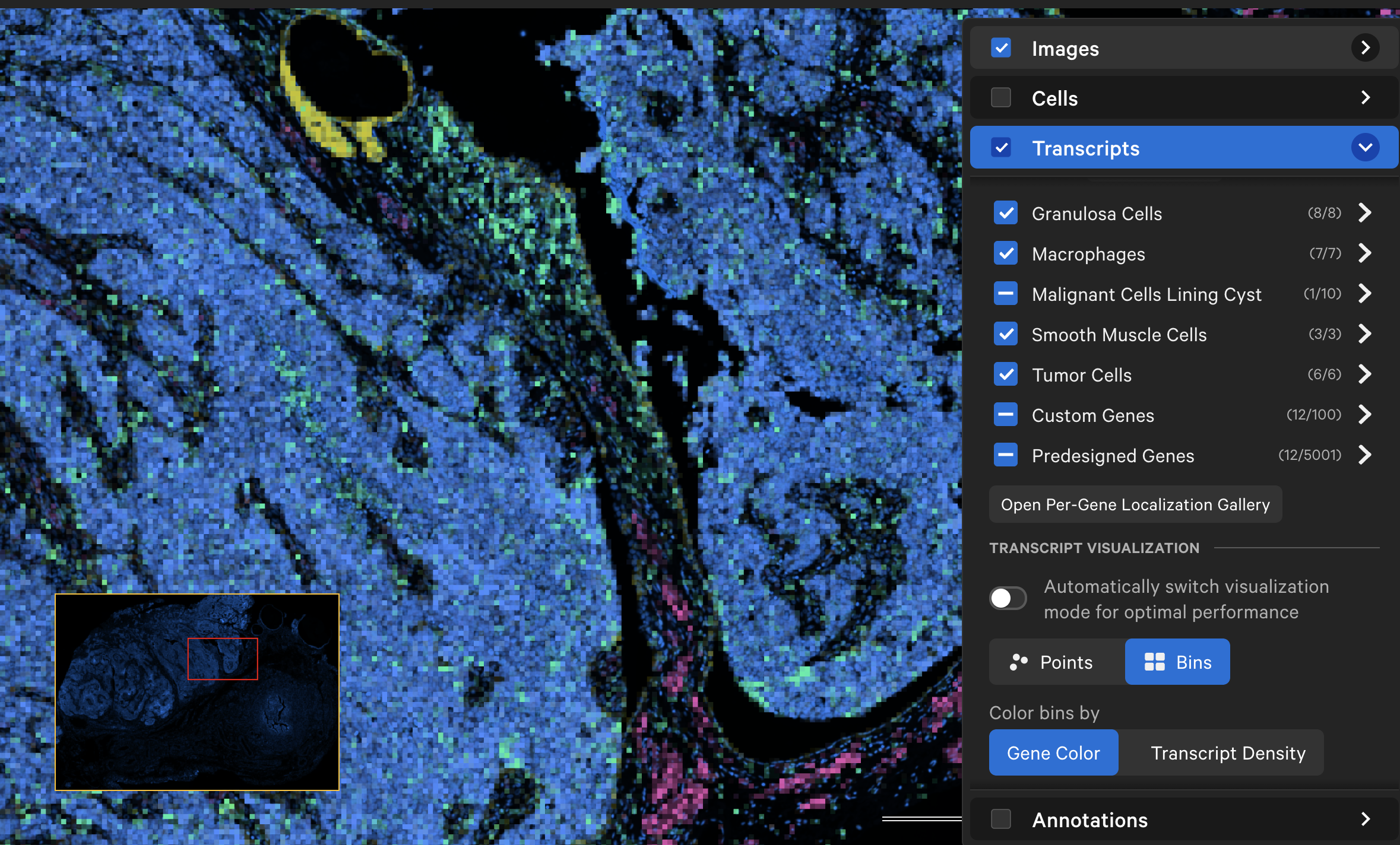
First, decide which genes you want to create groups for. Next, create a gene group comma-separated value (CSV) file in a text editor, such as Microsoft Excel. The format of the CSV file is as follows:
- The first row must have column headers with these exact names: "group" and "gene". The CSV file may also contain columns for "group_color" and "gene_color" with values provided in HEX format (e.g.,
#ff0055or#FF0055). - The "group" column is a list of gene group labels.
- The "gene" column is a list of gene names.
Previously created CSV files with "gene" and "group" headers are also accepted. Here is an example from the Xenium Prime 5K FFPE human ovarian cancer dataset (download custom gene group file here):
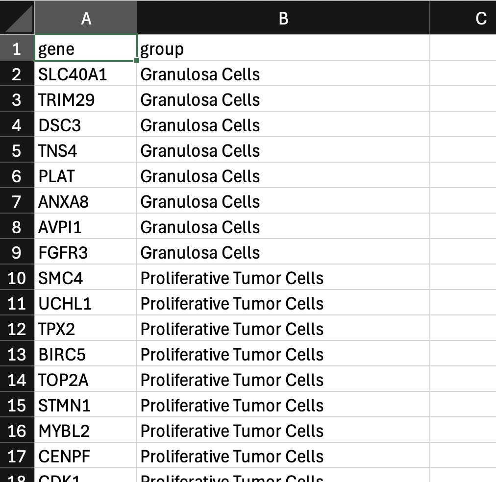
Next, click the upload custom gene group icon. Click Upload Gene Group CSV and choose your CSV file.
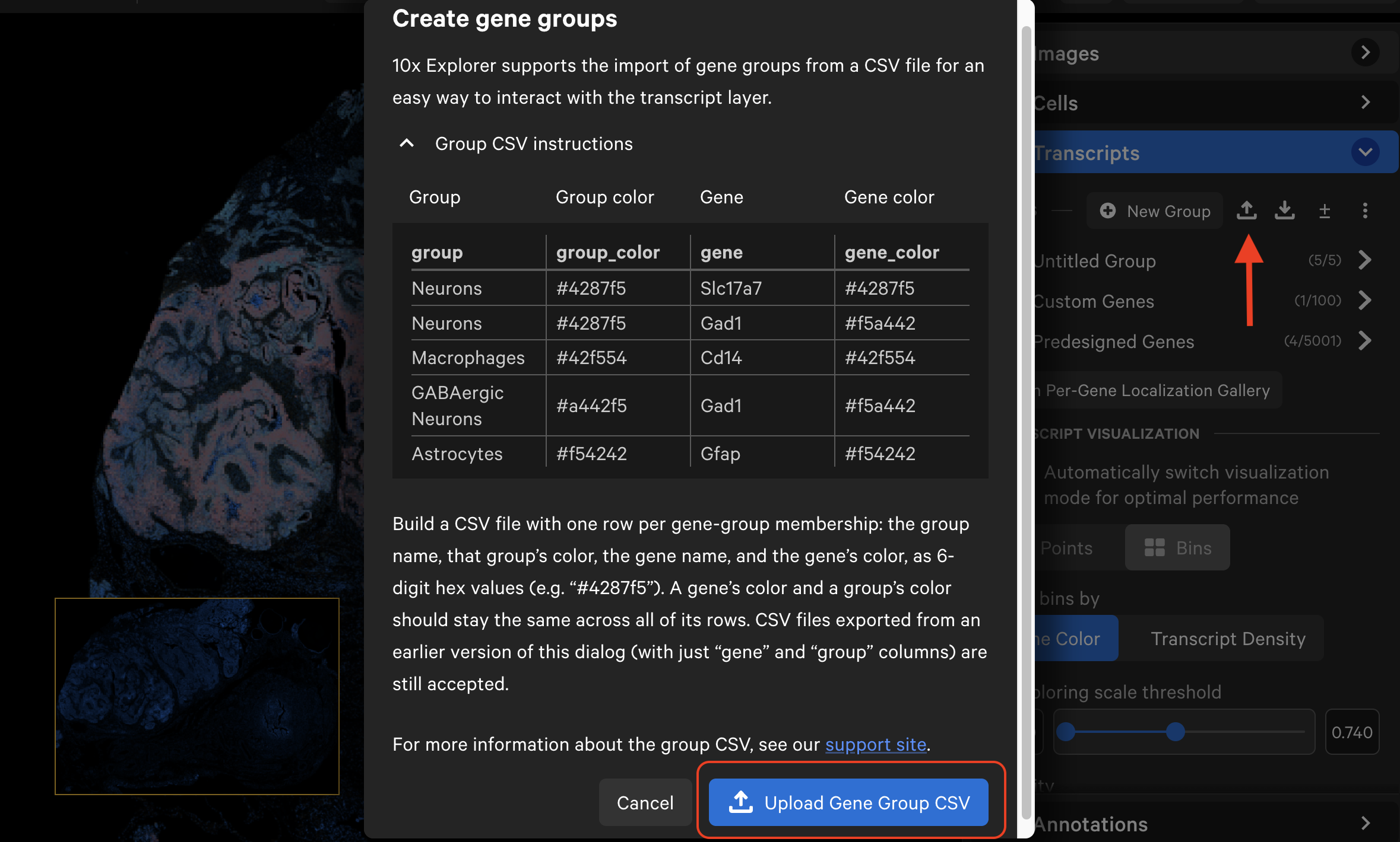
The gene list will now display the group names with dropdown menus. Grouped genes are automatically assigned the same point color, unless specified in the CSV file. If panel genes were not included in the CSV file, they will be automatically grouped into an "Ungrouped" category. Ungrouped genes have a gray circle icon by default.
If the CSV file contains multiple group name columns, all group names will be listed alphabetically. Individual genes may be assigned to multiple groups and will be listed under each group name.
The imported gene list and associated transcript icon color and shape changes can be saved with the Saved Current Views option.
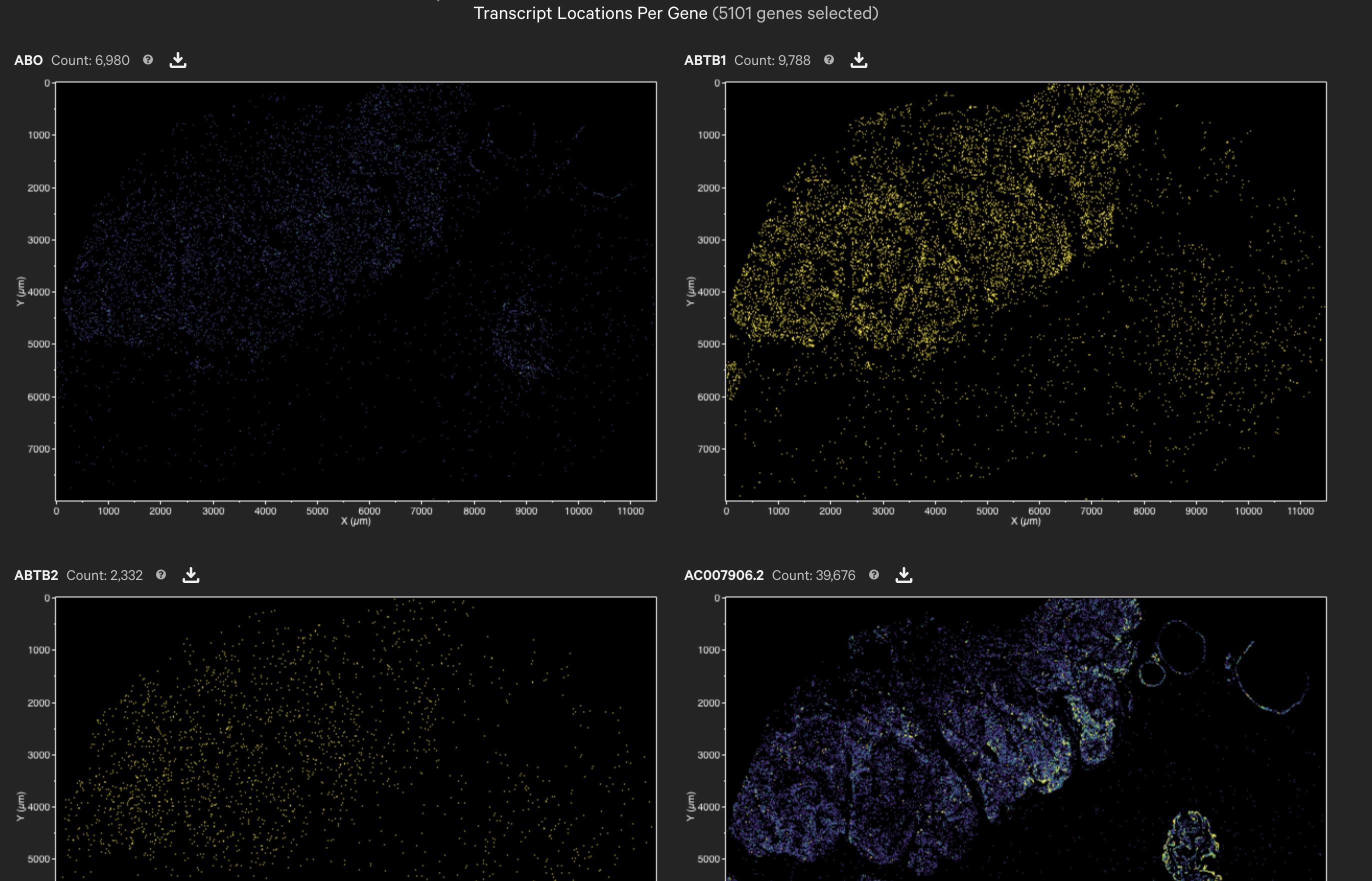
The localization plots gallery button is located on the top menu bar and in the Transcript layer.
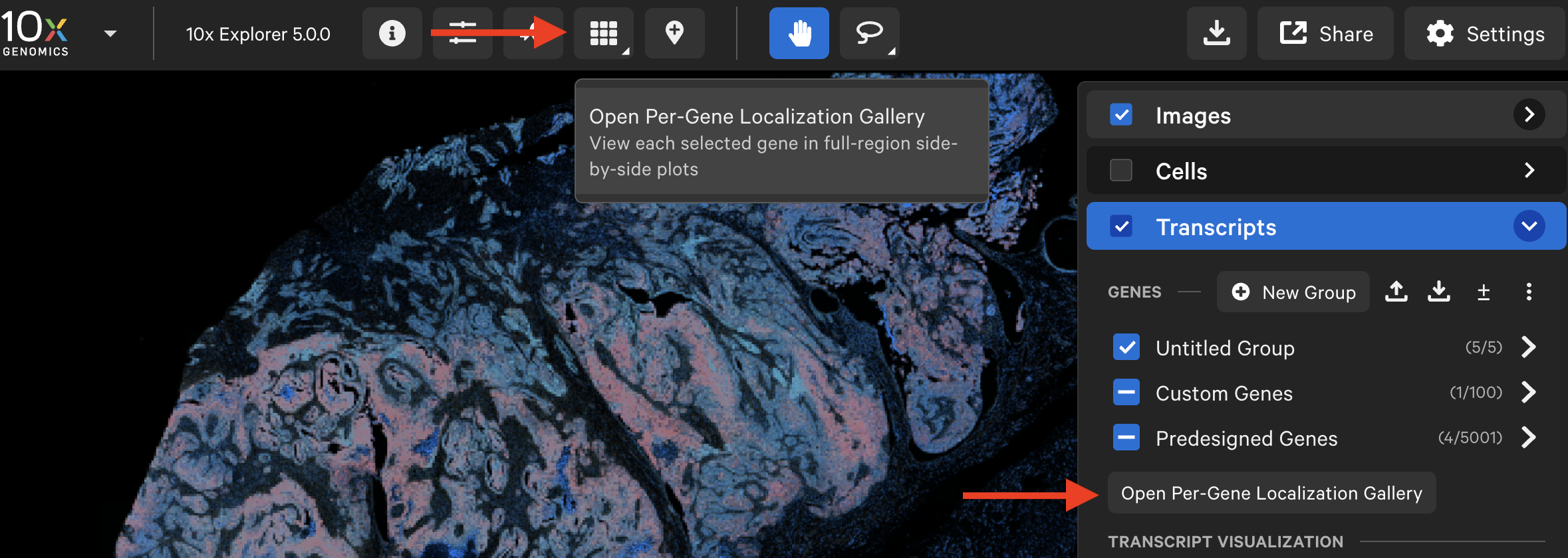
The per-gene localization feature is useful for assessing the spatial location of genes in the entire sample area. It displays spatial density map plots of total transcript counts (Q-Score ≥ 20) per gene and for all selected genes (combined counts if more than one gene is selected).