The spaceranger count and spaceranger aggr pipelines output an interactive web_summary.html that contains experimental metrics and automated secondary analysis results. The contents of the file will vary depending on the pipeline and parameters used, but generally follows a similar format across runs. On this page, we use a Gene + Protein Expression dataset on a human breast cancer sample run with Space Ranger 2.1.
The top of the page will display the title of the run and the pipeline used. There are also tabs for Summary, Gene Expression, and Antibody.
The summary tab starts with hero metrics and sequencing metrics. Click the ? for definitions of each metric.
- Number of Reads: Total number of read pairs that were assigned to this library in demultiplexing.
- Valid Barcodes: Fraction of reads with barcodes that match the inclusion list after barcode correction.
- Valid UMIs: Fraction of reads with valid UMIs; i.e. UMI sequences that do not contain Ns and that are not homopolymers.
- Sequencing Saturation: The fraction of reads originating from an already-observed UMI. This is a function of library complexity and sequencing depth. More specifically, this is the fraction of confidently mapped, valid spot-barcode, valid UMI reads that had a non-unique spot-barcode/UMI/gene combination.
- Q30 Bases in Barcode: Fraction of spot barcode bases with Q-score greater than or equal to 30, excluding very low quality/no-call (Q lesser than or equal to 2) bases from the denominator.
- Q30 Bases in Probe Read: Fraction of RNA read bases with Q-score greater than or equal to 30, excluding very low quality/no-call (Q lesser than or equal to 2) bases from the denominator. This is Read 2 for the Visium v1 chemistry.
- Q30 Bases in UMI: Fraction of UMI bases with Q-score greater than or equal to 30, excluding very low quality/no-call (Q lesser than or equal to 2) bases from the denominator.
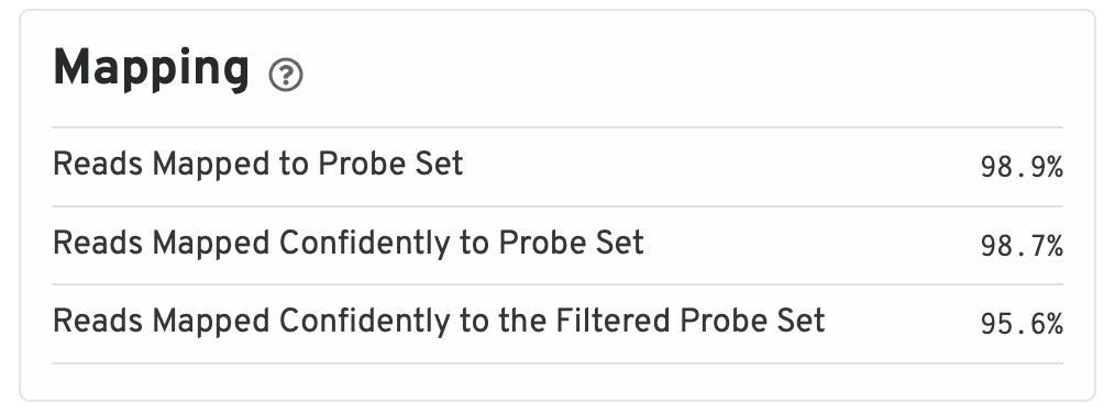
The mapping metrics indicate the success of alignment to the reference.
- Reads Mapped to Probe Set: Fraction of reads that mapped with MAPQ>0 to the probe set.
- Reads Mapped Confidently to Probe Set: Fraction of reads that mapped with MAPQ=255 to one unique probe in the probe set.
- Reads Mapped Confidently to the Filtered Probe Set: Fraction of reads that mapped with MAPQ=255 to one unique probe in the filtered probe set. These reads are considered for UMI counting.
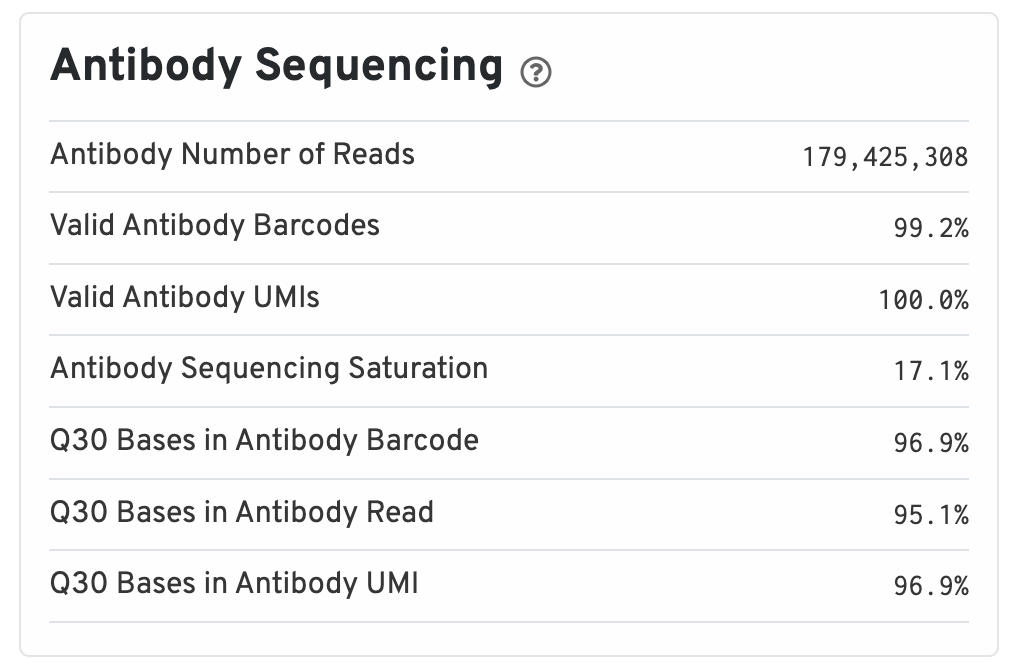
Antibody metrics are only shown when analyzing Protein Expression data.
- Antibody Number of Reads: Total number of Antibody library reads.
- Valid Antibody Barcodes: Fraction of Antibody library reads with a barcode found in or corrected to one that is found in the inclusion list.
- Valid Antibody UMIs: Fraction of Antibody library reads with valid UMIs.
- Antibody Sequencing Saturation: The fraction of Antibody library reads originating from an already-observed UMI. This is a function of library complexity and sequencing depth. More specifically, this is the fraction of confidently mapped, spot under tissue-associated barcode, valid UMI reads that had a non-unique (spot under tissue-associated barcode, UMI, Antibody feature barcode).
- Q30 Bases in Antibody Barcode: Fraction of Antibody library barcode bases with Q-score greater than or equal to 30, excluding very low quality/no-call (Q lesser than or equal to 2) bases from the denominator.
- Q30 Bases in Antibody Read: Fraction of Antibody library read bases with Q-score greater than or equal to 30, excluding very low quality/no-call (Q lesser than or equal to 2) bases from the denominator.
- Q30 Bases in Antibody UMI: Fraction of Antibody library UMI bases with Q-score greater than or equal to 30, excluding very low quality/no-call (Q lesser than or equal to 2) bases from the denominator.
Next, two images are shown.
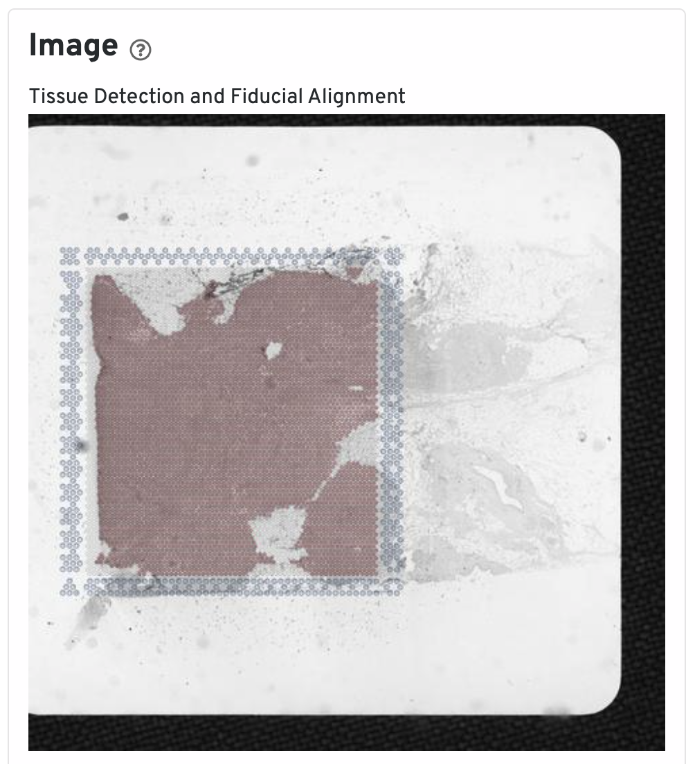
The Tissue Detection and Fiducial Alignment image shows the tissue image in gray tones with an overlay of the aligned fiducial frame (open blue circles) and the capture area spots (gray circles). For the latter, the circles filled in red denote selected tissue-associated spots and the remaining open gray circles denote unselected spots. Hover mouse cursor over the image to magnify the view. Confirm fiducial frame aligns well with fiducial spots, e.g. the corner shapes match, and confirm selection of tissue-covered spots. If the result shows poor fiducial alignment or tissue detection, consider sharing the image with support@10xgenomics.com so we can improve the algorithm. Otherwise, perform manual alignment and spot selection with Loupe Browser.
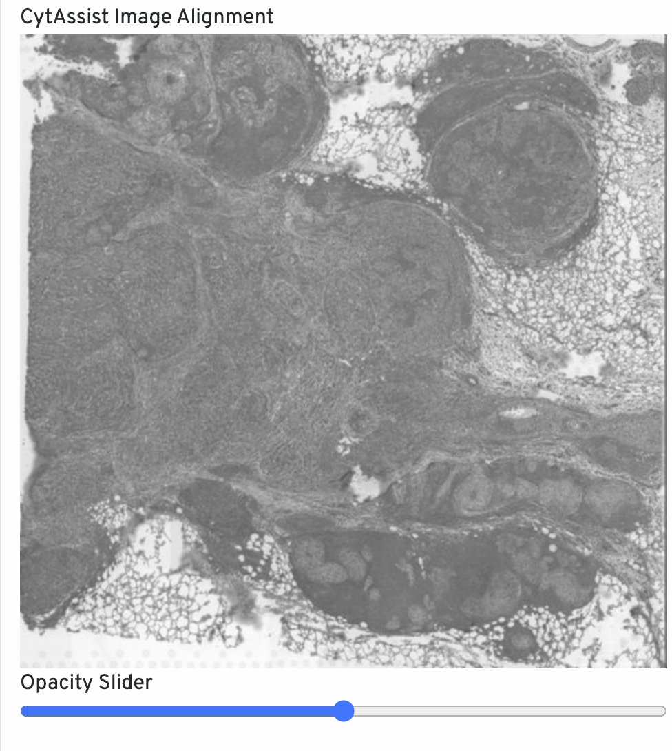
The CytAssist Image Alignment shows the CytAssist image aligned onto the microscope image. Click-drag the opacity slider to blend the two images to confirm good alignment, i.e. tissue boundaries and features should remain fixed in place. For QC purposes, fluorescence microscopy images are inverted to have a light background. If alignment is poor, rerun with Loupe Browser manual alignment.
Below the images is a Spots panel.
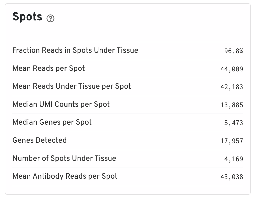
- Fraction Reads in Spots Under Tissue: The fraction of valid-barcode, confidently-mapped-to-probe-set reads with tissue-associated barcodes.
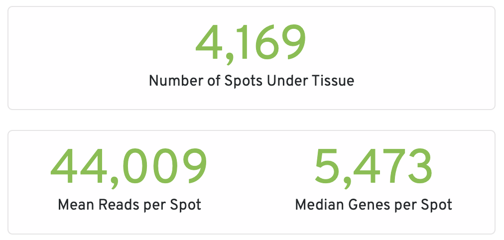
- Mean Reads per Spot: The number of reads, both under and outside of tissue, divided by the number of barcodes associated with a spot under tissue.
- Mean Reads Under Tissue per Spot: The number of reads under tissue divided by the number of barcodes associated with a spot under tissue.
- Median UMI Counts per Spot: The median number of targeted UMI counts per tissue-associated barcode.
- Median Genes per Spot: The median number of genes detected per spot under tissue-associated barcode. Detection is defined as the presence of at least 1 UMI count.
- Genes Detected: The number of unique genes from the filtered probe set with at least one UMI count in any tissue covered spot.
- Number of Spots Under Tissue: The number of barcodes associated with a spot under tissue.
- Mean Antibody Reads per Spot: The total number of sequenced reads divided by the number of barcodes associated with a spot under tissue.
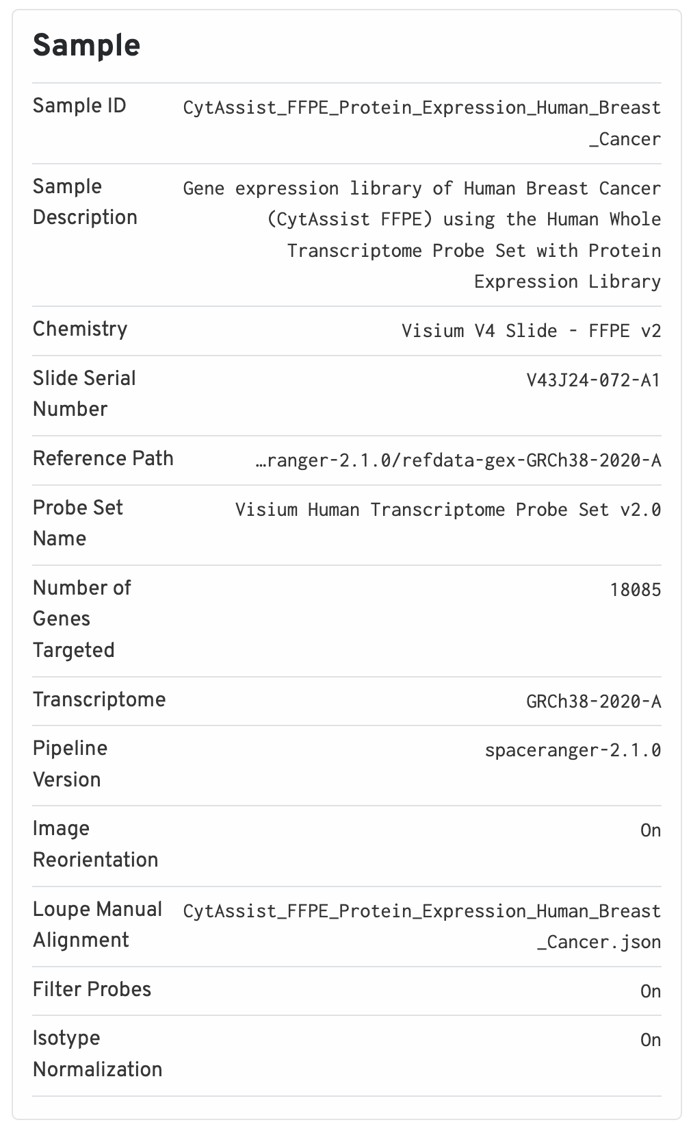
The sample panel shows additional experimental metadata. For troubleshooting purposes, this is the first place to check that the right pipeline, software version, reference, etc. were used.
The Antibody Application panel is only shown for Protein Expression datasets.
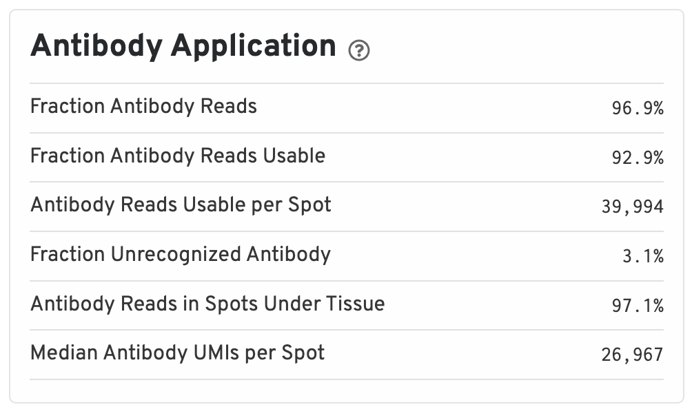
- Fraction Antibody Reads: Fraction of Antibody library reads that contain a recognized antibody barcode.
- Fraction Antibody Reads Usable: Fraction of Antibody library reads that contain a recognized antibody barcode, a valid UMI, and a spot under tissue-associated barcode.
- Antibody Reads Usable per Spot: Among Antibody library reads with a recognized antibody barcode, a valid UMI, and a valid barcode, the number associated with a spot under tissue.
- Fraction Unrecognized Antibody: Among all Antibody library reads, the fraction with an unrecognizable antibody barcode.
- Antibody Reads in Spots Under Tissue: Among Antibody library reads with a recognized antibody barcode, a valid UMI, and a valid barcode, the fraction associated with a spot under tissue.
- Median Antibody UMIs per Spot: Median UMIs per Spot (summed over all recognized antibody barcodes).
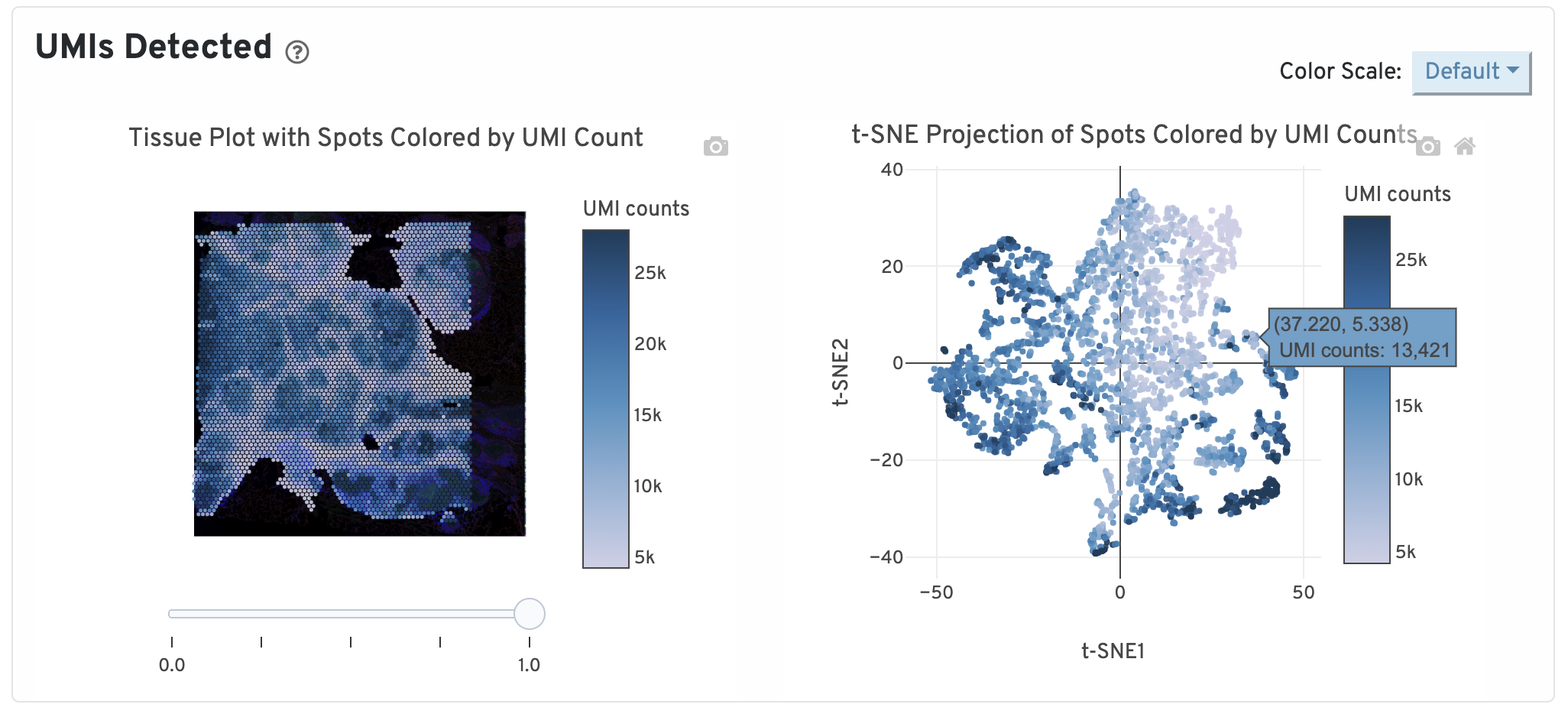
On the top of the Gene Expression tab, two UMI plots are displayed. The left one shows total UMI counts for each spot overlayed on the tissue image. Spots with greater UMI counts likely have higher RNA content than spots with fewer UMI counts. The right plot shows total UMI counts for spots displayed by a 2-dimensional embedding produced by the t-SNE algorithm. In this space, pairs of spots that are close to each other have more similar gene expression profiles than spots that are distant from each other.
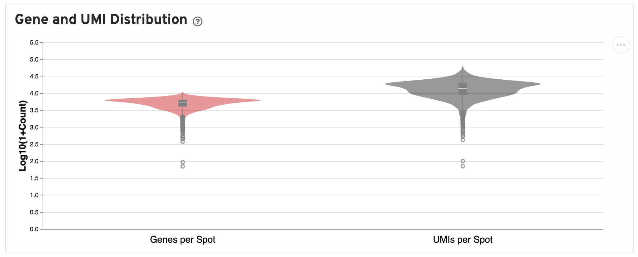
Below the UMI plots are violin plots of the distributions of genes and UMIs. Spots marked as outliers are shown as grey circles. You can hover over the boxplot to see quartile values.
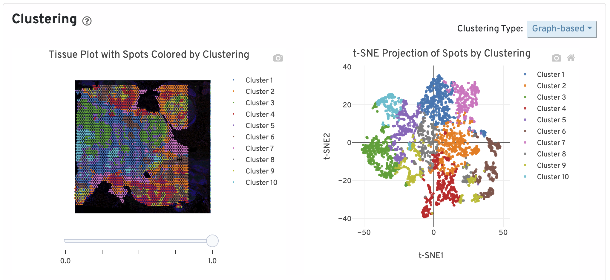
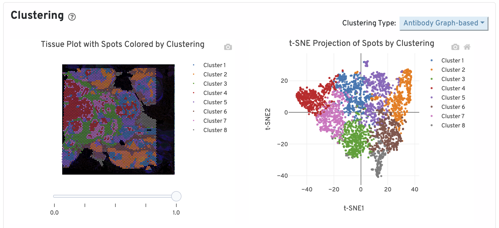
Next, two clustering plots are shown. The left plot displays the assignments of each spot-barcode to clusters by an automated clustering algorithm. The clustering groups together spots that have similar expression profiles. In this plot, spots are colored according to their cluster assignment and projected on to the tissue image. Only spots under tissue are used in the clustering algorithm. On the right, spots are colored by clustering assignment and shown in t-SNE space. The axes correspond to the 2-dimensional embedding produced by the t-SNE algorithm. In this space, pairs of spots that are close to each other have more similar gene expression profiles than spots that are distant from each other.
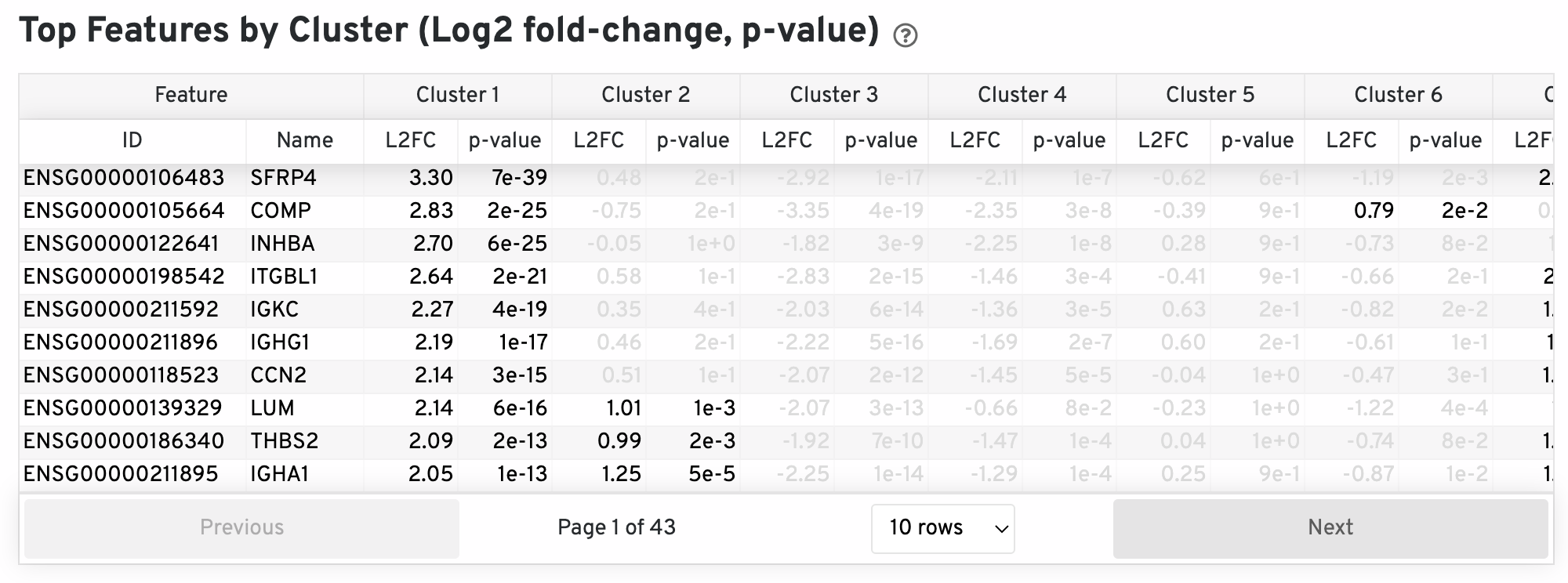
The differential expression analysis seeks to find, for each cluster, features that are more highly expressed in that cluster relative to the rest of the sample. Here a differential expression test was performed between each cluster and the rest of the sample for each feature. The Log2 fold-change (L2FC) is an estimate of the log2 ratio of expression in a cluster to that in all other spots. A value of 1.0 indicates 2-fold greater expression in the cluster of interest. The p-value is a measure of the statistical significance of the expression difference and is based on a negative binomial test. The p-value reported here has been adjusted for multiple testing via the Benjamini-Hochberg procedure. In this table you can click on a column to sort by that value. Also, in this table features were filtered by (Mean UMI counts > 1.0) and the top N features by L2FC for each cluster were retained. Features with L2FC < 0 or adjusted p-value greater than or equal to 0.10 were grayed out. The number of top features shown per cluster, N, is set to limit the number of table entries shown to 10,000; N=10,000/K^2 where K is the number of clusters. N can range from 1 to 50. For the full table, please refer to the 'differential_expression.csv' files produced by the pipeline.
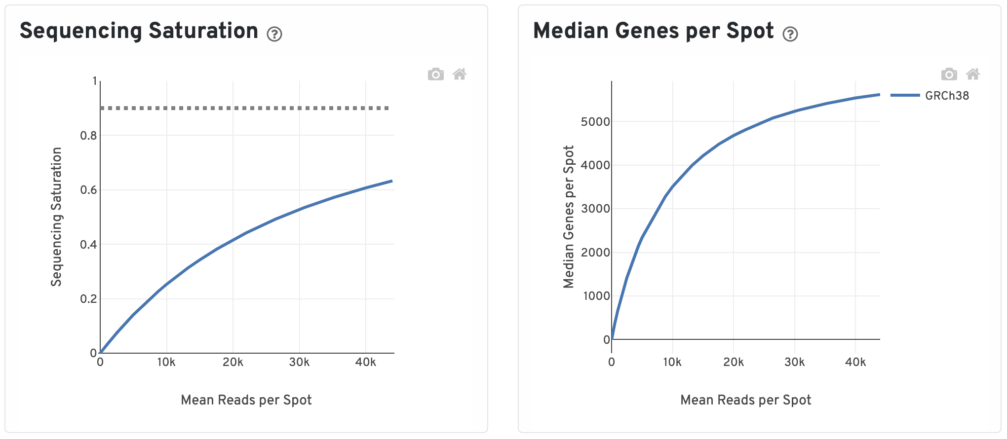
The Sequencing Saturation plot shows the Sequencing Saturation metric as a function of downsampled sequencing depth (measured in mean reads per spot), up to the observed sequencing depth. Sequencing Saturation is a measure of the observed library complexity, and approaches 1.0 (100%) when all converted probe ligation products have been sequenced. The slope of the curve near the endpoint can be interpreted as an upper bound to the benefit to be gained from increasing the sequencing depth beyond this point. The dotted line is drawn at a value reasonably approximating the saturation point.
To the right, the Median Genes per Spot are plotted as a function of downsampled sequencing depth up to the observed sequencing depth. The slope of the curve near the endpoint can be interpreted as an upper bound to the benefit to be gained from increasing the sequencing depth beyond this point.
Next are some metrics about UMIs from Genomic DNA.
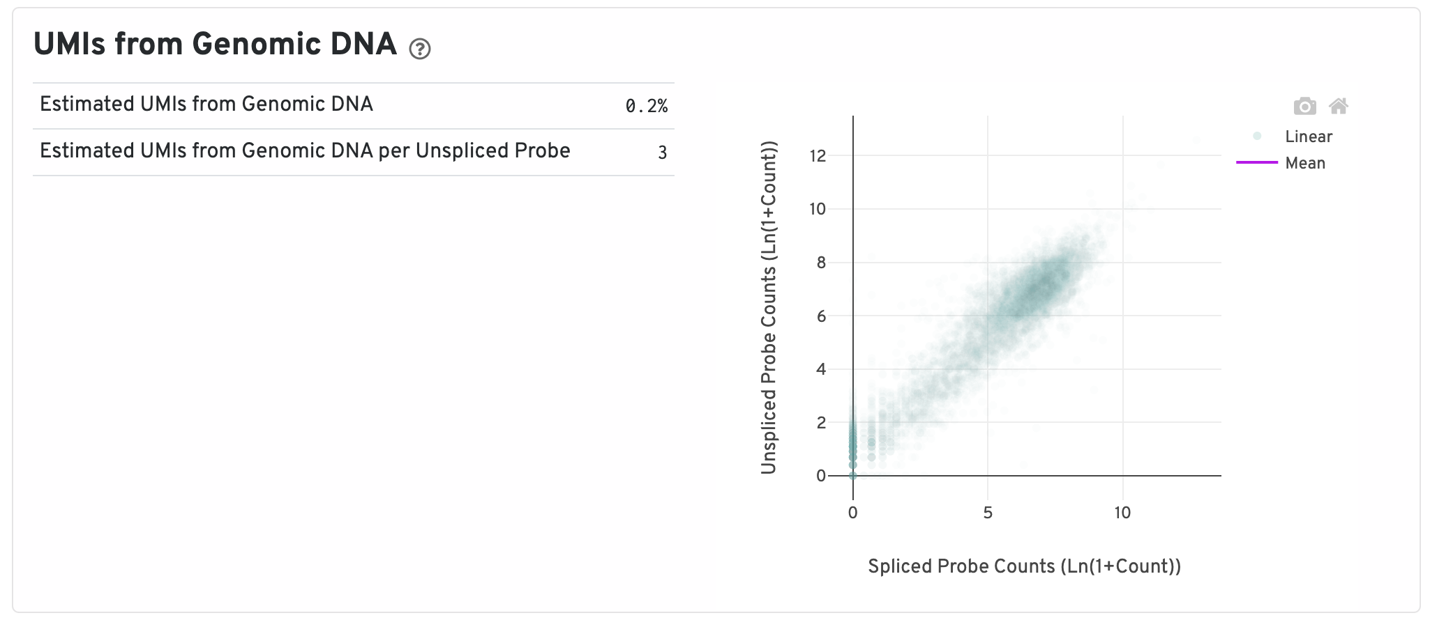
- Segmented Linear Model Plot: Each point represents a gene that has probes targeting both exon-junction-spanning and non-exon-junction-spanning regions, 'spliced' and 'unspliced', respectively. Unspliced probes can stem from open gDNA and from RNA. Spliced probes are expected to stem only from RNA. A segmented linear model is used to estimate where the unspliced and spliced counts begin to deviate. The mean of unspliced counts in purple estimates the UMI background level per unspliced probe. Counts less than this have a high probability of stemming from gDNA.
- Estimated UMIs from Genomic DNA: The estimated fraction of filtered UMIs derived from genomic DNA based on the discordance between probes targeting exon-junction-spanning regions and non-exon-junction-spanning regions.
- Estimated UMIs from Genomic DNA per Unspliced Probe: The estimated number of UMIs derived from genomic DNA for each probe targeting non-exon-junction-spanning regions. A probe not spanning an exon junction with a total UMI count below this value has a high likelihood of its UMIs being derived primarily from hybridization to genomic DNA rather than the mRNA.
The top of the Antibody tab shows two plots. On the left are the assignments of each spot-barcode to clusters by an automated clustering algorithm. The clustering groups together spots that have similar expression profiles. In this plot, spots are colored according to their cluster assignment and projected on to the tissue image. Only spots under tissue are used in the clustering algorithm. On the right are spots colored by clustering assignment and shown in t-SNE space. The axes correspond to the 2-dimensional embedding produced by the t-SNE algorithm. In this space, pairs of spots that are close to each other have more similar gene expression profiles than spots that are distant from each other.
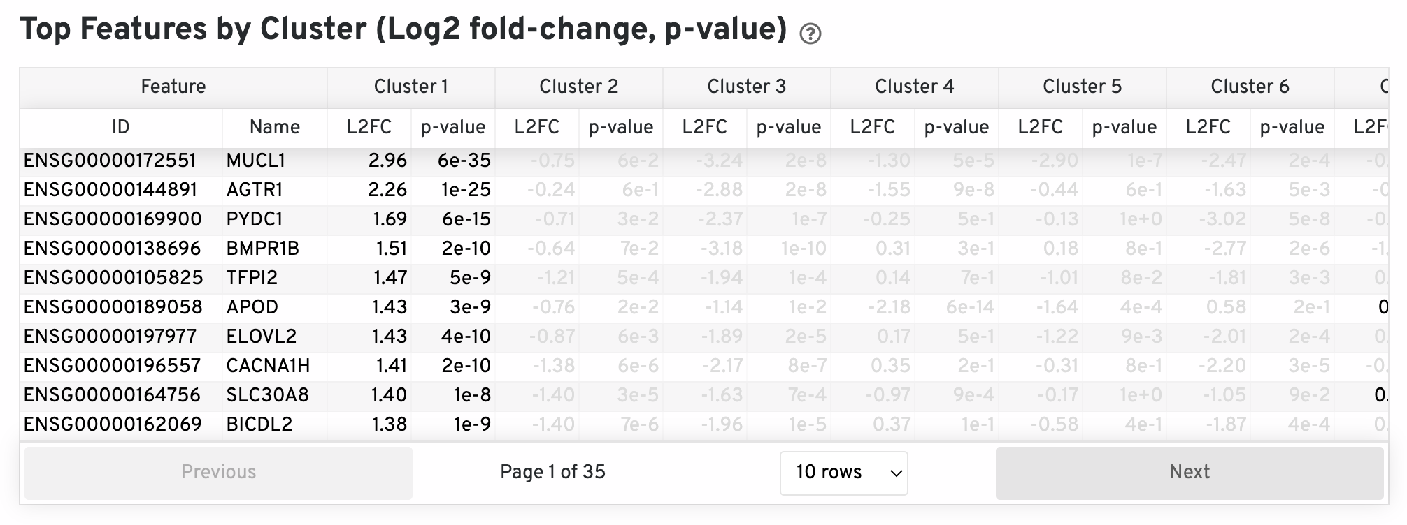
The differential expression analysis seeks to find, for each cluster, features that are more highly expressed in that cluster relative to the rest of the sample. Here a differential expression test was performed between each cluster and the rest of the sample for each feature. The Log2 fold-change (L2FC) is an estimate of the log2 ratio of expression in a cluster to that in all other spots. A value of 1.0 indicates 2-fold greater expression in the cluster of interest. The p-value is a measure of the statistical significance of the expression difference and is based on a negative binomial test. The p-value reported here has been adjusted for multiple testing via the Benjamini-Hochberg procedure. In this table you can click on a column to sort by that value. Also, in this table features were filtered by (Mean UMI counts > 1.0) and the top N features by L2FC for each cluster were retained. Features with L2FC < 0 or adjusted p-value greater than or equal to 0.10 were grayed out. The number of top features shown per cluster, N, is set to limit the number of table entries shown to 10,000; N=10,000/K^2 where K is the number of clusters. N can range from 1 to 50. For the full table, please refer to the 'differential_expression.csv' files produced by the pipeline.
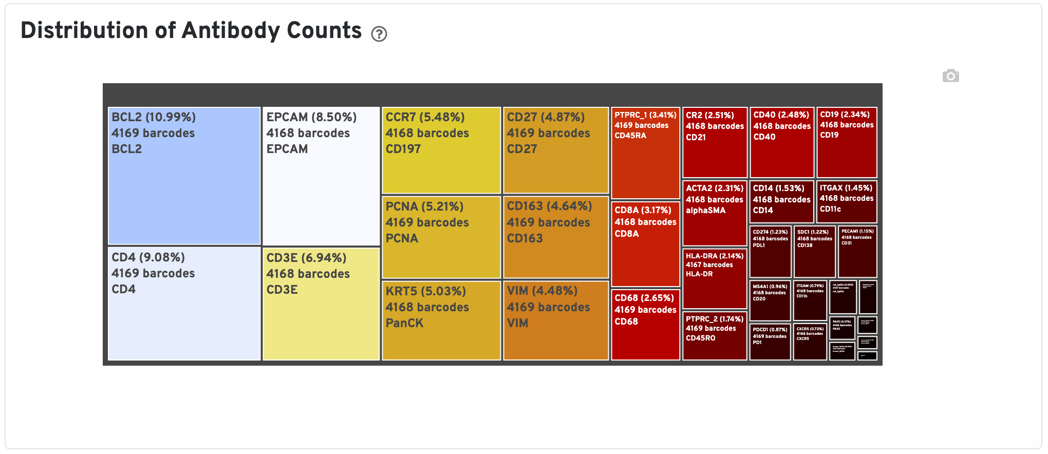
The Distribution of Antibody Counts plot shows the relative composition of isotype normalized antibody counts for features with at least 1 UMI. Box size represents fraction of total normalized antibody UMIs from spot barcodes that are derived from this antibody. Hover over a box to view more information on a particular antibody, including number of associated barcodes.
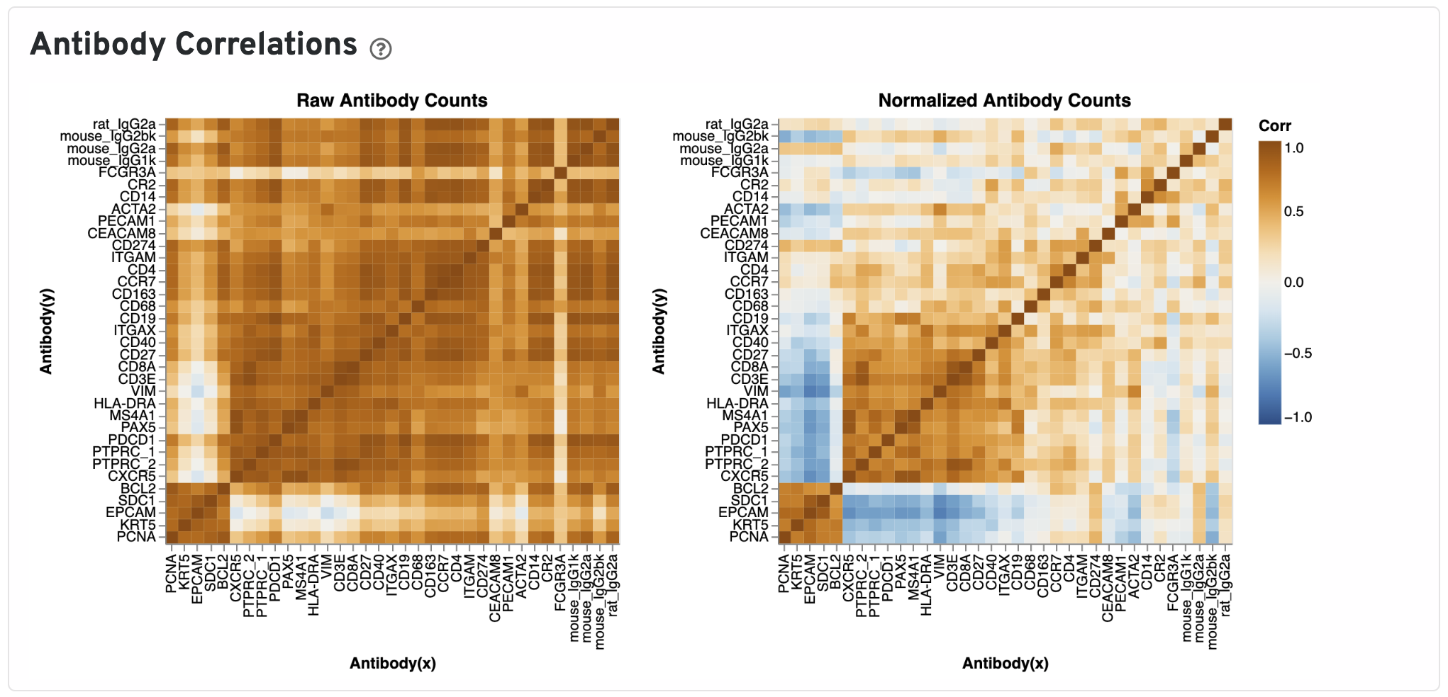
The Antibody Correlations plot shows a heatmap of Pearson correlation coefficients of raw (left) and isotype normalized antibody (right) counts across spots under tissue. Antibodies are clustered using the correlation structures and then ordered according this clustering. Compare the raw count correlation plot with the normalized count plot to see the effect of isotype normalization.
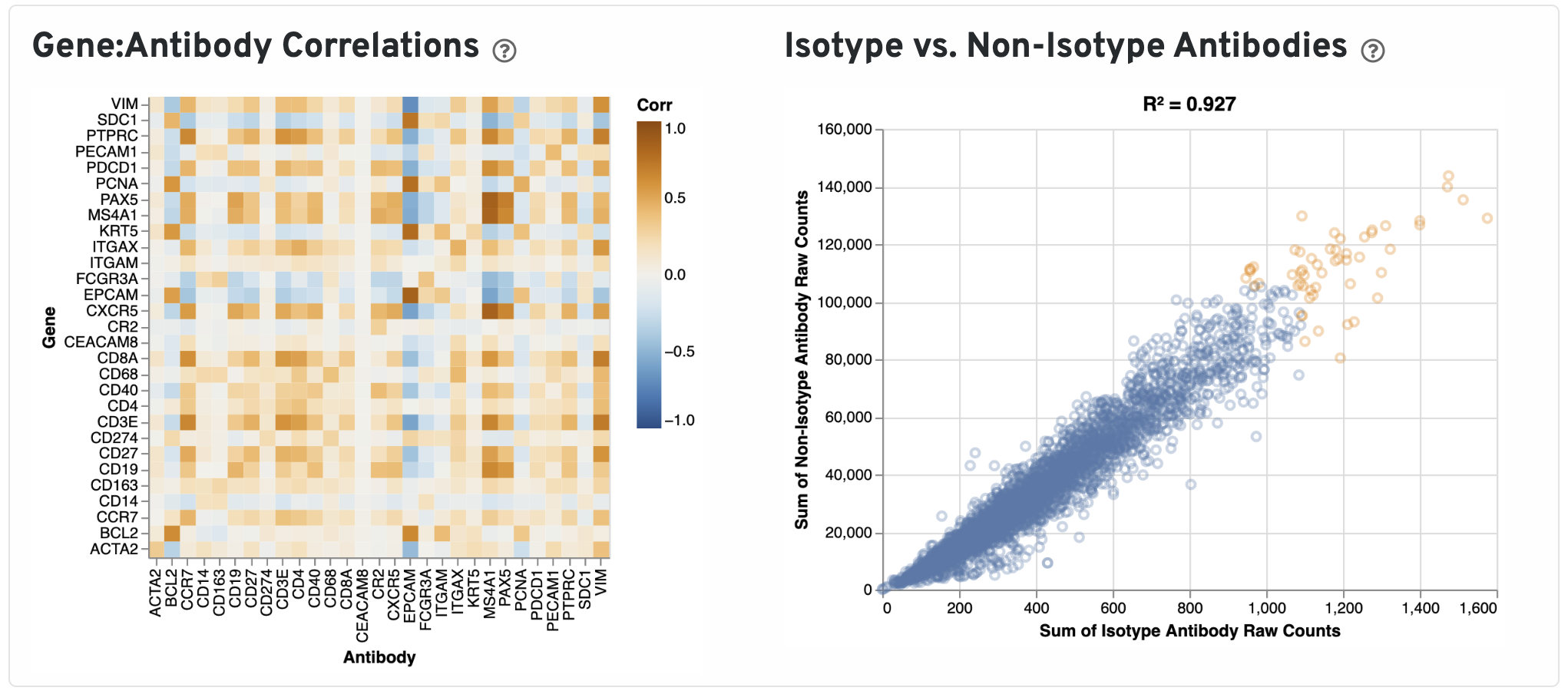
Next, Pearson correlations between log transformed gene expression counts and log transformed isotype normalized antibody counts for all gene:antibody pairs that have matching names are shown.
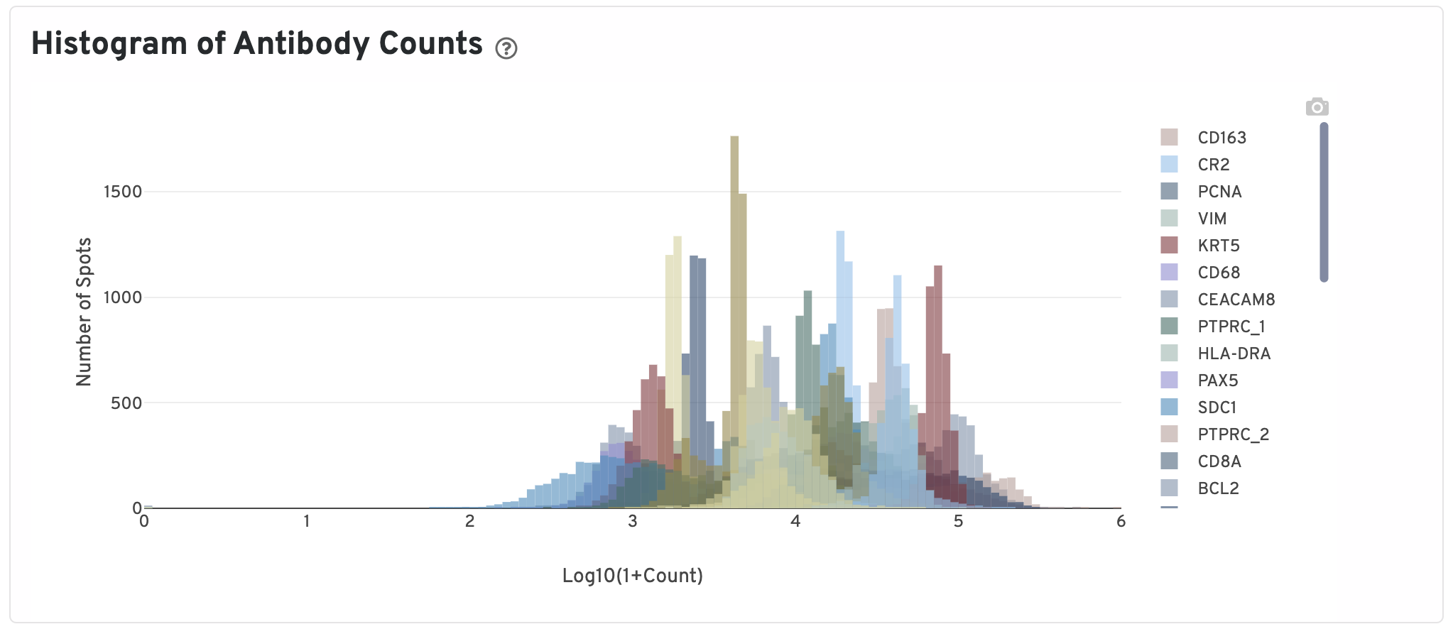
Only isotype normalized antibodies with total UMI counts over 1,000 are plotted, and only up to the top 120 Antibodies by UMI count are shown. The X-axis is the UMI counts in the log scale, while the Y-axis is the number of spots.