Note: 10x Genomics does not provide support for community-developed tools and makes no guarantees regarding their function or performance. Please contact tool developers with any questions. If you have feedback about Analysis Guides, please email analysis-guides@10xgenomics.com.
A critical step to gleaning biological insights and discoveries from your Xenium In Situ run is to annotate the cellular identities, or cell types, in your single cell spatial data. Many tools and methods have been developed for cell annotation in whole-transcriptome single cell expression data (see Web Resources for Cell Type Annotation), but cell annotation of Xenium data presents a different set of challenges to consider. First, In Situ gene panels comprise a targeted subset of genes in the transcriptome. Second, the number of transcripts and genes detected per cell in In Situ spatial datasets are typically lower than the expected UMI counts from whole transcriptome single cell gene expression chemistries. While the 10x Xenium gene panels are carefully designed to maximize cell typing capabilities and the global per-gene sensitivity is highly correlated between single cell and Xenium datasets (Wang, et al 2023), cell annotation algorithms developed for whole transcriptome single cell RNA-seq data may not be optimized for Xenium data due to these differences.
There are a number of different approaches to cell annotation, including cell type marker gene or correlation-based methods, neural network or machine learning based methods, gene expression imputation from a reference, and cluster projection or nearest-neighbors based approaches. Each has different pros and cons to consider according to the intended downstream analysis, prior knowledge of the cell types present and expected cellular phenotypes in the tissue sample, and the level of computational expertise and resources required.
This Analysis Guide will show you how to leverage the wealth of annotated and publicly available single cell RNA-seq datasets and atlases available now to perform label transfer from single cell RNA-seq data to annotate cell types in a Xenium In Situ dataset. In this guide, we will use a Xenium Prime dataset with 5K gene targets, but the methods here can be applied to other Xenium data configurations. There are a number of ways to perform label transfer. We will use the Seurat R package.
In summary, this Analysis Guide Tutorial walks through:
- Choosing and evaluating a single cell reference dataset for your experiment
- Preprocessing and QC of the Xenium and Flex Gene Expression datasets
- Using memory optimization tools for analyzing large Xenium datasets in R
- Performing normalization, dimensionality reduction, and clustering on your data
- Performing label transfer of cell types from the single cell reference to Xenium data
- Evaluating the cell label predictions
- Exporting cell annotations to upload and view in Xenium Explorer
For this guide, make sure you have installed the software below:
- R (4.2.1)
- Seurat >= v5.2.0
- SeuratObject
- SeuratDisk
- BPCells (v0.2.0)
- ggplot2
- tidyverse
SeuratDisk can be installed directly from GitHub:
# Install the remotes package
install.packages('remotes')
# Install SeuratDisk
remotes::install_github("mojaveazure/seurat-disk")
BPCells can also be installed from GitHub using the following:
remotes::install_github("bnprks/BPCells/r")
Additional R packages used in this tutorial can be installed directly from CRAN.
install.packages(c("Seurat", "SeuratObject", "arrow", "tidyverse", "jsonlite", "ggplot2", "ggpmisc", "scales", "cowplot", "gridExtra", "viridis", "hrbrthemes"))
In this guide, we will use a Xenium 5K Human Ovarian Cancer FFPE dataset, which can be found here from the 10x datasets website. The full size of this dataset is 26.7 GB and may take a few minutes to download.
You can either download locally via the datasets page above, or open your computer's terminal, navigate to your desired working directory, and download and unzip the Xenium dataset (XRrun_outs.zip) via command line like so:
# Edit to your directory name
cd /path/to/directory/
wget https://s3-us-west-2.amazonaws.com/10x.files/samples/xenium/3.0.0/Xenium_Prime_Ovarian_Cancer_FFPE_XRrun/Xenium_Prime_Ovarian_Cancer_FFPE_XRrun_outs.zip
unzip Xenium_Prime_Ovarian_Cancer_FFPE_XRrun_outs.zip
Load the necessary libraries into your R environment:
library(Seurat)
library(BPCells)
library(SeuratObject)
library(SeuratDisk)
library(tidyverse)
library(jsonlite)
options(future.globals.maxSize = 1e9)
# For plotting
library(ggplot2)
library(ggpmisc)
library(scales)
library(cowplot)
library(gridExtra)
library(viridis)
library(hrbrthemes)
Choosing an appropriate single cell reference dataset is a critical first step that will influence the quality of the transferred labels. This reference can be a single sample that you annotated manually before, or it can be a published and ideally a curated existing reference.
What to consider when choosing your reference
- Is it a matched sample type? Consider matching both biological factors (tissue type, age/sex/ancestry, disease state, treatments, etc.) and technical factors (sequencing technology, FF or FFPE, whole-cell versus single nuclei).
- The reference should ideally be balanced for different cell types based on your tissue type and region. For example, a single cell reference generated from the hippocampus may not translate well to cortex data. When using public data, integrated references generated from more than one sample tend to improve reference mapping (Mölbert et al.).
- Is the reference dataset curated with confident annotations? Consider which methods were used to annotate the cell types in the reference, the sample size and number of cells in the dataset, the sequencing depth of the experiment, and whether any validation was performed.
Recommended single cell reference sources
There are numerous publicly available and well-documented single cell reference datasets and atlases, such as:
We will use a 10x Flex Gene Expression dataset that was generated from the same tissue block as our Xenium dataset. While not required for cell annotation, having a matched biological sample can improve the cell transfer performance because it reduces biological heterogeneity, especially in human cancer samples. Download the human ovarian cancer FFPE Flex Gene Expression dataset from the 10x website here. For our purposes we will only need the filtered feature-barcode matrix file.
Again, you can either download locally via the link above, or download the filtered feature-barcode matrix .h5 file via command line using the following:
# Edit to your directory name
cd /path/to/directory/
curl -O https://cf.10xgenomics.com/samples/cell-exp/8.0.1/17k_Ovarian_Cancer_scFFPE/17k_Ovarian_Cancer_scFFPE_count_filtered_feature_bc_matrix.h5
Now we can load the 10x single cell Flex reference dataset to a Seurat object:
# Edit to your directory name
flex_path <- "/path/to/directory/17k_Ovarian_Cancer_scFFPE_count_filtered_feature_bc_matrix.h5"
flex_data.obj <- Read10X_h5(flex_path)
flex_data.obj <- CreateSeuratObject(counts = flex_data.obj)
flex_data.obj
The output of flex_data.obj should yield the following:
An object of class Seurat
18082 features across 17553 samples within 1 assay
Active assay: RNA (18082 features, 0 variable features)
A memory saving technique is to save the counts layer to disk for memory efficiency using the package BPCells. You can find more information on using BPCells with Seurat here.
# Write the counts layer to disk for memory efficiency
# First, specify the name of a new folder in your working directory where the counts will be written. Update this to your own working directory path
counts_dir <- "/path/to/directory/flex_counts_bpcells/"
write_matrix_dir(mat = flex_data.obj[["RNA"]]$counts, dir = counts_dir)
counts.mat <- open_matrix_dir(dir = counts_dir)
flex_data.obj[['RNA']]$counts <- counts.mat
rm(counts.mat)
You may want to perform some QC and filter out certain cells in your dataset depending on the source and what preprocessing was already done. Guidance on standard preprocessing and QC metrics to explore can be found in this Seurat vignette.
For example, we may want to filter out cells with high mitochondrial content, and cells that have exceptionally low or high (e.g., potential doublets) feature counts. In our Flex data, we will remove cells with fewer than 200 or more than 10,000 UMIs, as well as cells with more than 10% mitochondrial content.
# Add metadata column for percent.mt
flex_data.obj[["percent.mt"]] <- PercentageFeatureSet(flex_data.obj, pattern = "^MT-")
# Visualize QC metrics as a violin plot
VlnPlot(flex_data.obj, features = c("nFeature_RNA", "nCount_RNA", "percent.mt"), ncol = 3, group.by = "orig.ident")
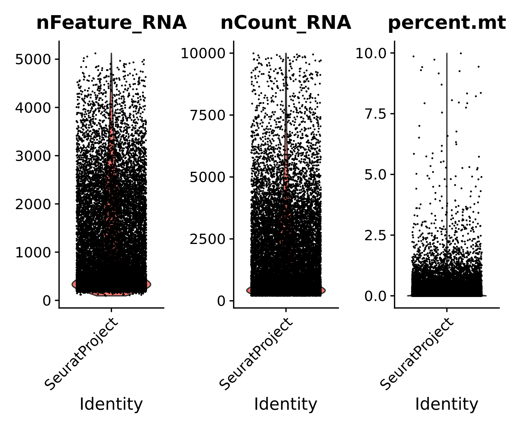
# Subset data based on desired filters
flex_data.obj <- subset(flex_data.obj, subset = nCount_RNA > 200 & nCount_RNA < 10000 & percent.mt < 10)
Add cell type annotations to the single cell Flex dataset
For this reference dataset, we also need to add the custom cell annotations to the flex_data.obj. The cell annotation CSV is available for download at the bottom of the human ovarian cancer FFPE Flex Gene Expression dataset page, along with additional information on how the annotations were assigned.
To download via command line:
# Edit to your directory name
cd /path/to/directory/
curl -O https://cf.10xgenomics.com/supp/cell-exp/FLEX_Ovarian_Barcode_Cluster_Annotation.csv
Add the cell type annotations to the Flex Seurat object:
# Edit to your directory name
flex_annotation_file <- read.csv("/path/to/directory/FLEX_Ovarian_Barcode_Cluster_Annotation.csv")
flex_annotations <- flex_annotation_file$Cell.Annotation
names(flex_annotations) <- flex_annotation_file$Barcode
flex_data.obj <- AddMetaData(object = flex_data.obj, metadata = flex_annotations, col.name = 'cell_type')
Now let us also load in the Xenium dataset to Seurat. To decrease memory usage, set molecule.coordinates = FALSE.
# Edit to your directory name
xenium_path <- "/path/to/xenium_data/"
xenium.obj <- LoadXenium(xenium_path, fov = "fov", molecule.coordinates = FALSE)
DefaultAssay(xenium.obj) <- "Xenium"
Xenium datasets are quite large; this one has over 400,000 cells and 5,101 genes. One way to improve memory efficiency is to convert the counts matrices to disk using the package BPCells, as we did above for the Flex dataset.
# Edit to your directory name
# Assign a path to store the count matrix
counts_dir <- "/path/to/xenium_data/counts_bpcells/"
# Write the counts matrix to this directory
write_matrix_dir(mat = xenium.obj[["Xenium"]]$counts, dir = counts_dir)
# Open the on-disk counts matrix and assign to the counts layer of the Seurat object.
counts.mat <- open_matrix_dir(dir = counts_dir)
xenium.obj[['Xenium']]$counts <- counts.mat
rm(counts.mat)
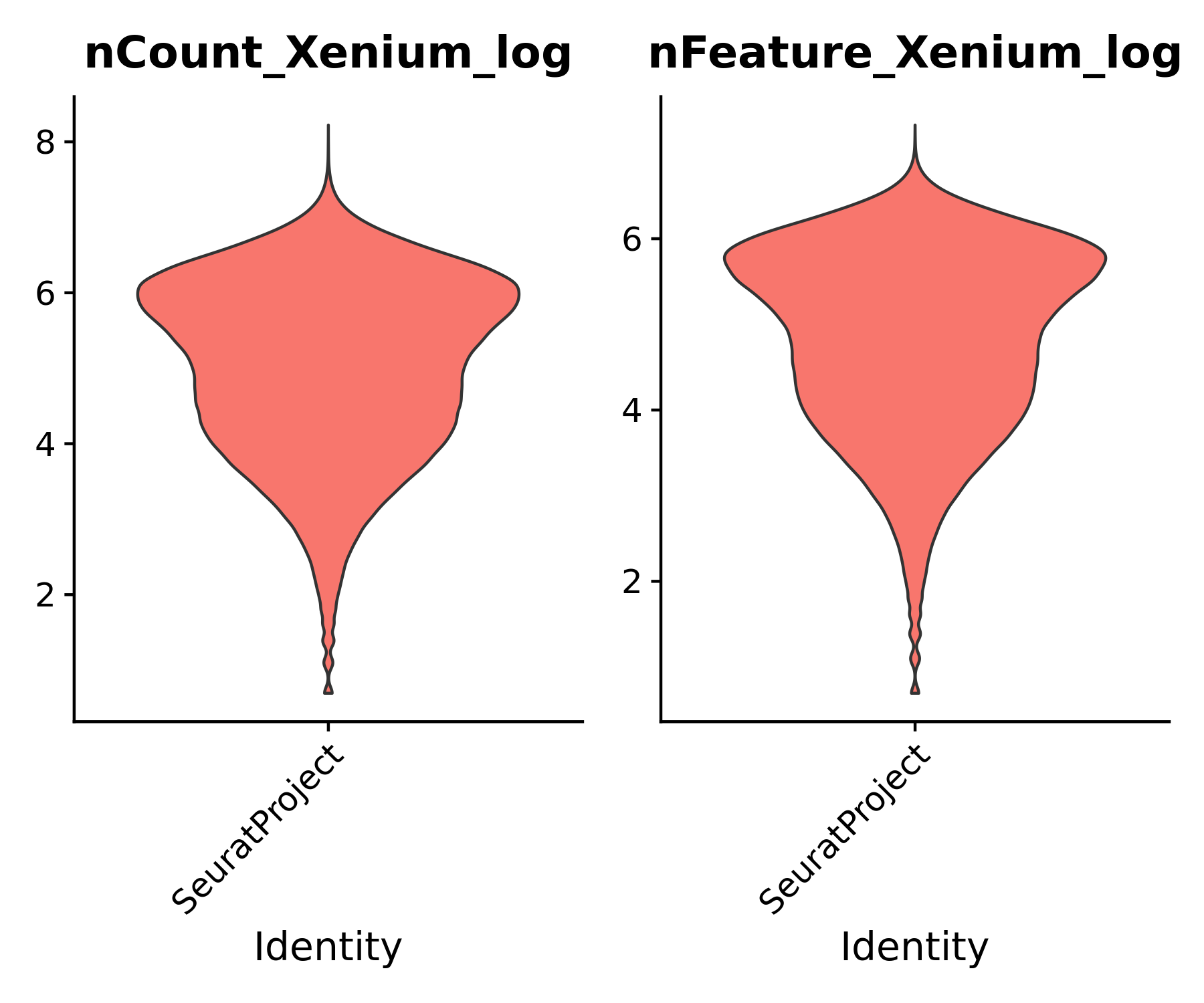
Let us do some quick evaluations of our data. For example, we can look at the number of genes and transcripts per cell, and plot these spatially on the tissue.
# What is the median tx and gene counts per cell?
print(median(xenium.obj@meta.data$nCount_Xenium))
print(median(xenium.obj@meta.data$nFeature_Xenium))
This dataset has a median of 178 transcript counts per cell and 147 features per cell. Add some additional metadata columns for plotting purposes:
# Add log1p_nCount_RNA, log1p_nFeatures
xenium.obj@meta.data$nCount_Xenium_log <- log1p(xenium.obj@meta.data$nCount_Xenium)
xenium.obj@meta.data$nFeature_Xenium_log <- log1p(xenium.obj@meta.data$nFeature_Xenium)
Evaluate the distributions of transcripts and genes per cell. This can help determine if you would like to do any additional filtering of your data before continuing with preprocessing. For example, outliers with the highest number of transcripts per cell may indicate cell multiplets due to segmentation errors and should be inspected.
You may also choose to filter out cells with exceptionally low transcript counts per cell, similar to the single cell Flex data QC. For this dataset, we will simply filter out empty cells with 0 transcripts.
# Remove any empty cells
xenium.obj <- subset(xenium.obj, subset = nCount_Xenium > 0)
# Violinplots of the transcript and feature counts per cell
VlnPlot(xenium.obj, features = c("nCount_Xenium_log", "nFeature_Xenium_log"), ncol = 2, pt.size = 0, group.by = "orig.ident")
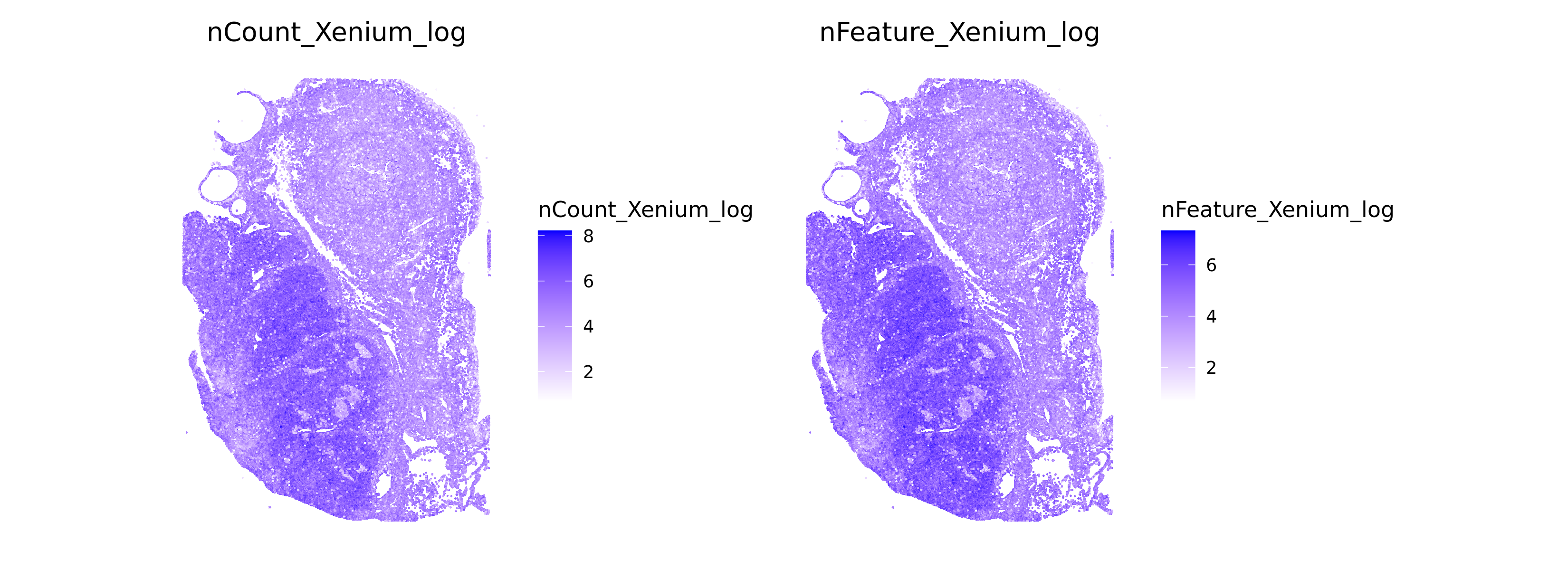
# Spatial Plots of tx and genes per cell
ImageFeaturePlot(xenium.obj, features = c("nCount_Xenium_log", "nFeature_Xenium_log"), size = 0.5, cols=c("white", "blue"), dark.background = FALSE, min.cutoff=c(0, 0))
An important aspect of evaluating the predictive success of cell annotation label transfer is whether there is good gene expression correlation between the single cell "reference" and the Xenium "query" datasets. Let us evaluate the gene expression correlation between our Flex and Xenium ovarian cancer datasets.
# This function takes in the Xenium and single cell reference Seurat object and returns the per-gene expression means
get_gex_means <- function(xenium_obj, flex_obj){
xen_means <- data.frame(
mean_counts = rowMeans(xenium_obj[["Xenium"]]$counts),
gene = rownames(xenium_obj[["Xenium"]]$counts)
) %>%
arrange(desc(mean_counts)) %>%
mutate(Rank = 1:n())
flex_means <- data.frame(
mean_counts = rowMeans(flex_obj[["RNA"]]$counts),
gene = rownames(flex_obj[["RNA"]]$counts)
) %>%
arrange(desc(mean_counts)) %>%
mutate(Rank = 1:n())
# Merge mean counts per cell,
merged_means <- merge(xen_means, flex_means, by.x = "gene", by.y = "gene", all.x = TRUE)
return(merged_means)
}
This Xenium Prime dataset contains both the 5K pre-designed panel and 100 custom genes. We can annotate our correlation plot with which genes came from the pre-designed or custom add-on gene panel using the gene_panel.json file in the Xenium outputs. This could help distinguish any potential outliers with custom panel designs.
# Distinguish custom add-on genes from the gene_panel.json:
# Edit to your file path
gene_panel <- fromJSON("/path/to/gene_panel.json")
targets <- gene_panel$payload$targets
panel_source <- setNames(data.frame(cbind(targets$source$identity$name, targets$type$data$name)), c("gene_panel", "gene"))
merged_means <- get_gex_means(xenium.obj, flex_data.obj)
merged_means <- merge(merged_means, panel_source, by.x="gene", by.y="gene", all.x=TRUE)
merged_means <- na.omit(merged_means) %>%
arrange(gene_panel)
Plot per-gene expression correlation between Flex and Xenium datasets, colored by the pre-designed panel (Xenium Human 5K Pan Tissue & Pathways Panel) or add-on panel genes (Xenium Human 5K with Cell Typing + HPV-16/18 and SNV Add-on).
ggplot(merged_means, aes(x=mean_counts.y, y=mean_counts.x, color=gene_panel)) +
geom_point(size=0.5) +
scale_colour_manual(values=c("darkcyan", "coral")) +
stat_poly_eq() +
scale_x_log10() +
scale_y_log10() +
xlab("SC Flex Mean Expression") + ylab("Xenium Mean Expression") +
ggtitle("Ovarian Cancer GEX correlation") +
theme_classic() +
theme(axis.text = element_text(color="black", size=10),
axis.title = element_text(size=12)) +
geom_abline(slope = 1, intercept = 0) +
tune::coord_obs_pred()
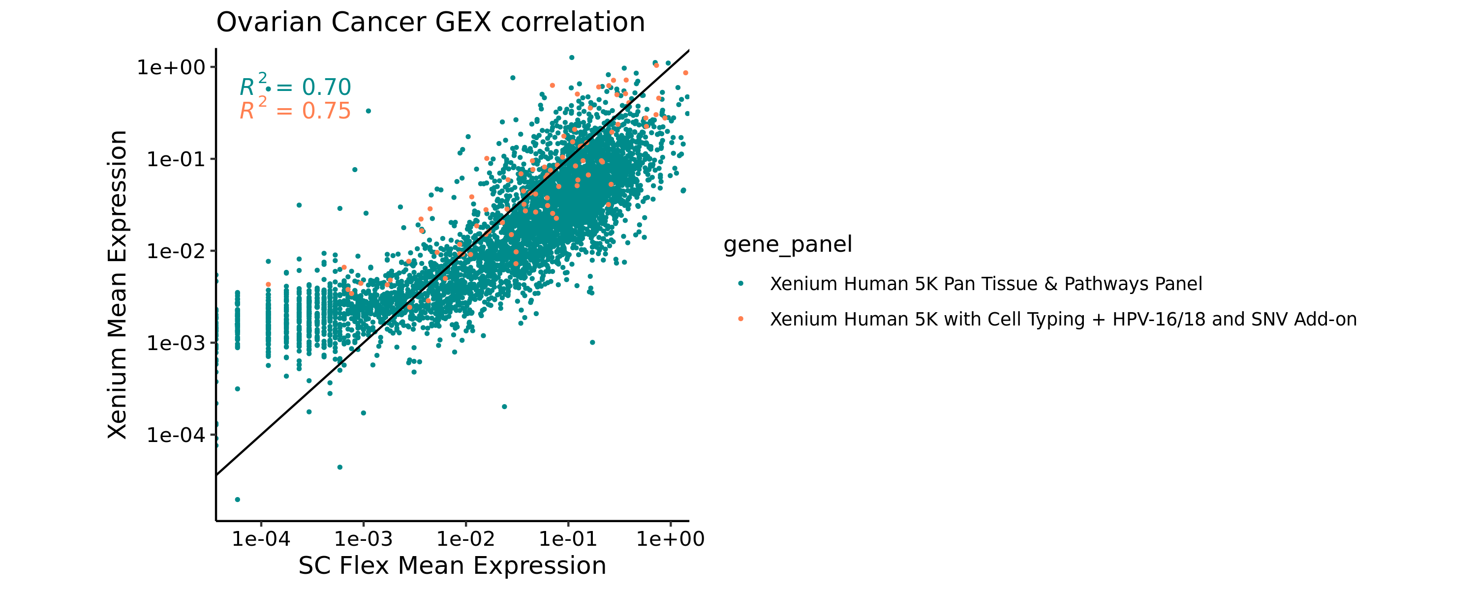
In our case, the Xenium and Flex datasets appear to have strong gene expression correlation, as indicated by the R-squared values. You may choose to remove certain genes with poor correlation for the purposes of the label transfer process, depending on your dataset results. For example, you can see that the lowest expressed genes in the single cell data have slightly elevated counts in the Xenium data (bottom-left quadrant). This typically indicates genes in the 5K pan tissue panel that are not expected to be expressed in ovarian tissue but are being detected at the level of background noise in the In Situ data.
Next, we will perform normalization, dimensionality reduction, and clustering of both the single cell Flex reference dataset and the Xenium dataset. This can take a while for large datasets, but the processing time and memory usage should be greatly reduced using a Xenium sketch dataset and on-disk counts matrices. In your datasets, you may want to adjust parameters such as the number of dimensions used and clustering resolution to fine-tune your analysis.
DefaultAssay(flex_data.obj) <- "RNA"
flex_data.obj <- NormalizeData(flex_data.obj) %>%
FindVariableFeatures() %>%
ScaleData() %>%
RunPCA(verbose=F) %>%
RunUMAP(dims=1:15) %>%
FindNeighbors(dims=1:15) %>%
FindClusters(resolution=0.5)
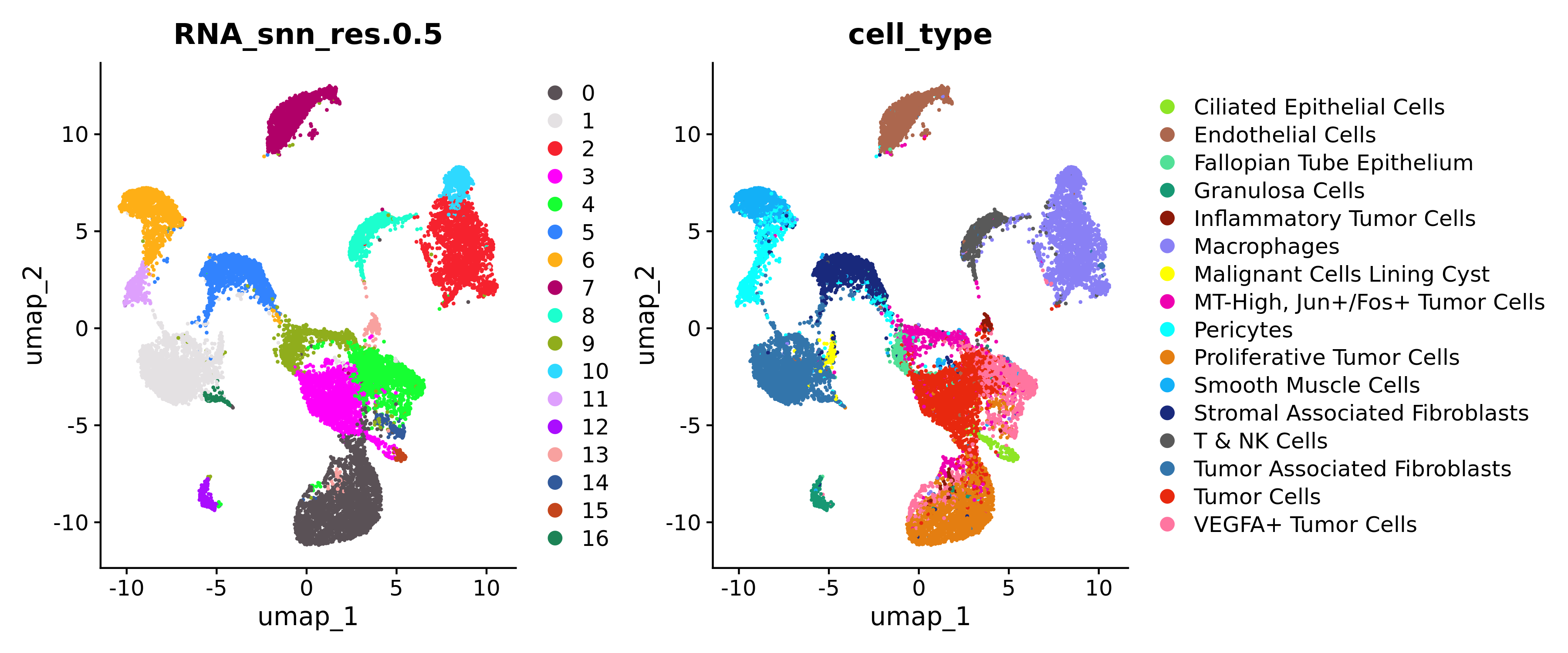
Since our reference dataset is already annotated with cell types, we can plot the clusters and cell types in UMAP space. You can find more information about how the cell types were annotated in the dataset description here.
For continuity throughout the tutorial, let us also assign plot color HEX codes for each of the cell types in the dataset:
custom_hex <- c("#3375AB", "#FFFF00", "#E8280E", "#8D1909", "#E47E11","#FF75A0", "#19297C", "#AC674E", "#805D93", "#13B0F7", "#8980F5", "#595959", "#0BFFFF", "#169873", "#8EE525", "#169873", "#52E097", "#8980F5", "#EE00B0")
names(custom_hex) <- c("Tumor Associated Fibroblasts", "Malignant Cells Lining Cyst", "Tumor Cells", "Inflammatory Tumor Cells", "Proliferative Tumor Cells", "VEGFA+ Tumor Cells", "Stromal Associated Fibroblasts", "Endothelial Cells",
"Stromal Associated Macrophages", "Smooth Muscle Cells", "Tumor Associated Macrophages", "T & NK Cells", "Pericytes", "Granulosa and FT Epithelial Cells", "Ciliated Epithelial Cells",
"Granulosa Cells", "Fallopian Tube Epithelium", "Macrophages", "MT-High, Jun+/Fos+ Tumor Cells")
# Create plots
p1 <- DimPlot(flex_data.obj, reduction = "umap", cols = "polychrome", group.by = "RNA_snn_res.0.5", pt.size = 0.2)
p2 <- DimPlot(flex_data.obj, reduction = "umap", cols = custom_hex, group.by = "cell_type", pt.size = 0.2)
p1 + p2
Since Xenium datasets are quite large, performing normalization, dimensionality reduction, and clustering can be quite memory intensive. Another method to improve memory usage is to generate a "sketch" dataset of a subset of cells that is representative of the entire dataset and retains biological complexity while drastically improving computational performance.
Afterward, you can project the dimensionality reduction, clustering, and ultimately the cell annotation results to the rest of the sample. Read more about using sketch datasets in Seurat here.
Generate a "sketch" dataset of 100K Xenium cells:
DefaultAssay(xenium.obj) <- "Xenium"
xenium.obj <- NormalizeData(xenium.obj)
xenium.obj <- FindVariableFeatures(xenium.obj)
xenium.obj <- SketchData(
object = xenium.obj,
ncells = 100000,
method = "LeverageScore",
sketched.assay = "sketch"
)
Now we switch to using the "sketch" data
DefaultAssay(xenium.obj) <- "sketch"
Scale data, dimensionality reduction, and clustering on sketch data:
xenium.obj <- FindVariableFeatures(xenium.obj) %>%
ScaleData() %>%
RunPCA(npcs = 20) %>%
RunUMAP(dims = 1:16, return.model=TRUE) %>%
FindNeighbors(reduction = "pca", dims = 1:16) %>%
FindClusters(resolution = 0.6)
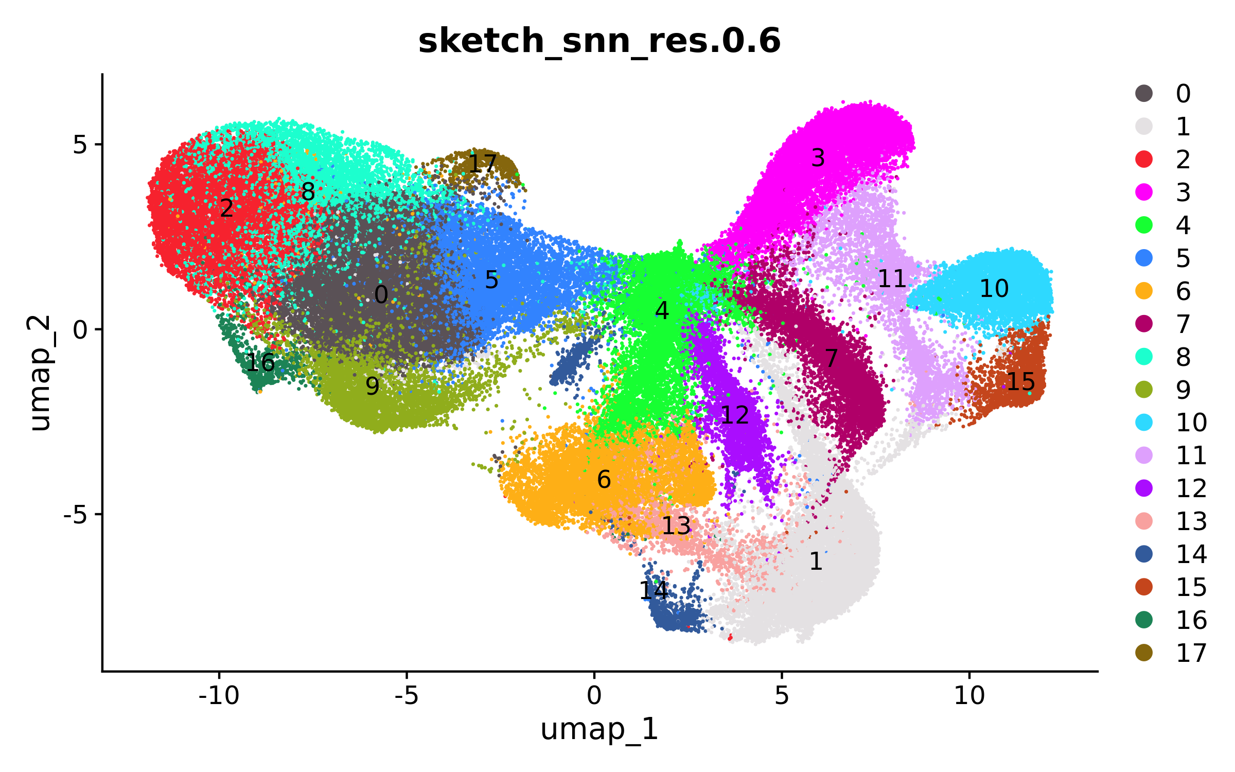
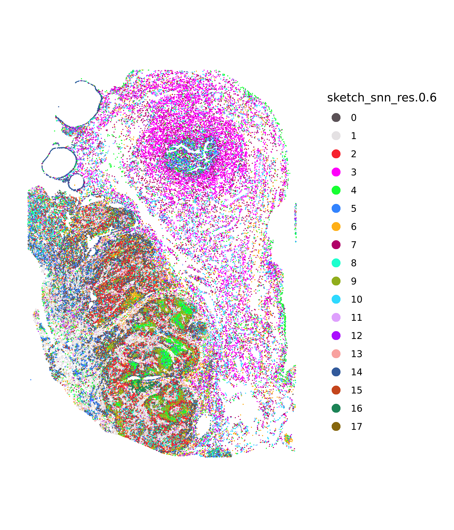
Once the processing on the sketched dataset is complete, we can view the UMAP and spatial clustering results of the 100K cell subset:
# Plot UMAP
DimPlot(xenium.obj, group.by = c("sketch_snn_res.0.6"), cols = "polychrome", label=T, label.size = 4)
# Plot spatial clustering
ImageDimPlot(xenium.obj, fov = "fov", group.by = c("sketch_snn_res.0.6"), cols = "polychrome", size = 0.5, dark.background = FALSE)
Below, we will use Seurat's TransferData() function to classify the query cells based on reference data.
First, we will subset the reference dataset to only the genes that are shared between both the Flex and Xenium assays (in our case, 4,912 genes are shared). This is helpful for ensuring the label transfer anchors are identified using information only found in both assays.
# Get the genes shared between the reference and query datasets
flex_xen_common_genes <- intersect(rownames(xenium.obj), rownames(flex_data.obj))
print(length(flex_xen_common_genes))
> [1] 4912
Next, we will subset the Flex data to only the genes in common with the Xenium data and process the subsetted dataset.
flex_subset <- CreateSeuratObject(counts = flex_data.obj[["RNA"]]$counts[flex_xen_common_genes,],
meta = flex_data.obj@meta.data) %>%
NormalizeData() %>%
FindVariableFeatures() %>%
ScaleData() %>%
RunPCA(verbose=F)
Next, we will identify the transfer anchors between the subsetted Flex "reference" and the sketch Xenium "query" datasets using Seurat's FindTransferAnchors(). This may take some time to run.
The counts matrices need to be read back into memory for FindTransferAnchors().
flex_data.obj[["RNA"]]$counts <- as(object = flex_data.obj[["RNA"]]$counts, Class = "dgCMatrix")
xenium.obj[["Xenium"]]$counts <- as(object = xenium.obj[["Xenium"]]$counts, Class = "dgCMatrix")
anchors_from_flex <- FindTransferAnchors(reference = flex_subset,
query = xenium.obj,
query.assay = "sketch",
features = flex_xen_common_genes,
dims = 1:20,
reference.reduction = "pca")
Once the anchors have been identified, we can transfer the cell label predictions onto the Xenium sketch data using Seurat TransferData().
label_transfer <- TransferData(anchorset = anchors_from_flex,
refdata = flex_subset$cell_type,
dims = 1:20)
The label transfers will give prediction scores of each cell type for every cell barcode, if you wish to evaluate further.
head(label_transfer)
Now we will add the cell label predictions to the metadata of our Xenium object:
xenium.obj <- AddMetaData(object = xenium.obj, metadata = label_transfer, col.name = 'predicted.id')
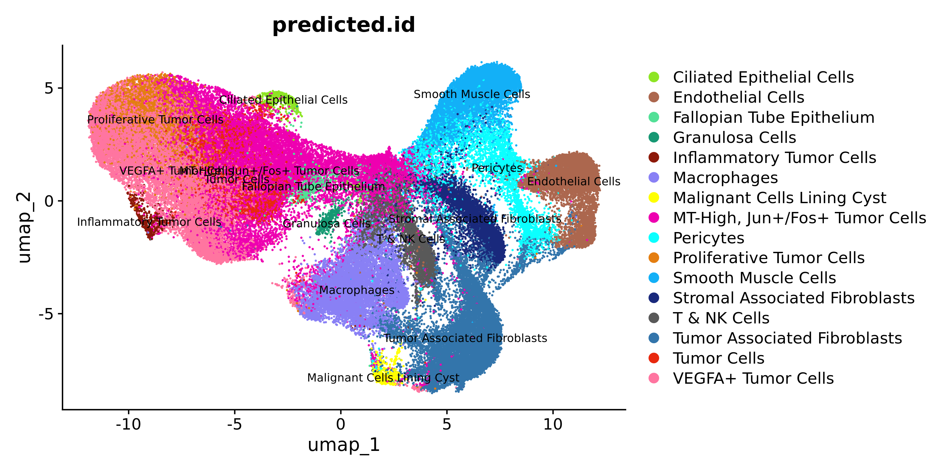
Let us evaluate the cell label transfers for the sketch data:
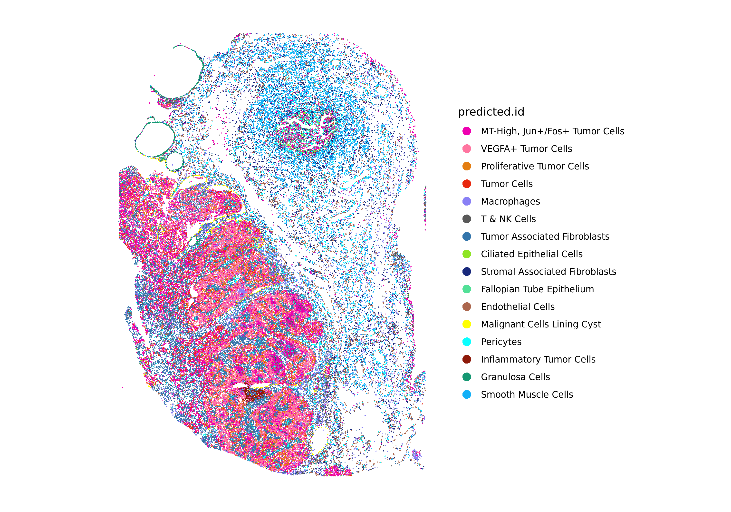
DimPlot(xenium.obj, group.by = c("predicted.id"), cols = custom_hex, label=T, label.size = 3)
ImageDimPlot(xenium.obj, fov = "fov", group.by = c("predicted.id"), cols = custom_hex, size = 0.5, dark.background = FALSE)
If satisfied with the initial results, continue by projecting the dimensionality reduction and clustering from the sketch dataset to the full Xenium dataset using Seurat's ProjectData() function. If not, iterate on the preprocessing steps to refine clustering and label transfer results that best fit your biological samples.
# Project sketch data to full data
DefaultAssay(xenium.obj) <- "sketch"
xenium.obj <- ProjectData(
object = xenium.obj,
assay = "Xenium",
full.reduction = "pca.full",
sketched.assay = "sketch",
sketched.reduction = "pca",
umap.model = "umap",
dims = 1:16,
refdata = list(cluster_full = "sketch_snn_res.0.6")
)
DefaultAssay(xenium.obj) <- "Xenium"
Plot the full dataset UMAP:
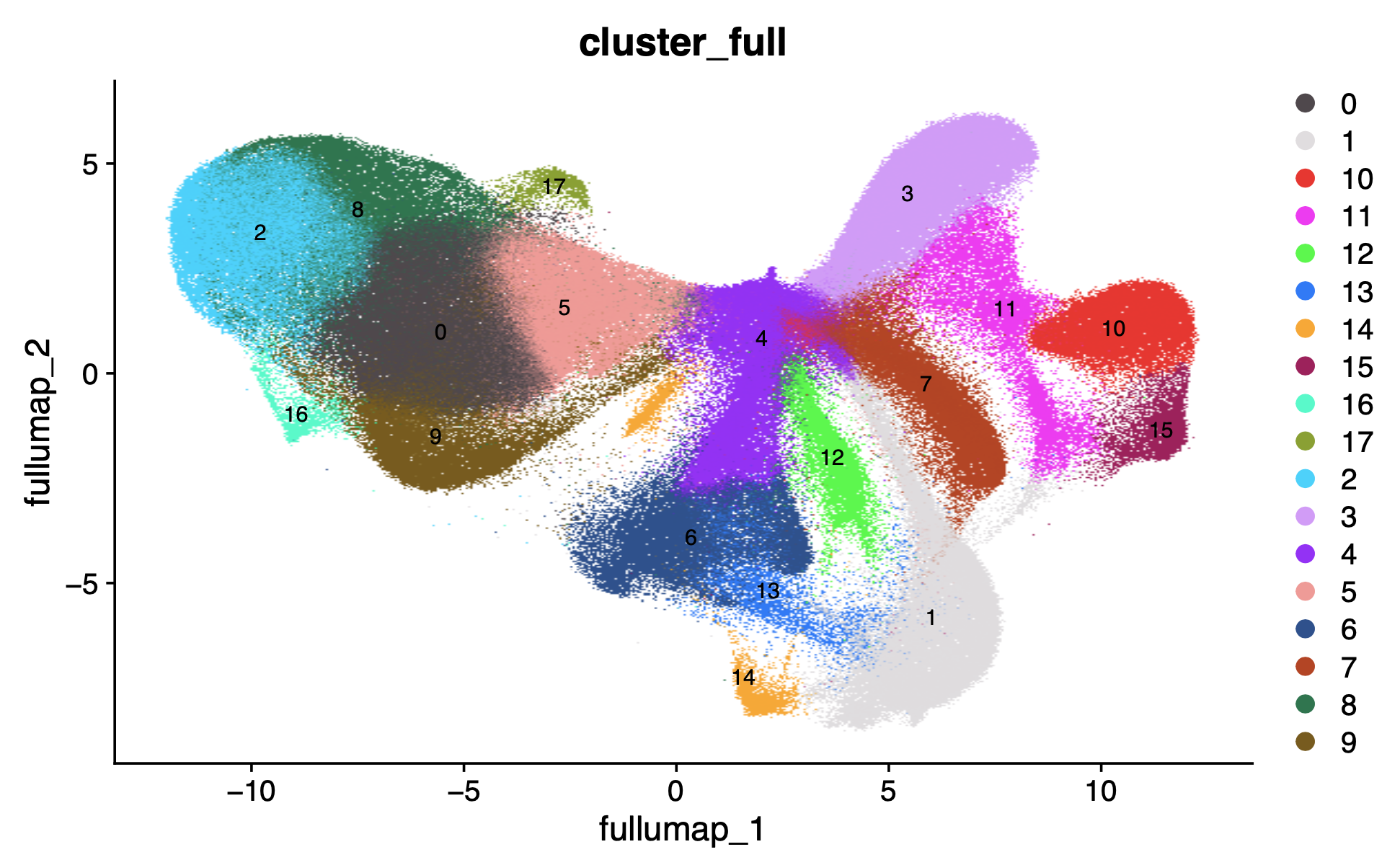
DimPlot(xenium.obj, group.by = c("cluster_full"), cols = "polychrome", label=T, label.size = 3)
Now we can also transfer the sketch cell annotation labels to the full dataset using Seurat's TransferSketchLabels() function:
xenium.obj <- TransferSketchLabels(
xenium.obj,
sketched.assay = "sketch",
reduction = "pca.full",
dims = 1:16,
refdata = list(predicted.id_full = "predicted.id"),
k = 50,
reduction.model = "umap",
recompute.neighbors = FALSE,
recompute.weights = FALSE,
verbose = TRUE
)
Plot the full dataset cell types in UMAP and spatial coordinates:
# Rename "predicted.id" to "cell_type" for consistency with Flex
xenium.obj@meta.data$cell_type <- xenium.obj@meta.data$predicted.id_full
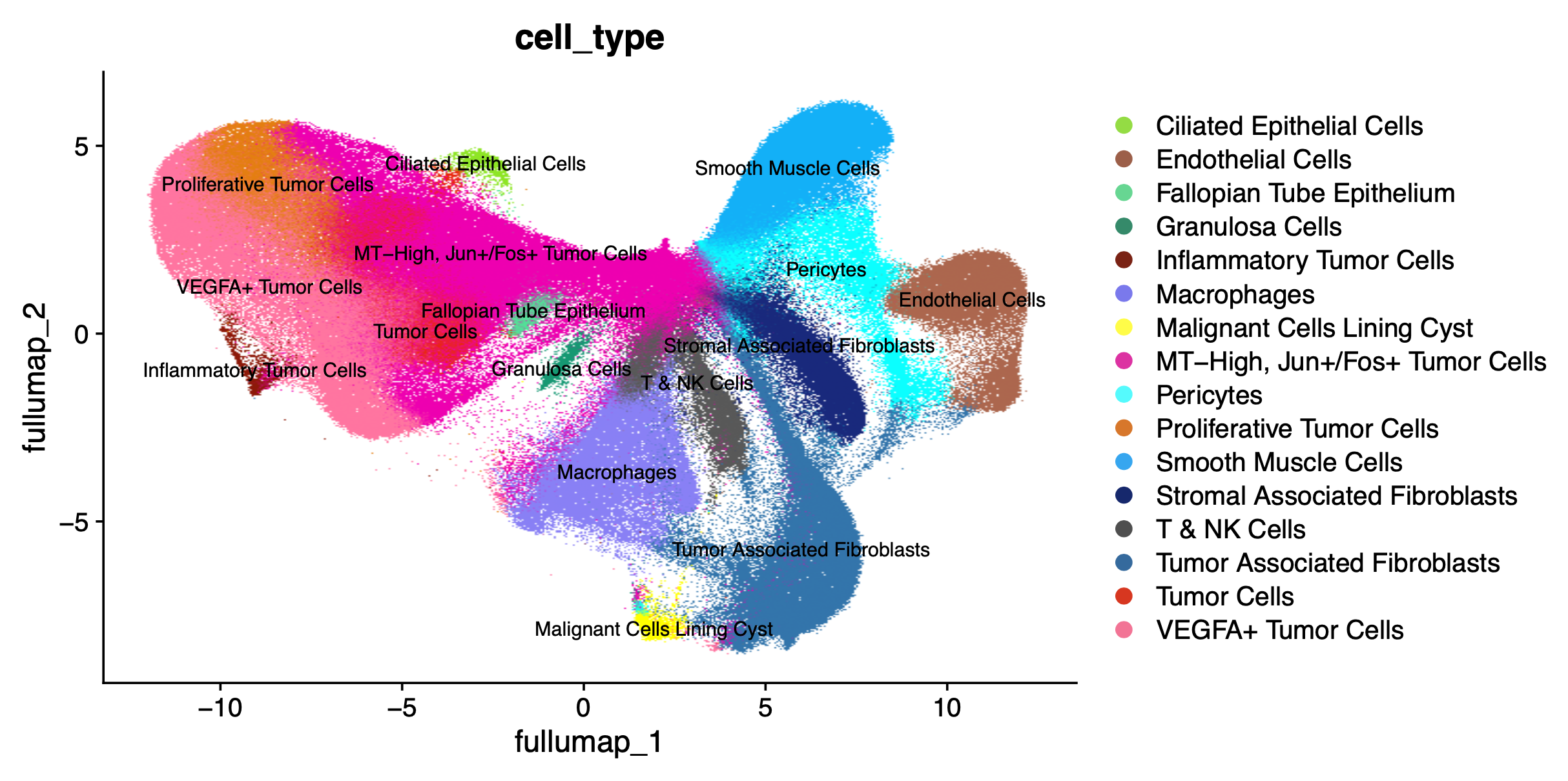
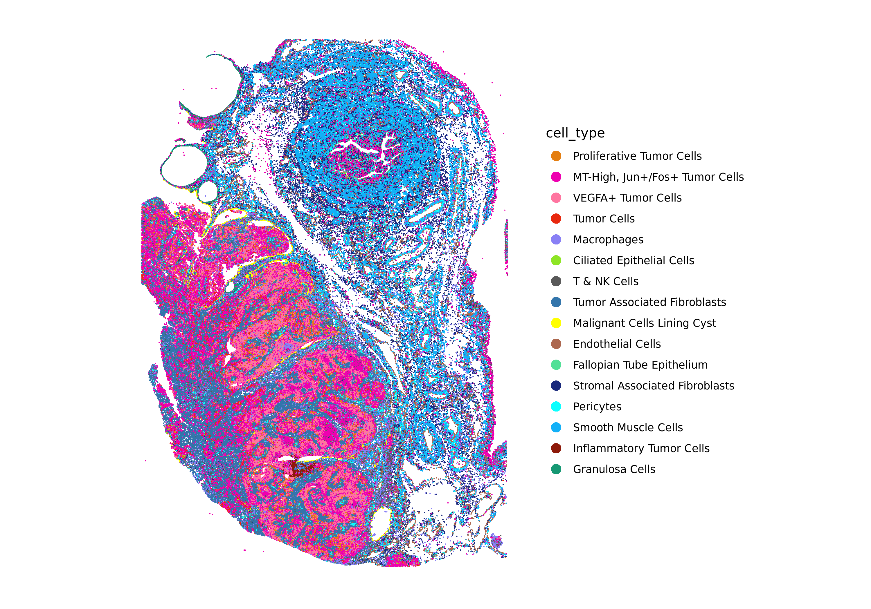
Generate the full dataset UMAP and spatial plots annotated with the cell_type label transfer.
DimPlot(xenium.obj, reduction = 'full.umap', group.by = "cell_type", label=T, label.size = 3, cols = custom_hex, raster=TRUE)
ImageDimPlot(xenium.obj, fov = "fov", group.by = "cell_type", cols = custom_hex, dark.background = FALSE)
In this section, we will do some high-level evaluation of the label transfer results.
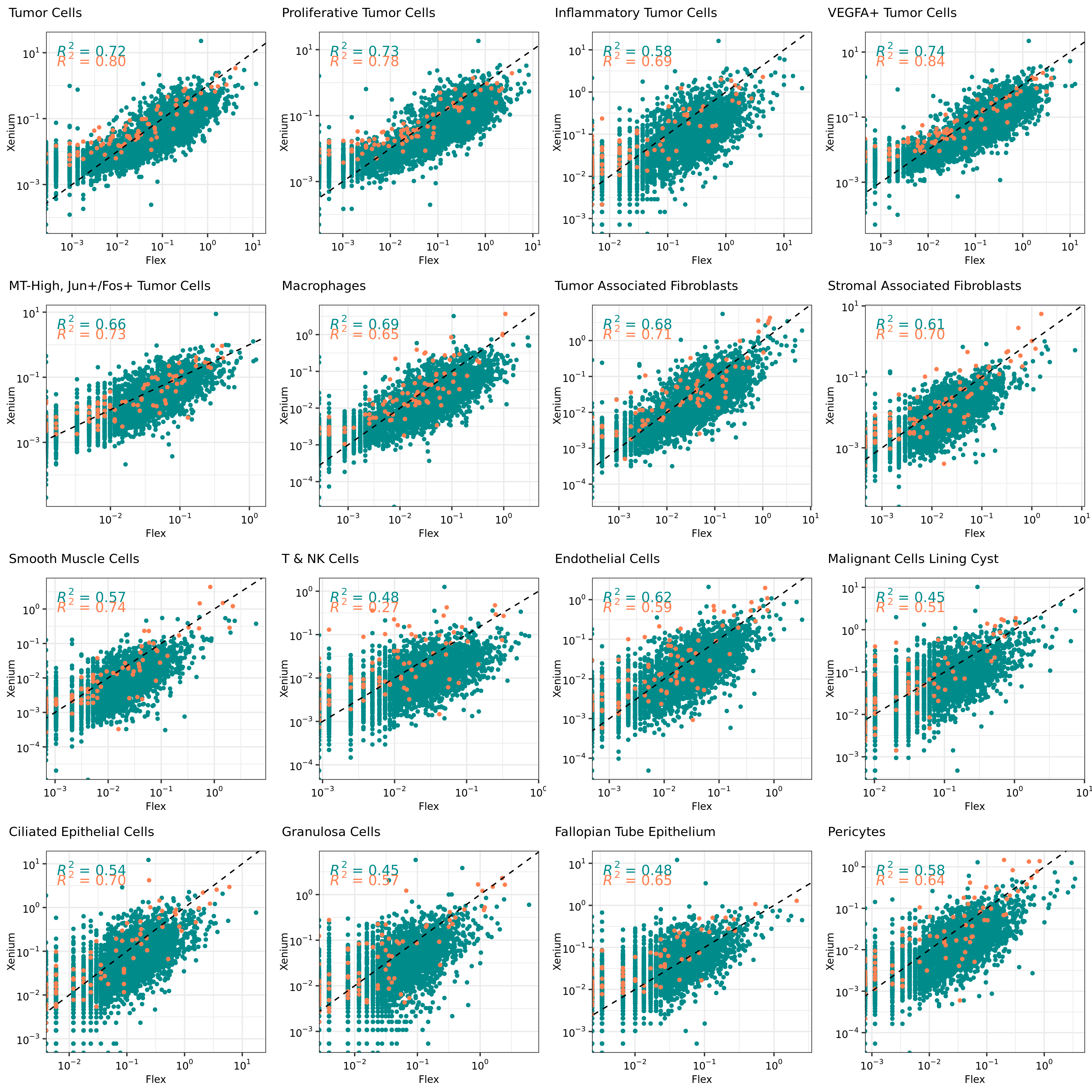
For example, we can evaluate the gene expression correlation between the Xenium and single cell reference on a per-cell type basis. This can help determine if some cell types may not be well-matched.
cell_types <- list(
"Tumor Cells",
"Proliferative Tumor Cells",
"Inflammatory Tumor Cells",
"VEGFA+ Tumor Cells",
"MT-High, Jun+/Fos+ Tumor Cells",
"Macrophages",
"Tumor Associated Fibroblasts",
"Stromal Associated Fibroblasts",
"Smooth Muscle Cells",
"T & NK Cells",
"Endothelial Cells",
"Malignant Cells Lining Cyst",
"Ciliated Epithelial Cells",
"Granulosa Cells",
"Fallopian Tube Epithelium",
"Pericytes"
)
# Function to get per-cell type counts
getCellMeans <- function(celltype){
# Identify common genes between Xenium and Flex
flex_xen_common_genes <- intersect(rownames(xenium.obj), rownames(flex_data.obj)) ## defined above as well
# Get cell barcodes of celltype
xen_cells <- colnames(xenium.obj)[xenium.obj$cell_type == celltype]
flex_cells <- colnames(flex_data.obj)[flex_data.obj$cell_type == celltype]
# Generate counts matrix for cell type
xen_mat <- xenium.obj[["Xenium"]]$counts[flex_xen_common_genes, xen_cells]
flex_mat <- flex_data.obj[["RNA"]]$counts[flex_xen_common_genes, flex_cells]
# Return dataframe of mean counts per gene for both datasets
df <- data.frame(
Xenium = rowMeans(xen_mat),
Flex = rowMeans(flex_mat),
gene = flex_xen_common_genes
)
merged_means <- merge(df, panel_source, by.x="gene", by.y="gene", all.x=TRUE)
merged_means <- na.omit(merged_means) %>%
arrange(gene_panel)
return(merged_means)
}
# Function to generate the per-cell type GEX correlation plots
plotCor <- function(celltype){
df <- getCellMeans(celltype)
p <- ggplot(na.omit(df), aes(x = Flex, y = Xenium, color=gene_panel)) +
geom_point(size=1, show.legend = FALSE) +
scale_colour_manual(values=c("darkcyan", "coral")) +
geom_abline(intercept = 0, slope = 1, linetype=2) +
stat_poly_eq() +
scale_x_log10(labels = label_log(digits = 1)) +
scale_y_log10(labels = label_log(digits = 1)) +
xlab("Flex") + ylab("Xenium") +
theme_bw() +
theme(axis.text = element_text(size=8, color="black"),
axis.title = element_text(size=8),
plot.title = element_text(size=8))
# Add title
title <- ggdraw() +
draw_label(celltype, x = 0, hjust = 0, size = 10) +
theme(
plot.margin = margin(0, 0, 0, 7)
)
p <- cowplot::plot_grid(title, p, ncol=1, rel_heights=c(0.1, 1))
return(p)
}
# Plot all the cell type GEX correlations into one plot
all_plots <- lapply(cell_types, plotCor)
grid.arrange(
grobs = all_plots, nrow = 4)
From these correlation plots, we see some cell types have lower overall gene expression correlation between Xenium and Flex data, which could indicate lower confidence in the label transfers for some of those cells. For example, rarer cell types in this tissue such as Granulosa Cells and Fallopian Tube Epithelium.
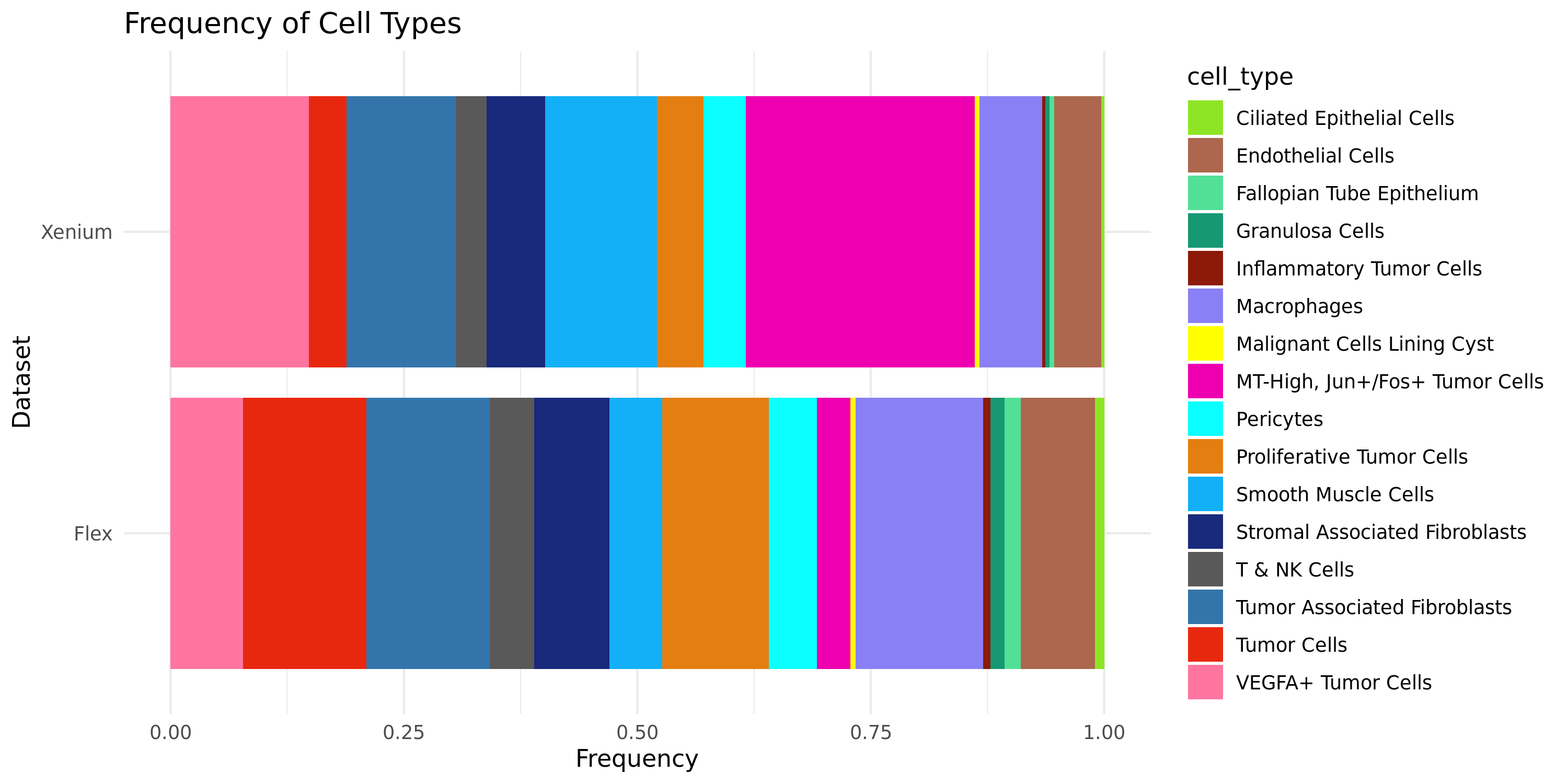
Another gut-check to evaluate the efficacy of the label transfer is to ask whether the cell type proportions between the single cell reference dataset and the Xenium dataset are relatively well-matched. If the two datasets are from the same biological sample, we should expect the cell type proportions to be quite similar. More variability may be expected depending on the tissue type if the single cell reference dataset is from a different biological sample.
# Summarize the frequency of cell_type in both dataframes
freq_xenium <- xenium.obj@meta.data %>%
mutate(sample = "Xenium") %>%
group_by(sample, cell_type) %>%
summarize(count = n()) %>%
mutate(relative_freq = count/sum(count))
freq_flex <- flex_data.obj@meta.data %>%
mutate(sample = "Flex") %>%
group_by(sample, cell_type) %>%
summarize(count = n()) %>%
mutate(relative_freq = count/sum(count))
# Combine the summarized dataframes
combined_freq <- bind_rows(freq_xenium, freq_flex)
# Stacked bar chart
ggplot(subset(combined_freq, sample %in% c("Flex", "Xenium")), aes(x = sample, y = relative_freq, fill = custom_hex)) +
geom_bar(stat = "identity", position = "stack") +
scale_fill_manual(values = custom_hex) +
coord_flip() +
labs(title = "Frequency of Cell Types",
x = "Dataset",
y = "Frequency") +
theme_minimal()
In section 5, Seurat's TransferData() function provides prediction scores for the cell types predicted by the label transfer. We already added this metadata to our Xenium Seurat object for the sketch data subset. We will evaluate the label transfer prediction scores for each cell type to determine whether any cell populations or cell types have uncertain label predictions that might be further refined with additional analysis.
xenium.obj@meta.data %>%
ggplot( aes(x=predicted.id_full, y=predicted.id_full.score, fill=predicted.id_full)) +
geom_violin(scale="width") +
scale_fill_viridis(discrete = TRUE, alpha=0.6, option="A") +
theme_ipsum() +
theme(
legend.position="none",
plot.title = element_text(size=11),
axis.text.x = element_text(angle = 45, hjust=1)
) +
ggtitle("Label Transfer Prediction Scores") +
xlab("") +
ylab("label prediction score") +
ylim(0, 1)
Label transfer prediction scores by cell type:
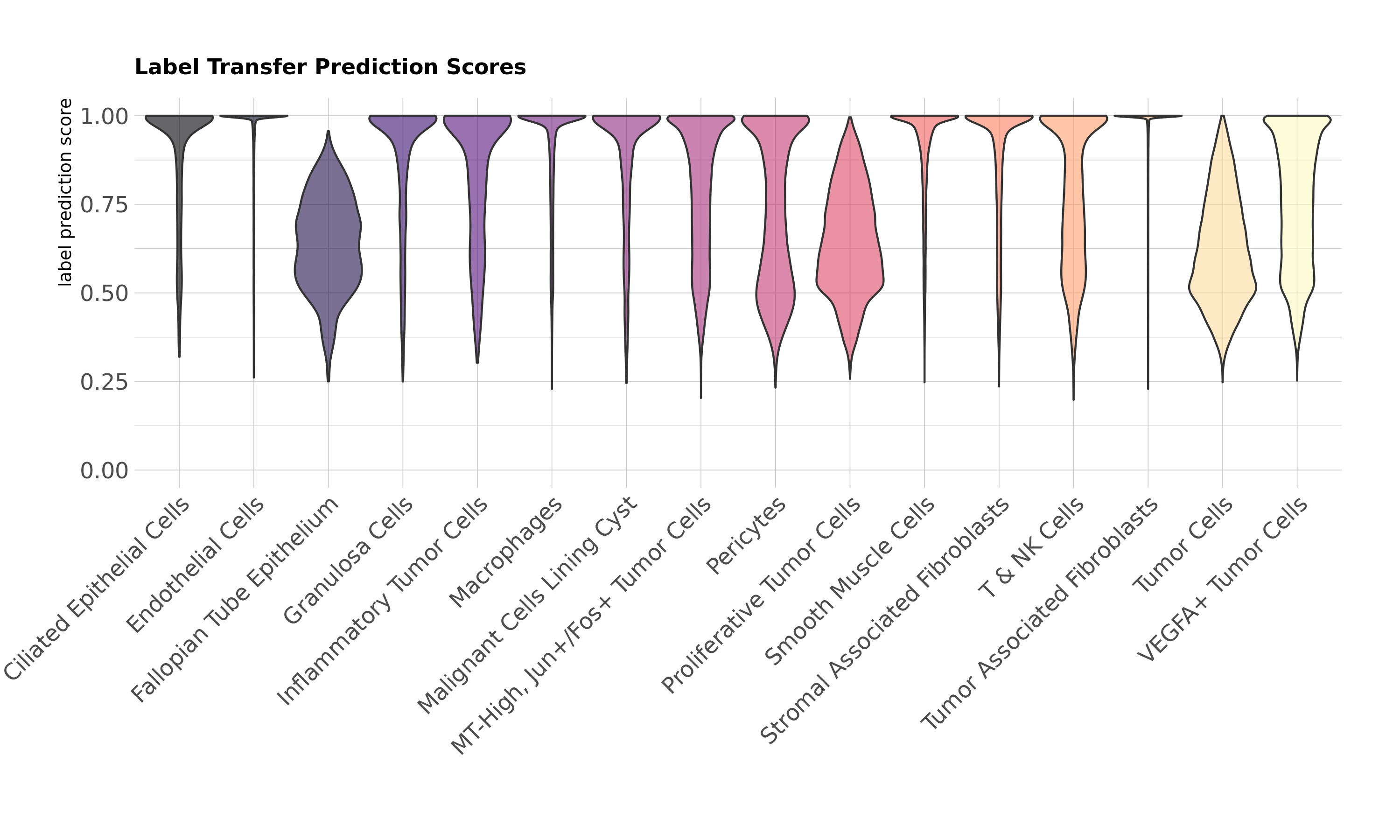
In this dataset, a few cell types have lower prediction scores on average. The Fallopian Tube Epithelium is a rarer cell type in this tissue, so prediction scores may be lower due to infrequency of the cell population. You may also notice that a number of the tumor subtypes have some lower prediction scores: Tumor Cells, Proliferative Tumor Cells, and VEGFA+ Tumor Cells. Given the similarity of these tumor subtypes and the heterogeneous nature of evolving tumor populations in general, it is not entirely unexpected to have some ambiguity between subtypes.
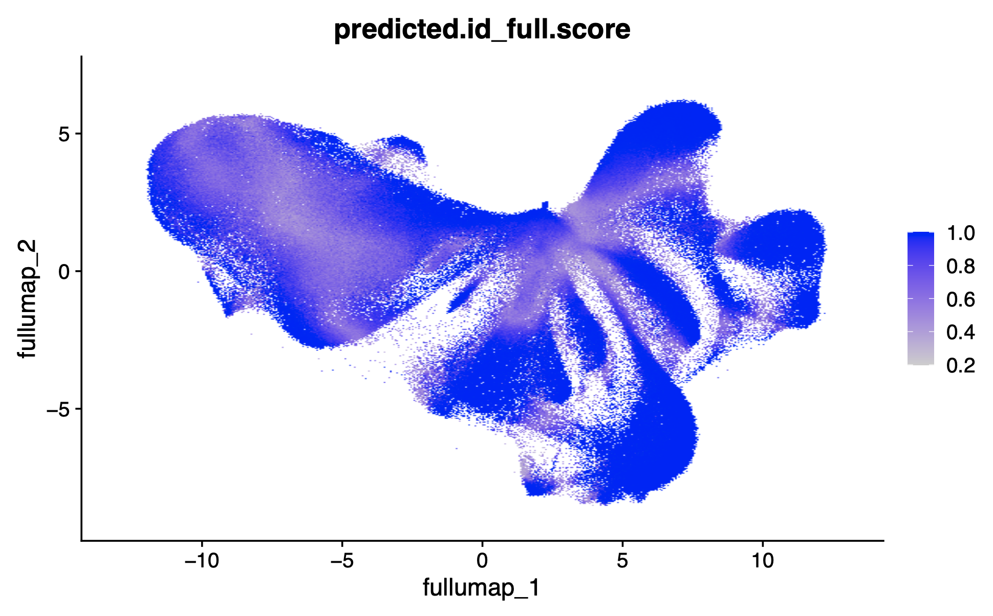
Plotting the prediction scores in UMAP space shows where the ambiguity between clusters relates to lower prediction scores. Label transfer prediction scores in UMAP:
FeaturePlot(xenium.obj, reduction = 'full.umap', features = "predicted.id_full.score", raster=TRUE)
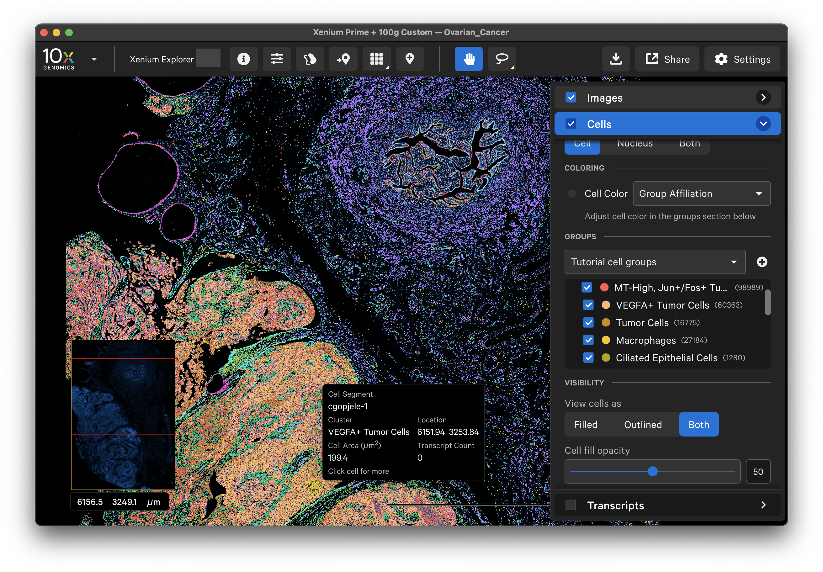
Finally, you can upload your cell annotations into Xenium Explorer by creating a cell group CSV file from the Seurat object metadata. The CSV file should have two column headers: "cell_id" and "group" corresponding to the cell barcode and cell type annotation, respectively.
cell_groups <- xenium.obj@meta.data %>%
rownames_to_column(var = "cell_id") %>%
select(cell_id, group = cell_type)
write.csv(cell_groups, "cell_groups.csv", row.names = FALSE)
Next, upload the cell_groups.csv with the label transfer cell annotations into Xenium Explorer. Follow the tutorial here to upload this CSV to Xenium Explorer and visualize cells by the custom cell type annotations, as shown below:
> sessionInfo()
R version 4.2.1 (2022-06-23)
Platform: x86_64-conda-linux-gnu (64-bit)
Running under: Amazon Linux 2
Matrix products: default
BLAS/LAPACK: /mnt/opt/R/R-4.2.1-conda/env/lib/libopenblasp-r0.3.21.so
locale:
[1] LC_CTYPE=en_US.UTF-8 LC_NUMERIC=C LC_TIME=en_US.UTF-8 LC_COLLATE=en_US.UTF-8 LC_MONETARY=en_US.UTF-8 LC_MESSAGES=en_US.UTF-8
[7] LC_PAPER=en_US.UTF-8 LC_NAME=C LC_ADDRESS=C LC_TELEPHONE=C LC_MEASUREMENT=en_US.UTF-8 LC_IDENTIFICATION=C
attached base packages:
[1] stats graphics grDevices utils datasets methods base
other attached packages:
[1] hrbrthemes_0.8.7 viridis_0.6.5 viridisLite_0.4.2 future_1.40.0 gridExtra_2.3 cowplot_1.1.3 scales_1.3.0 ggpmisc_0.6.1
[9] ggpp_0.5.8-1 jsonlite_2.0.0 lubridate_1.9.4 forcats_1.0.0 stringr_1.5.1 dplyr_1.1.4 purrr_1.0.4 readr_2.1.5
[17] tidyr_1.3.1 tibble_3.2.1 ggplot2_3.5.2 tidyverse_2.0.0 SeuratDisk_0.0.0.9020 BPCells_0.2.0 Seurat_5.2.1 SeuratObject_5.0.2
[25] sp_2.2-0