The cellranger aggr pipeline outputs an interactive summary HTML file named web_summary.html that contains summary metrics and automated secondary analysis results. If an issue was detected during the pipeline run, an alert appears on this page. More information about alerts is provided in the Cell Ranger troubleshooting documentation.
Here, we describe the aggr web summary using screenshots from example datasets run with some combination of 3' and 5' Gene Expression, Antibody Capture, and CRISPR Guide Capture libraries. Click the ? icons next to each section in the web summary title to display information about that metric.
Depending on the libraries sequenced, the aggr web summary consists of:
- Summary tab
- Gene Expression tab
- Antibody tab: If an Antibody Capture (cell surface protein) library is present in your dataset
- VDJ-B/T: If a VDJ library is present in your dataset
- Antigen: If an Antigen Capture (BEAM) library is present in your dataset
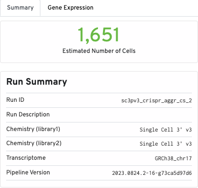
The Summary tab contains the run summary metrics, including Run ID, Chemistry (per library), transcriptome, and pipeline version:
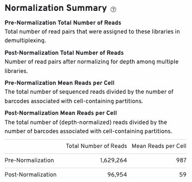
The normalization summary shows the effects of normalization on total number of reads and mean reads per cell:
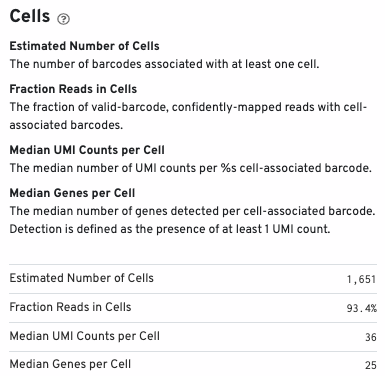
Cell metrics (including estimated number of cells, fraction of reads in cells, etc.) are shown in the Cells section:
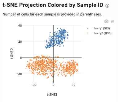
A t-SNE projection colored by sample ID is also sown:
The bottom of the Summary tab includes library-specific aggregation metrics, depending on the libraries present in your dataset (Gene Expression, CRISPR, Antibody, and/or Antigen). This example shows aggregation metrics for Gene Expression and CRISPR libraries:
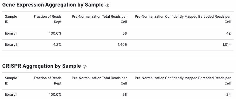
You may see a similar section for Antibody and Antigen libraries, depending on your experimental design.
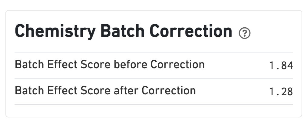
If chemistry batch correction was specified (batch column in input aggregation CSV file), there will be an additional Chemistry Batch Correction section with batch effect scores before and after correction. Batch effect scores indicate whether there is a batch effect (greater than one) or no batch effect (closer to one) (read more on the algorithm page).
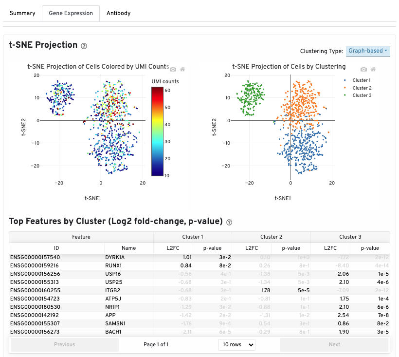
The t-SNE Projection section shows the data reduced to two dimensions, colored by UMI count or clustering (Graph-based by default). It is a good starting point to explore structure in the data.
The Top Features by Cluster (Log2 fold-change, p-value) section summarizes the results of differential gene expression analysis to help users find, for each cluster, features that are more highly expressed in that cluster relative to the rest of the sample.
If your experimental design includes an Antibody Capture library, an Antibody tab is present in your web summary.
A t-SNE projection of cells colored by antibody UMI count is shown on the top left. The top right shows the t-SNE projection of cells colored by antibody clustering (assignments of each cell barcode to clusters by an automated clustering algorithm). The clustering type can be changed using the 'Clustering Type' drop down menu:
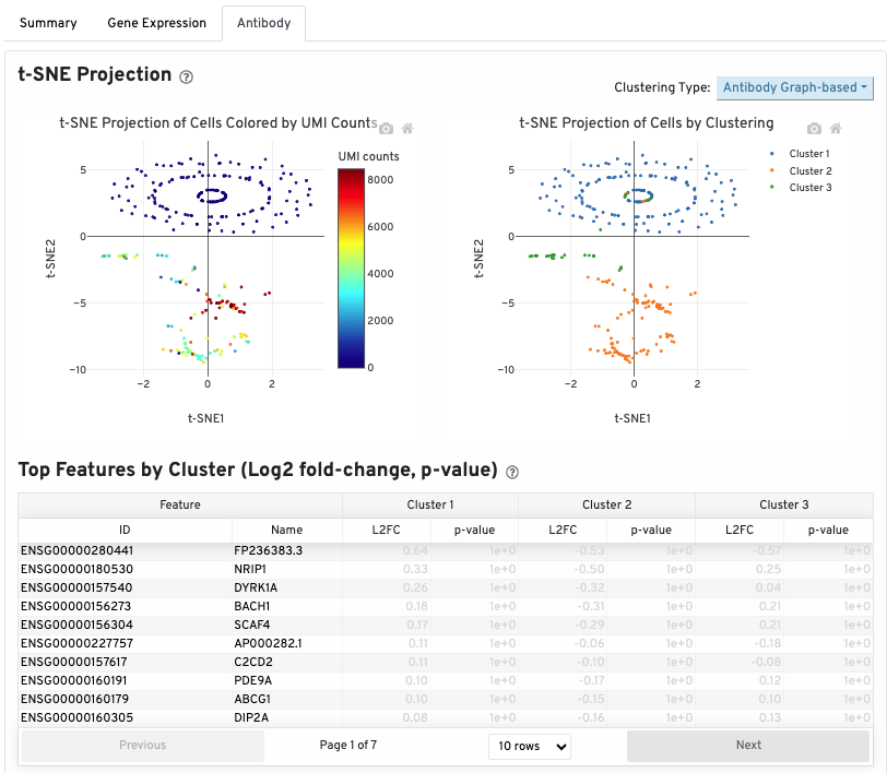
The table below the t-SNEs shows the top features by cluster. A differential expression test is performed between each cluster and the rest of the sample for each feature. Clicking on a column name sorts by values in that column.
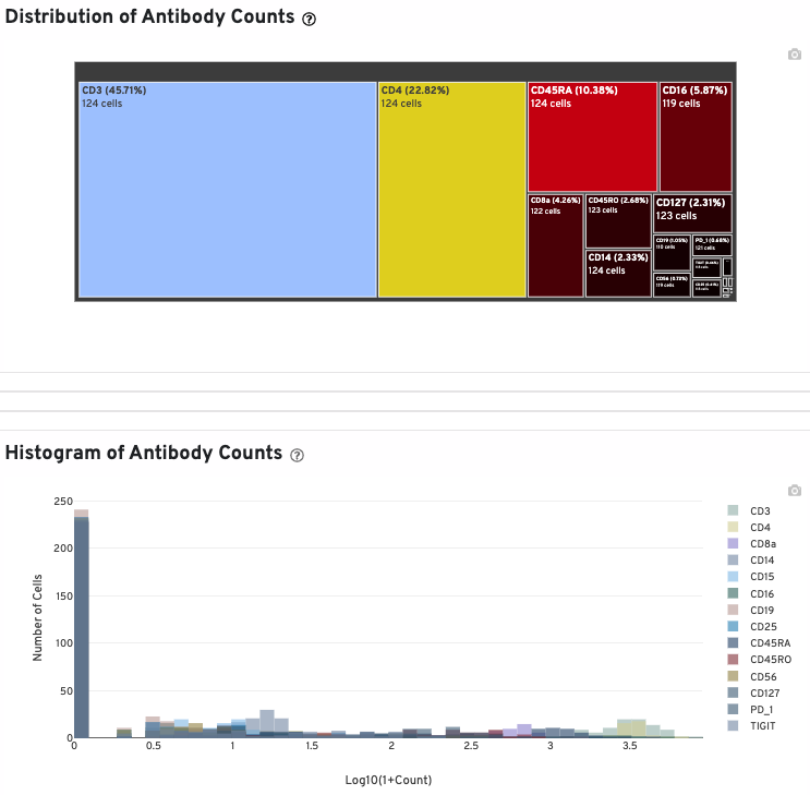
The Distribution of Antibody Counts section shows the relative composition of antibody counts for features with at least 1 UMI. Box size represents the fraction of total normalized antibody UMIs from cell barcodes that are derived from this antibody. You can hover over each box to view more information on a particular antibody, including the number of associated barcodes.
A histogram of antibody counts (for antibodies with total UMI counts > 1000) is also provided:
If your 5' Immune Profiling experiment includes a VDJ-B or a VDJ-T library, the corresponding tab is present in your web summary. You will see both VDJ-B and VDJ-T tabs if both libraries are present. The contents of the VDJ-B tab described in this example are also applicable to a VDJ-T library.
The top part of the VDJ-T/B tab shows the total number of T or B cells, the total number of clonotypes, and the number of cells with productive V-J spanning pairs. Run and annotations summary is also shown:
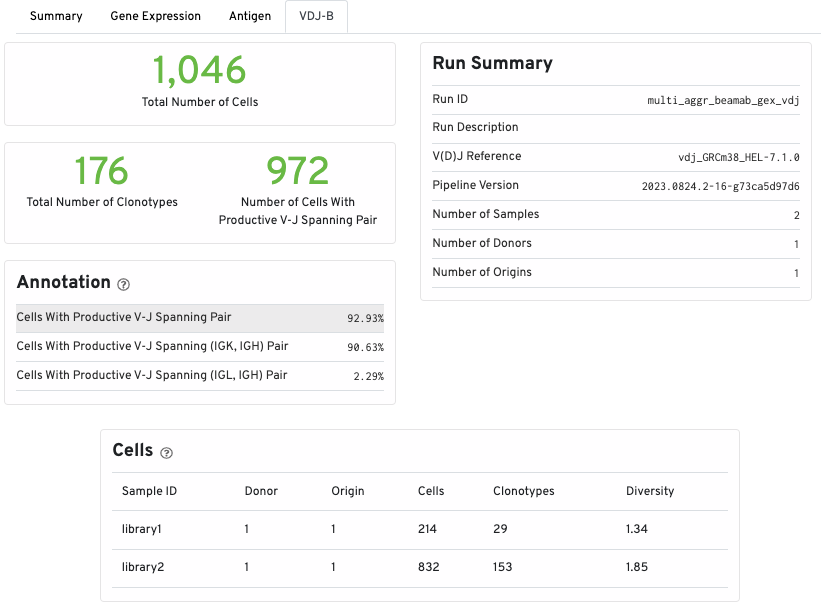
The Cells table displays summary statistics for the aggregated samples based on donor and origin. Each line lists the number of cells, the number of clonotypes, and the clonotypic diversity of the donor/origin combination.
A histogram displaying the percentage of cells occupied by the 10 most abundant clonotypes (colored by the sample of origin) in the aggregated datasets is also shown:
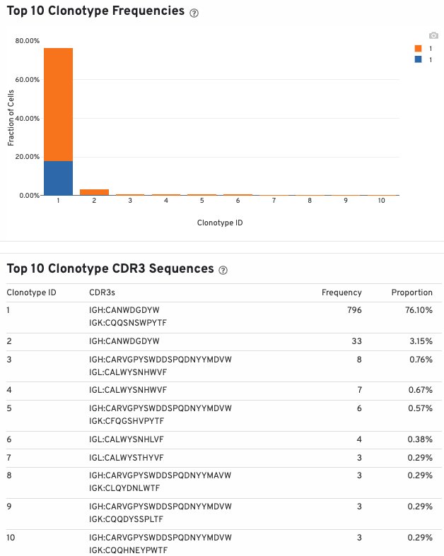
The table below the histogram lists the top 10 clonotype, their CDR3 sequences, frequencies, and proportions.
The top shared CDR3s table shows the 10 most shared CDR3 amino acid sequences. It is ordered by the number of shared donor/origin/libraries and the number of cells. The "Categorize by:" button allows you to display the 10 most prevalent CDR3 amino acid sequences by donor (number of donors a CDR3 is shared between), origin (number of origins a CDR3 is shared between), and libraries (number of libraries a CDR3 is shared between). This table also displays the number of cells sharing a given CDR3 amino acid sequence.
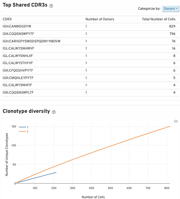
The clonotype diversity plot displays rarefaction curves of clonotype diversity. Each curve is from 1 origin.
If your 5' Immune Profiling experiment includes an Antigen Capture library, an Antigen tab is present in your web summary.
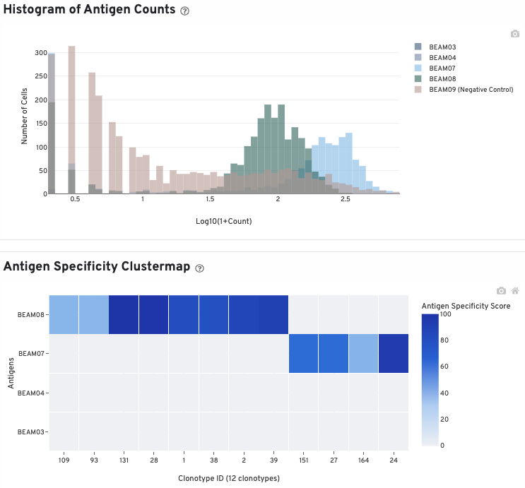
The histogram shows cells with non-zero total UMI antigen counts. As with the antibody histogram, you can select and deselect antigens to view by clicking on the antigen names in the legend.
The clustermap is a hierarchically-clustered heatmap showing the antigen specificity score for the top 12 clonotypes identified in the sample.